Agile Dashboards

Visualize Your Agile Progress and Performance

Agile Dashboards showing custom graphs, reports, and metrics for sprint tracking and team performance analysis.
(4.8) Review Score 4.8
Dashboard displaying comprehensive sprint tracking with burn-up, burn-down, velocity, and lead time charts.

Comprehensive Sprint Tracking

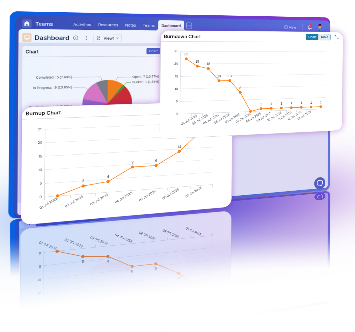
Monitor burn-up, burn-down, velocity, and lead time charts to ensure Agile project success.

Customizable graphs, number widgets, and grids on an Agile Dashboard for visualizing key metrics.

Customizable Graphs and Reports

Create tailored graphs, number widgets, and grids to visualize key metrics and drive data-informed decisions.

Agile Dashboard shared with team members, ensuring access to relevant data and insights for collaboration.

Enhanced Team Collaboration

Share dashboards with team members, ensuring everyone has access to relevant data and insights.

Agile Dashboards showcasing various graph widgets, number widgets, and grid views for comprehensive progress.

Know your Agile Team Progress
Pronnel's Agile Dashboards provide a powerful way to visualize and analyze your Agile progress, ensuring your team stays on track and continuously improves.

How It Works

Burn-up and burn-down charts showing sprint progress and updates for proactive management.

Burn-Up and Burn-Down Charts

Untitled-1

Track Sprint Progress

Visualize the amount of work completed versus the total work planned.
Untitled-1

Historical Data Analysis

Use historical data to monitor daily progress throughout the sprint.
Untitled-1

Real-Time Updates

Get real-time updates to ensure the team stays on track with sprint goals.
Untitled-1

Identify Roadblocks

Spot potential delays and bottlenecks early for proactive management.

Velocity Charts

Untitled-1

Sprint Comparison

Compare performance across multiple sprints to track improvements or declines.
Untitled-1

Measure Team Performance

Evaluate team productivity and identify trends over time.
Untitled-1

Forecast Future Sprints

Use velocity data to predict the capacity of future sprints.
Untitled-1

Continuous Improvement

Implement changes based on velocity insights to enhance sprint outcomes.
Velocity charts comparing performance across multiple sprints to measure team productivity.
Churn rate tracking monitoring task changes during sprints to optimize planning and stability.

Churn Rate Tracking

Untitled-1

Monitor Task Changes

Track how many tasks are added or removed during a sprint.
Untitled-1

Optimize Sprint Planning

Identify disruptions to improve future sprint planning and stability.
Untitled-1

Analyze Sprint Health

Understand the impact of changing priorities on sprint goals.
Untitled-1

Minimize Task Churn

Implement strategies to keep task churn low and maintain sprint focus.

Lead Time Charts

Untitled-1

Measure Turnaround Time

Track the time taken to complete work from request to delivery.
Untitled-1

Identify Bottlenecks

Spot delays in the workflow and take corrective actions.
Untitled-1

Enhance Customer Satisfaction

Reduce lead time to improve response times for customers.
Untitled-1

Improve Workflow Efficiency

Continuously monitor and optimize processes for faster delivery.
Lead time charts measuring turnaround time from request to delivery, identifying bottlenecks.
Cumulative flow diagrams visualizing task progress through stages, identifying trends.

Cumulative Flow Diagrams

Untitled-1

Visualize Workflow

Display the progress of tasks through different stages over time.
Untitled-1

Spot Trends

Identify trends and bottlenecks in the workflow easily.
Untitled-1

Balance Workload

Ensure a balanced distribution of work across the team.
Untitled-1

Improve Process

Use insights from flow diagrams to refine processes and enhance efficiency.

Bar, Line, and Scatter Graphs

Untitled-1

Multiple Axes and Scales

Plot data using multiple X and Y axes with different scales.
Untitled-1

Dynamic Representation

Choose between bar, line, and scatter representations for data visualization.
Untitled-1

Target Setting

Set specific targets for categories and visualize progress.
Untitled-1

Data Sorting

Sort data based on X or Y axis values for better analysis.
Bar, line, and scatter graphs with multiple axes, dynamic representation, target setting, and sorting.
Pie, donut, and funnel charts visualizing data distribution, category breakdown, and interactivity.

Pie, Donut, and Funnel Charts

Untitled-1

Data Distribution

Visualize data distribution with pie, donut, and funnel charts.
Untitled-1

Category Breakdown

Break down complex data into comprehensible visual segments.
Untitled-1

Interactive Elements

Click on segments to drill down into detailed item data.
Untitled-1

Customizable Appearance

Adjust chart colors, labels, and legends for clarity.

Stacked Bar and Area Graphs

Untitled-1

Category Stacking

Stack multiple categories within a bar or area to show detailed comparisons.
Untitled-1

Trend Analysis

Visualize how different categories contribute to overall trends over time.
Untitled-1

Dynamic Scaling

Switch between number and percentage scales for representation.
Untitled-1

Multiple Y-Axes

Visualize data with different Y-axes for detailed insights.
Stacked bar and area graphs showing category stacking, trend analysis, dynamic scaling, and Y-axes.
Gauge charts highlighting key metrics, customizable thresholds, real-time updates, and data points.

Gauge Charts

Untitled-1

Single Metric Focus

Highlight key metrics with gauge charts for performance tracking.
Untitled-1

Customizable Thresholds

Define custom thresholds to indicate performance levels.
Untitled-1

Real-Time Updates

Monitor critical metrics in real-time for accurate tracking.
Untitled-1

Multiple Data Points

Plot multiple values on a single gauge for a comprehensive overview.

Number Widgets

Untitled-1

Key Metrics Display

Summarize key metrics with number widgets for quick insights.
Untitled-1

Customizable Units

Add units like %, $, or custom labels to contextualize numbers.
Untitled-1

Formula Integration

Use simple or complex formulas to calculate displayed values.
Untitled-1

Real-Time Metrics

Display real-time data to track important metrics as they change.
Number widgets displaying key metrics, customizable units, formula integration, and data tracking.
Heat maps visualise data intensity, categorizing with color gradients, and identifying trends.

Heat Maps

Untitled-1

Intensity Visualization

Visualize data intensity with heat maps highlighting activity levels.
Untitled-1

Category and Value Axes

Use X and Y axes to categorize data with color gradients.
Untitled-1

Spot Trends and Outliers

Easily identify trends, clusters, and outliers in large data sets.
Untitled-1

Value Aggregation

Aggregate values to provide meaningful insights directly within the heat map.

Discover More Powerful Features

Explore additional features that enhance your Agile workflows, from customizable dashboards to advanced reporting tools, and more.

See All Features

Calender and Meetings

Connect your Google or Microsoft calendar, set reminders, and organize meetings effortlessly.

Round Arrow Right Streamline Icon: https://streamlinehq.com

Pronnel Drive

Centralized Storage Solution Your Agile Project Needs

Round Arrow Right Streamline Icon: https://streamlinehq.com

Seamless Data Migration

Smoothly transition your project data to and from Pronnel

Round Arrow Right Streamline Icon: https://streamlinehq.com

Custom Attributes

Precisely tailor task information using diverse attribute options for streamlined data capture and management.

Round Arrow Right Streamline Icon: https://streamlinehq.com

Agile Dashboards

Visualize Your Agile Progress and Performance.

Round Arrow Right Streamline Icon: https://streamlinehq.com

Access Levels and Permissions

Secure and Granular Control Over Data Access

Round Arrow Right Streamline Icon: https://streamlinehq.com

Leverage Pronnel's solutions to streamline your project management, improve team collaboration, and drive better outcomes for your business.

Machine Learning Streamline Icon: https://streamlinehq.com

Incident Resolution

Prioritizes and manages incident resolution tasks efficiently, ensuring quick response times and reduced downtime.

Machine Learning Streamline Icon: https://streamlinehq.com

Change Management

Streamlines planning and implementation of changes in Agile infrastructure, minimizing disruption and ensuring smooth transitions.

Machine Learning Streamline Icon: https://streamlinehq.com

Project Deployment

Coordinates deployment tasks effectively, ensuring timely delivery and alignment with project milestones.

Warning: Undefined variable $faqPaddingRequired in /var/www/html/includes/faq-features.php on line 52
>

FAQs: We have answers to your Questions

What are Agile Dashboards in Pronnel?

Agile Dashboards in Pronnel are customizable visual tools designed to enhance your Agile project management. They allow you to create various widgets such as graphs, charts, and grids to monitor project progress, sprint performance, and team productivity. By providing a comprehensive view of your Agile processes, these dashboards enable you to quickly identify trends, track key metrics, and make informed decisions to drive your projects forward efficiently.

How do Agile Dashboards benefit my team?

Agile Dashboards offer numerous benefits to your team by providing real-time insights into your Agile processes. They enable you to visualize progress, identify bottlenecks, and track team performance, ensuring your projects stay on track and within scope. By having a centralized view of all relevant data, your team can collaborate more effectively, make data-driven decisions, and continuously improve their workflows. This ultimately leads to increased productivity, better resource management, and a higher likelihood of project success.

Can I create multiple Agile Dashboards in Pronnel?

Yes, Pronnel allows you to create multiple Agile Dashboards. This flexibility means you can tailor each Dashboard to meet the specific needs of different teams or projects. For example, you might have one Dashboard focusing on sprint progress and another on overall project health. By creating customized dashboards, you ensure that the relevant stakeholders have access to the specific data they need to make informed decisions and keep their projects on track.

What types of widgets can I add to my Agile Dashboard?

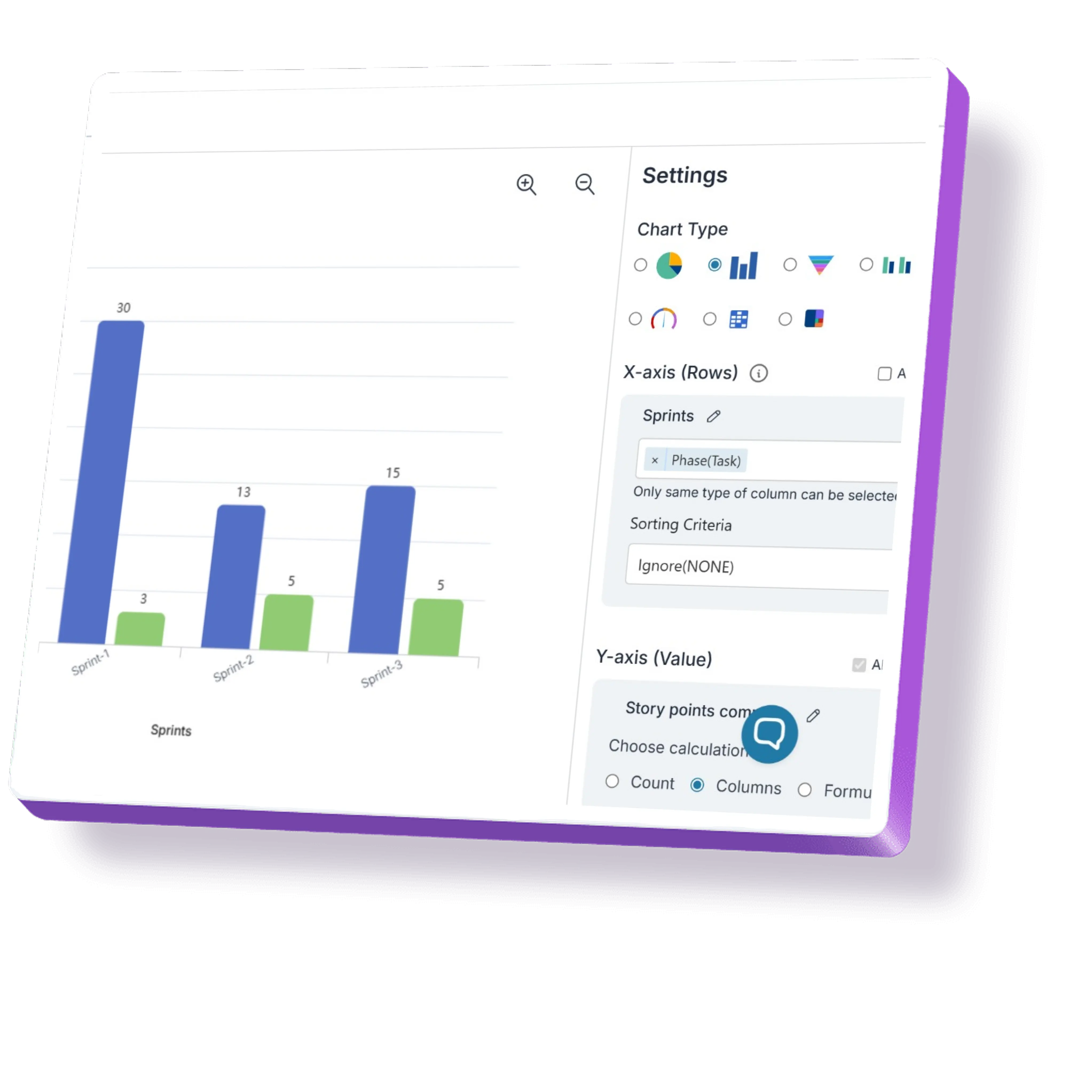
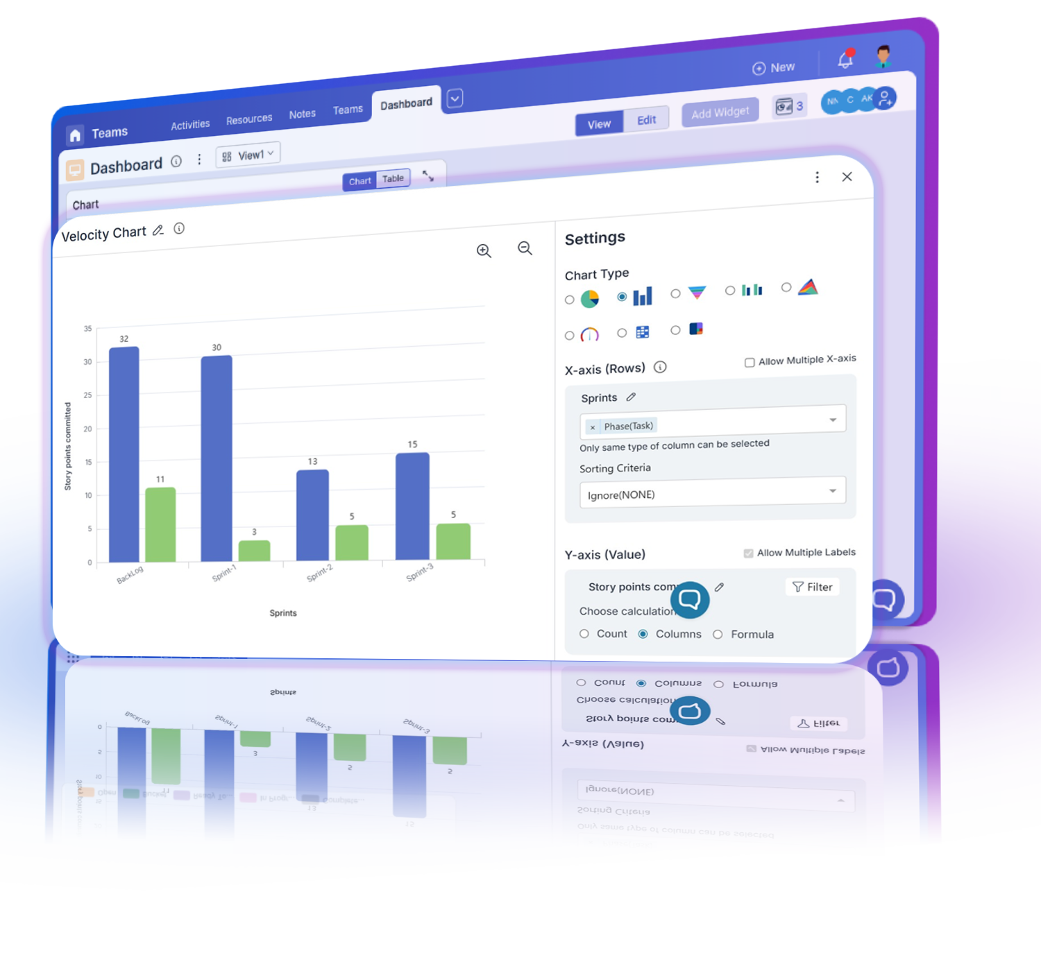
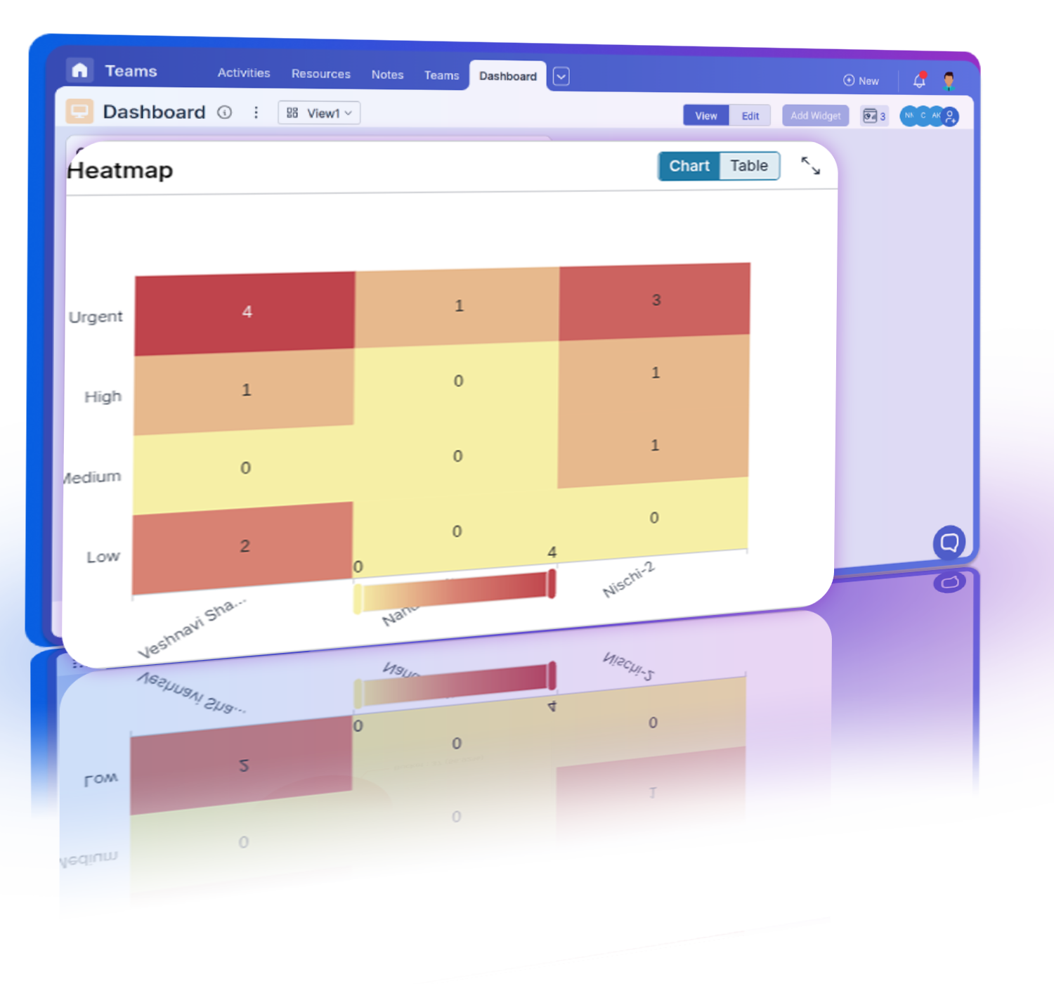
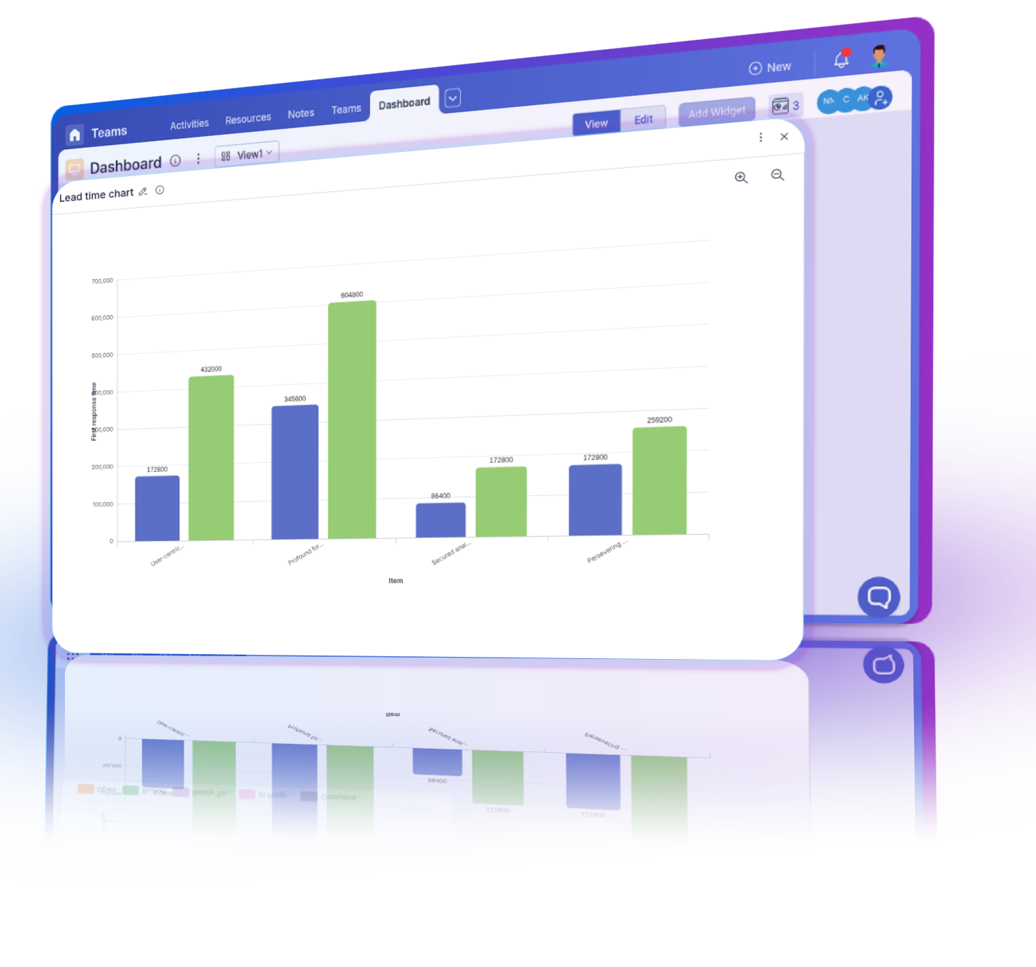
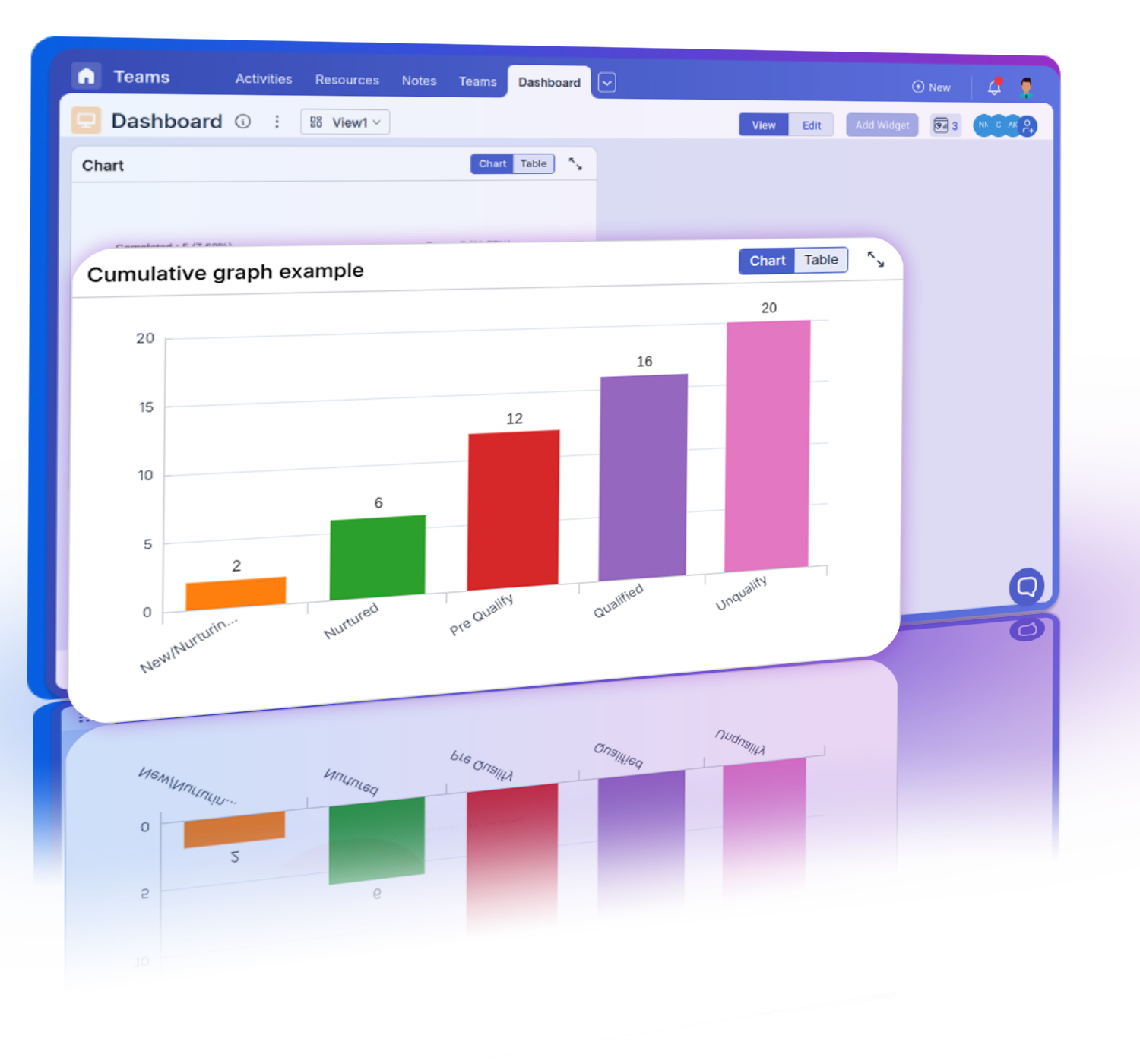
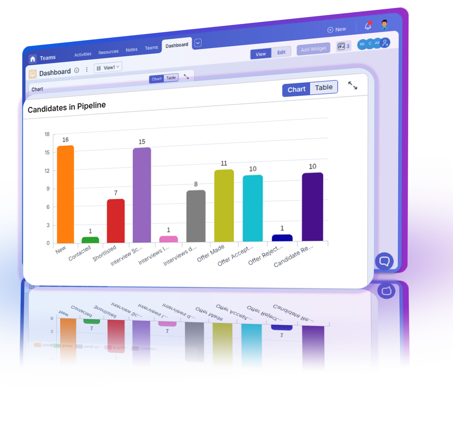
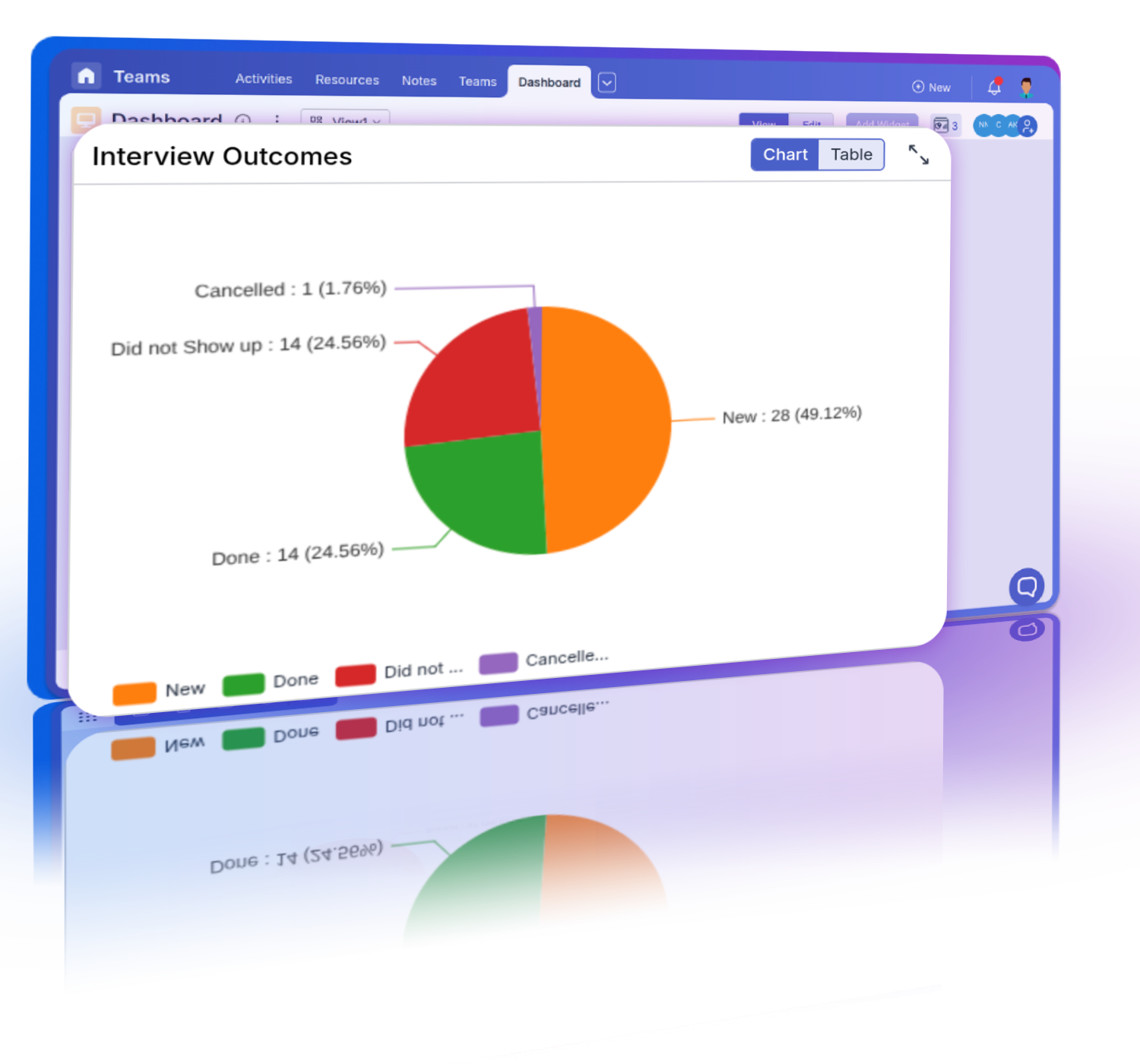
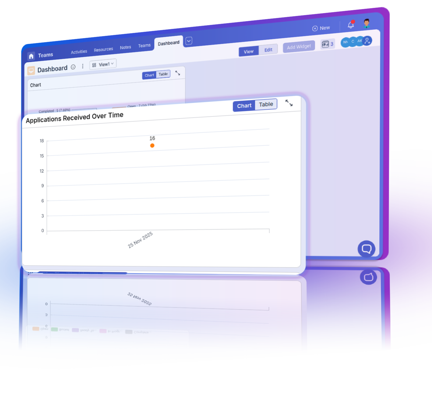
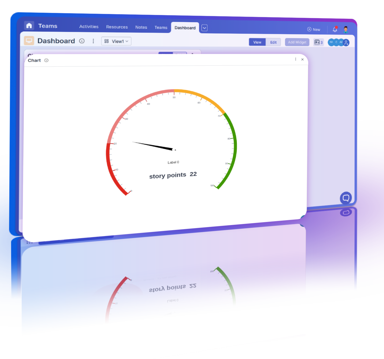
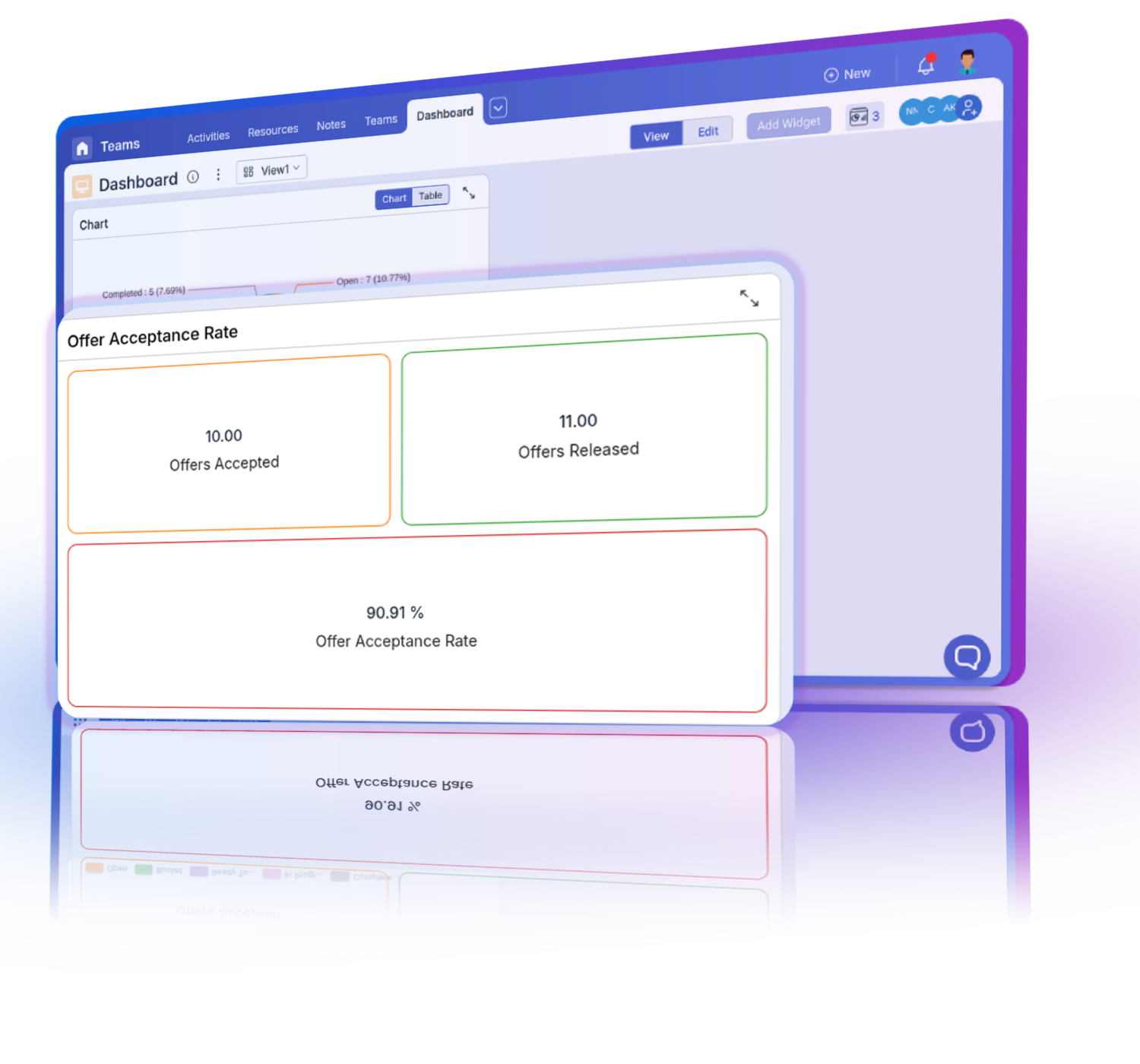
Pronnel offers a variety of widgets you can add to your Agile Dashboard to provide comprehensive insights. These include burn-up and burn-down charts to track sprint progress, velocity charts to measure team performance across sprints, lead time charts to monitor task completion times, and cumulative flow diagrams to visualize work stages. Additionally, you can add custom widgets like bar graphs, pie charts, number cards, and data grids to tailor the Dashboard to your specific needs. These widgets help you analyze different aspects of your Agile processes and make data-driven decisions.

How can I ensure data security while using Agile Dashboards?

Pronnel takes data security seriously and provides robust access control mechanisms to ensure that only authorized users can view or modify data. When setting up your Agile Dashboards, you can assign specific access levels to different users, ensuring they only see the data they are permitted to access. Additionally, Pronnel's security features include data encryption, regular security audits, and compliance with industry standards, ensuring your data remains secure and confidential.

How do I customize the widgets on my Agile Dashboard?

Customizing widgets on your Agile Dashboard in Pronnel is straightforward. You can select the type of widget you want to add and then configure it to display the specific data you need. For example, you can choose the data source, set filters, define axes for graphs, and select how data should be visualized (e.g., bar, line, or pie charts). This customization allows you to tailor the Dashboard to meet your unique needs and ensure it provides relevant and actionable insights.

What is the difference between burn-up and burn-down charts in Agile Dashboards?

Both burn-up and burn-down charts are essential tools in Agile Dashboards for tracking sprint progress, but they serve different purposes. Burn-down charts show the remaining work in a sprint or project, helping teams understand how much work is left and if they are on track to complete it by the deadline. Burn-up charts, on the other hand, show both the total amount of work and the work completed over time, providing a clear picture of progress towards the goal. Together, these charts help teams monitor their pace and make necessary adjustments to stay on target.

How can Agile Dashboards help with sprint retrospectives?

Agile Dashboards play a crucial role in sprint retrospectives by providing visual data that teams can analyze to evaluate their performance. Widgets like velocity charts, lead time charts, and cumulative flow diagrams offer insights into what went well, what could be improved, and where bottlenecks occurred. By reviewing this data during retrospectives, teams can identify patterns, discuss improvements, and plan actionable steps to enhance their future sprints. This continuous feedback loop is essential for maintaining a culture of improvement and achieving long-term success.

Can Agile Dashboards track multiple projects simultaneously?

Yes, Agile Dashboards in Pronnel can track multiple projects simultaneously. By setting up different dashboards for each project or consolidating data from multiple boards into a single Dashboard, you can monitor progress, compare performance, and manage resources across various projects. This capability helps project managers maintain a holistic view of all ongoing initiatives and ensures that teams stay aligned with overall business objectives.

How can I share Agile Dashboards with my team?

Sharing Agile Dashboards with your team in Pronnel is easy. You can assign specific dashboards to team members, granting them appropriate access levels (e.g., view-only or edit permissions). This ensures that all relevant stakeholders have access to the necessary information and can collaborate effectively to drive project success.

What support is available for setting up Agile Dashboards in Pronnel?

Pronnel offers comprehensive support for setting up Agile Dashboards. You can access detailed tutorials, documentation, and how-to guides that provide step-by-step instructions on creating and customizing dashboards. Additionally, Pronnel's customer support team is available to assist you with any questions or challenges you might encounter. Whether you're new to Agile Dashboards or looking to optimize your setup, Pronnel provides the resources and support you need to succeed.

How does Pronnel's Agile Dashboard help in continuous improvement?

Pronnel's Agile Dashboard supports continuous improvement by providing real-time data and visual insights that help teams analyze their performance and identify areas for enhancement. With tools like burn-up and burn-down charts, velocity charts, and lead time charts, teams can monitor their progress, evaluate the effectiveness of their processes, and implement changes based on data-driven insights. This iterative approach ensures that teams can continuously refine their workflows, improve efficiency, and achieve better outcomes in subsequent sprints.

Can I export data from Agile Dashboards for reporting purposes?

Yes, Pronnel allows you to export data from Agile Dashboards for reporting purposes. You can export data from individual widgets, such as graphs and grids, into various formats like Excel or PDF. This capability enables you to share insights with external stakeholders, create detailed reports, and maintain records of your Agile processes. Exporting data ensures that you have a comprehensive understanding of your projects and can communicate progress and results effectively.

What Our Clients Say

Happy Client Review Faisal
Faisal

Business Development Head in United Arab Emirates

Quote Left Streamline Icon: https://streamlinehq.com

Love the user interface and the straightforward navigation. Tailoring the CRM was effortless, thanks to the amazing customization options.

Quote Right Streamline Icon: https://streamlinehq.com
Happy Client Review Anirban
Anirban

Director/ Partner in United Arab Emirates

Quote Left Streamline Icon: https://streamlinehq.com

This application can do anything and everything based on your requirements, any modifications can be done based on your requirements.

Quote Right Streamline Icon: https://streamlinehq.com
Happy Client Review Serah
Serah

Executive Assistant in India

Quote Left Streamline Icon: https://streamlinehq.com

Ease of use and efficiency with which I could see which all tasks have been done and what is yet to do

Quote Right Streamline Icon: https://streamlinehq.com

Pronnel's keeps you on track

Get your personal work companion today!

Get Started Book A Demo See Pricing