Reports and Dashboards

Visualize and Analyze Your Data with Customizable Reports and Graphs

Dashboard view of customizable reports and graphs for improved visibility and data insights.
(4.8) Review Score 4.8
User-specific visualization options for tailored data access and customized reports.

Customized Data Visualization

Tailor dashboards to individual user needs with restricted access, ensuring relevant data visibility.

Customizable graphs and reports showcasing data-driven insights for informed decision-making.

Data-Driven Insights

Unlock powerful insights with customizable graphs and reports, enabling data-driven decisions.

A comprehensive dashboard view integrating multiple data sources for holistic insights.

Comprehensive Analysis

Combine multiple data sources into a single dashboard for a holistic view of your performance.

Dashboard showcasing advanced reporting and graph features for visual data insights and analysis.

Pronnel's advanced reporting and graph features empower teams with visual data insights, enhancing decision-making and performance tracking.

How It Works

Pie, donut, and funnel charts illustrating category distribution and performance with clear visuals.

Customizable Pie, Donut, and Funnel Charts

Untitled-1

Versatile Visualization

Visualize data distribution with pie, donut, and funnel charts.
Untitled-1

Category Breakdown

Easily break down complex data into comprehensible visual segments.
Untitled-1

Visual Colours

Auto colouring for different proportions and stages.
Untitled-1

Simple and Easy

Powerful data representation yet with simplicity at its best.

Bar, Line, and Scatter Graphs

Untitled-1

Multiple Axes and Scales

Plot data using multiple X and Y axes, each with different scales, to compare diverse data sets on a single graph.
Untitled-1

Dynamic Representation

Choose between bar, line, and scatter representations to best visualize your data.
Untitled-1

Target Setting

Set specific targets for different categories and visualize progress with target lines.
Untitled-1

Cumulative Data

Use sorting and cumulative data plots for better understanding of trends.
Bar, line, and scatter graphs showing trend analysis and complex data visualizations for analytics.
Stacked bar and area graphs showcasing detailed comparisons with dynamic scaling for analysis.

Stacked Bar and Area Graphs

Untitled-1

Category Stacking

Stack multiple categories within a bar or area to show detailed comparisons and cumulative data.
Untitled-1

Trend Analysis

Use stacked area graphs to visualize how different categories contribute to overall trends over time.
Untitled-1

Dynamic Scaling

Switch between number and percentage scales to best represent your stacked data.
Untitled-1

Multiple Y-Axes

Visualize data with different Y-axes for more detailed insights into your data sets.

Gauge Charts

Untitled-1

Single Metric Focus

Highlight key metrics with gauge charts, perfect for tracking performance against targets.
Untitled-1

Customizable Thresholds

Define custom thresholds to visually indicate performance levels (e.g., red, yellow, green zones).
Untitled-1

Real-Time Updates

Monitor critical metrics in real-time to ensure targets are being met.
Untitled-1

Multiple Data Points

Plot multiple values on a single gauge, each representing different metrics for a comprehensive overview.
Gauge charts depicting performance metrics with color-coded thresholds for quick visual assessment.
Heat maps highlighting data intensity and trends with color gradients for activity areas.

Heat Maps

Untitled-1

Intensity Visualization

Visualize data intensity with heat maps, highlighting areas of high and low activity.
Untitled-1

Category and Value Axes

Use X and Y axes to categorize data, with intensity values represented by color gradients.
Untitled-1

Spot Trends and Outliers

Easily identify trends, clusters, and outliers within large data sets.
Untitled-1

Value Aggregation

Aggregate values to provide meaningful data insights, such as sums or averages, directly within the heat map.

100% Bar Graphs

Untitled-1

Proportional Representation

Show data proportions within categories using 100% bar graphs.
Untitled-1

Consistent Scale

Represent all data bars as a full 100% length, divided by category proportions.
Untitled-1

Comparative Analysis

Easily compare category proportions across different groups.
Untitled-1

Detailed Insights

Break down each bar into multiple segments to understand the contribution of each category.
100% bar graphs displaying proportional data distribution with each bar segmented by category.
Number widgets providing key metrics and calculations like counts and averages for data insights.

Number Widgets

Untitled-1

Simple Summarization

Summarize key metrics with number widgets for quick insights.
Untitled-1

Customizable Units

Add units like %, $, or custom labels to contextualize the numbers.
Untitled-1

Formula Integration

Use simple or complex formulas to calculate the displayed values.
Untitled-1

Real-Time Metrics

Display real-time data to keep track of important metrics as they change.

Grid Widgets

Untitled-1

Data Overview

Display tabular data from multiple boards in a single grid for easy viewing.
Untitled-1

Custom Column Selection

Choose which columns to display and arrange their sequence.
Untitled-1

Filtered Views

Apply filters to show only relevant data in the grid.
Untitled-1

Easy Navigation

Use grid widgets to quickly access detailed data and perform actions directly from the dashboard.
Grid widgets offer tabular data views with customizable columns and filters for item analysis.
Graphs featuring filtering, sorting, data labels, and item drill-down for enhanced visualization.

Common Features for Graphs

Untitled-1

Interactive Filters

Apply filters to refine the data displayed in any graph or widget.
Untitled-1

Sorting Options

Sort data based on different attributes to highlight key information.
Untitled-1

Drill-Down Capability

Click on graph elements to view detailed item data behind the visual representation.
Untitled-1

Customization

Customize X and Y axis labels, legend positions, and add descriptions to graphs.
Untitled-1

Zoom Functionality

Zoom into specific areas of graphs for a closer look at the data.

By choosing Pronnel's Dashboard, you're not just investing in a reporting tool; you're empowering your organization with actionable insights to drive growth and success

Pronnel has many other amazing features, be sure to check out.

See All Features

Email, Chat, PDF Templates

Standardize and Accelerate Communication with Email, Chat, and Document Templates

Round Arrow Right Streamline Icon: https://streamlinehq.com

Manage Notes and Files

Collaborate with your team on notes and securely manage files in one unified platform.

Round Arrow Right Streamline Icon: https://streamlinehq.com

CRM Email Integration

Connect and Manage Emails Directly in CRM

Round Arrow Right Streamline Icon: https://streamlinehq.com

Customizable Workflows

Configure Your Pipeline to Match Your Team’s Unique Workflow

Round Arrow Right Streamline Icon: https://streamlinehq.com

Activity Tracking

Capture, Track, and Analyze All Interactions Seamlessly

Round Arrow Right Streamline Icon: https://streamlinehq.com

Configurable Items

Customize tasks, contacts, leads, and more with Pronnel's versatile item configuration.

Round Arrow Right Streamline Icon: https://streamlinehq.com

Unlocking accurate insights with dashboards are invaluable. That's why we offer a diverse array of tailored, ready-made graphs suited for every use case in our solutions.

It is an important feature in these Suites

See Solutions
Machine Learning Streamline Icon: https://streamlinehq.com

Sales Pipleine

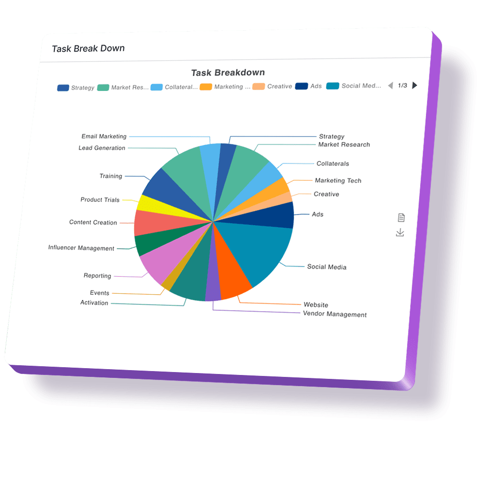
Sales analytics tools: YTD revenue vs. targets, lead/salesperson performance pie charts, cumulative revenue growth graphs.

Machine Learning Streamline Icon: https://streamlinehq.com

Company Internal Notice Board

Number widgets for key metrics like Revenue. Customer Centricity scores YTD vs Last year. Sales Leads Funnel Graph, Conversion Ratio's flipped 100% chart

Machine Learning Streamline Icon: https://streamlinehq.com

Customer Service Desk

Pre-bundled Average Ticket Closure Time Gauge Graph, Grid Widget for Identifying hotspots for delays, Stacked Area graph for cumulative ticket closures

FAQs: We have answers to your Questions

Pronnel's Dashboard and Customizable Reports feature is indispensable for senior executives who require real-time insights into business performance. With Pronnel, you'll have access to a robust reporting system that empowers you to track every aspect of your business effortlessly. This feature ensures you can make data-driven decisions with ease, enhancing your strategic planning and operational efficiency.

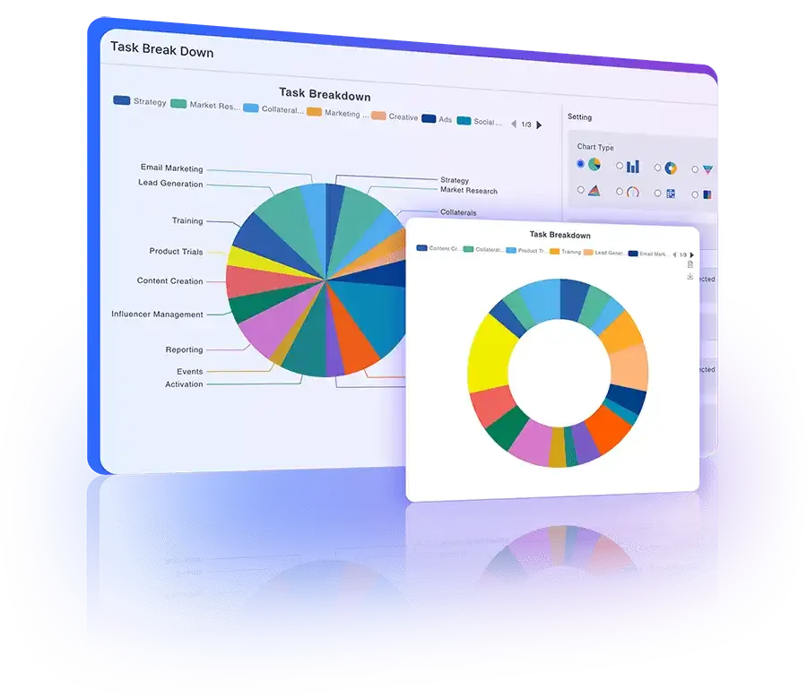
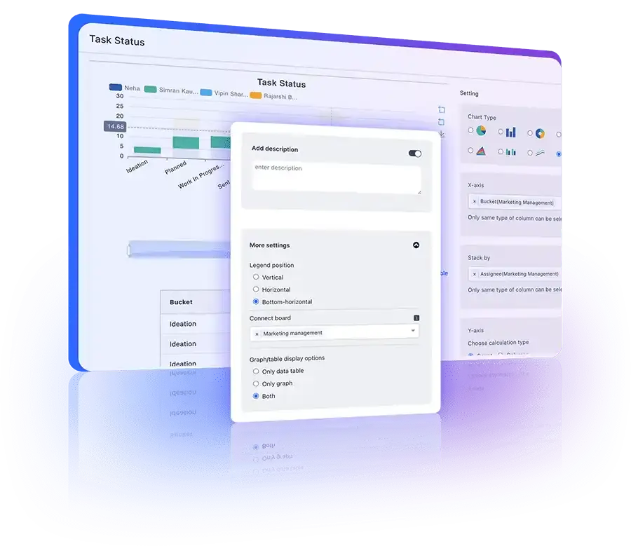
Absolutely! Pronnel offers unparalleled customization options for your reports. You can leverage our pre-built reports or create your own from scratch. Whether you're analyzing sales pipelines, customer feedback, or service tickets, Pronnel adapts to your business requirements seamlessly. You can tailor the dashboards to reflect the metrics that matter most to your organization, ensuring relevant and actionable insights.

Indeed! Our pre-built solutions suite includes standard reports tailored to your needs. While we've meticulously crafted these reports, we understand the uniqueness of every business. Hence, you have complete flexibility to modify, duplicate, or even create custom reports. For further details on the pre-built reports available with each suite, we recommend exploring our Industry pages. These standard reports are designed to give you a head start, providing valuable insights right out of the box.

Learning to build your graphs may seem daunting, but Pronnel simplifies the process with comprehensive tutorials available under Resources > Tutorials > Reports. These tutorials offer step-by-step guidance with live examples, making it easy to understand. If you encounter any challenges, feel free to experiment with our sample graphs. However, if you prefer a hands-off approach, our Sales Team is here to assist. Simply reach out via email, and we'll gladly discuss your requirements and provide a tailored estimate for a turnkey solution.

Graphs and reports can be created by anyone who is an Admin of a Board. Additionally, anyone with access to the Board can view them. For non-Admin individuals with access to a Board, can create their graphs by building a fresh Dashboard. This ensures that your team members can access the data they need to perform their roles effectively.

Your data security is our top priority. Pronnel ensures robust security measures, ensuring that only users invited by you can access your data. Even the Pronnel Team cannot access your data without your explicit invitation. Additionally, access control is in your hands, with Board Admins determining access levels for team members, including Admin, Restricted Access, Read-Only, or Edit-Only permissions. Rest assured, you have full control over who can view and interact with your data.

None whatsoever! Regardless of your pricing plan, Pronnel offers unlimited access to dashboards and reports. We believe in empowering our users to extract maximum value from our platform without any hidden clauses or additional costs. After all, what good is software if you can't explore and analyze your data freely?

Absolutely! Pronnel recognizes that businesses operate on varying fiscal year cycles. Whether your fiscal year aligns with the calendar year or follows a unique schedule, Pronnel's reporting functionality seamlessly adapts to your preferences. Our tutorials on setting fiscal years provide a hassle-free solution tailored to your needs.

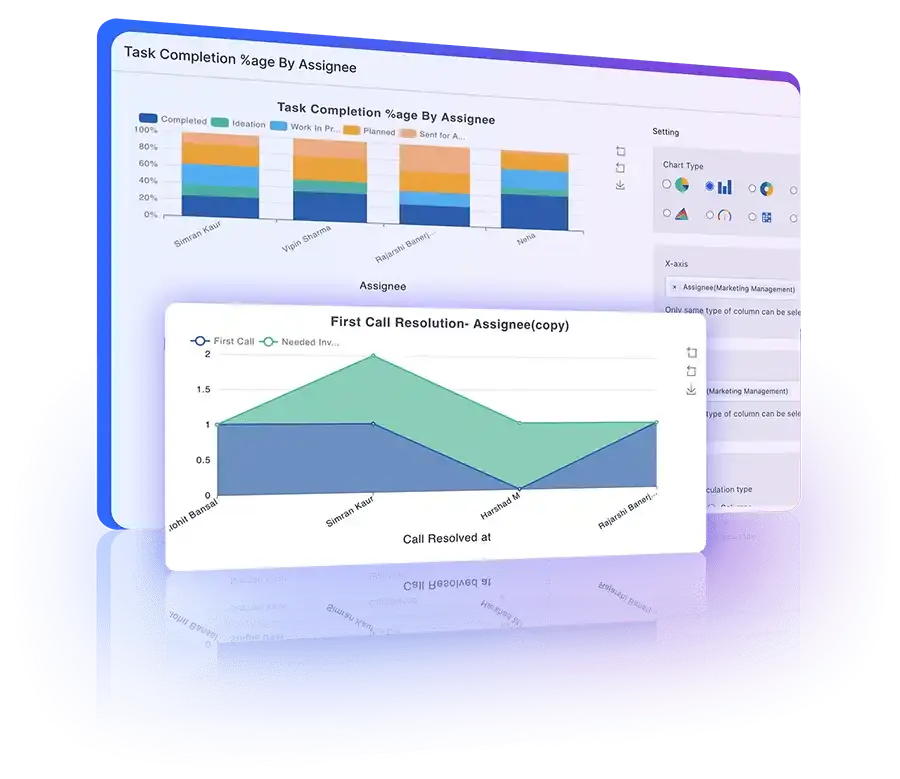
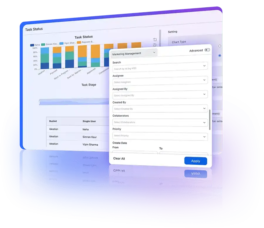
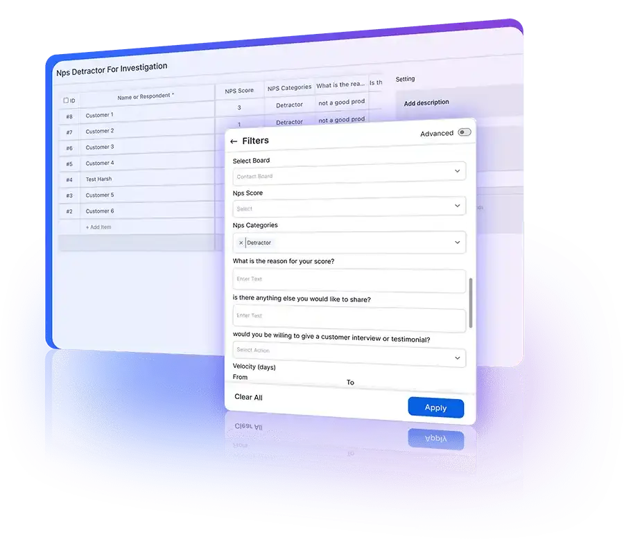
Pronnel provides a plethora of filter options to refine your reports, ensuring that you extract precise insights. From basic filters like assignee and priority to advanced filters akin to those found in MS Excel, Pronnel caters to your every need. Plus, our tutorials on filters offer comprehensive guidance for leveraging these features effectively.

Pronnel allows you to set access controls and permissions for different users. Board Admins can configure reports to show data only for items that specific team members have access to. This ensures that each team member sees only the relevant data, maintaining data privacy and security.

Yes, you can easily export reports and graphs from Pronnel. This feature allows you to share insights with stakeholders who might not have access to Pronnel. Export options include various formats such as PDF, Excel, and CSV, ensuring compatibility with your preferred tools.

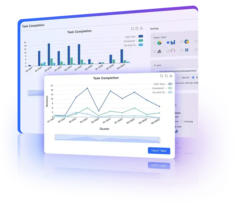
Reports in Pronnel can be updated in real-time. As new data comes in, your reports and graphs will automatically reflect these changes, providing you with up-to-date insights. This real-time updating ensures that you always have the latest information at your fingertips.

Yes, Pronnel integrates with a variety of other tools to enhance your reporting capabilities. You can connect Pronnel with your existing CRM, ERP, and other business tools to pull in data and create comprehensive reports. This integration ensures that you can consolidate data from multiple sources into a single dashboard.

Creating effective dashboards involves understanding your key metrics and how best to visualize them. Start by identifying the most important data points for your business goals. Use Pronnel’s customization features to create graphs and reports that highlight these metrics. Regularly review and update your dashboards to ensure they remain relevant. Utilize filters and sorting options to focus on the most critical data, and take advantage of our tutorials for advanced tips and tricks.

What Our Clients Say

Happy Client Review Faisal
Faisal

Business Development Head in United Arab Emirates

Quote Left Streamline Icon: https://streamlinehq.com

Love the user interface and the straightforward navigation. Tailoring the CRM was effortless, thanks to the amazing customization options.

Quote Right Streamline Icon: https://streamlinehq.com
Happy Client Review Anirban
Anirban

Director/ Partner in United Arab Emirates

Quote Left Streamline Icon: https://streamlinehq.com

This application can do anything and everything based on your requirements, any modifications can be done based on your requirements.

Quote Right Streamline Icon: https://streamlinehq.com
Happy Client Review Serah
Serah

Executive Assistant in India

Quote Left Streamline Icon: https://streamlinehq.com

Ease of use and efficiency with which I could see which all tasks have been done and what is yet to do

Quote Right Streamline Icon: https://streamlinehq.com

Pronnel's keeps you on track

Get your personal work companion today!

Get Started Book A Demo See Pricing