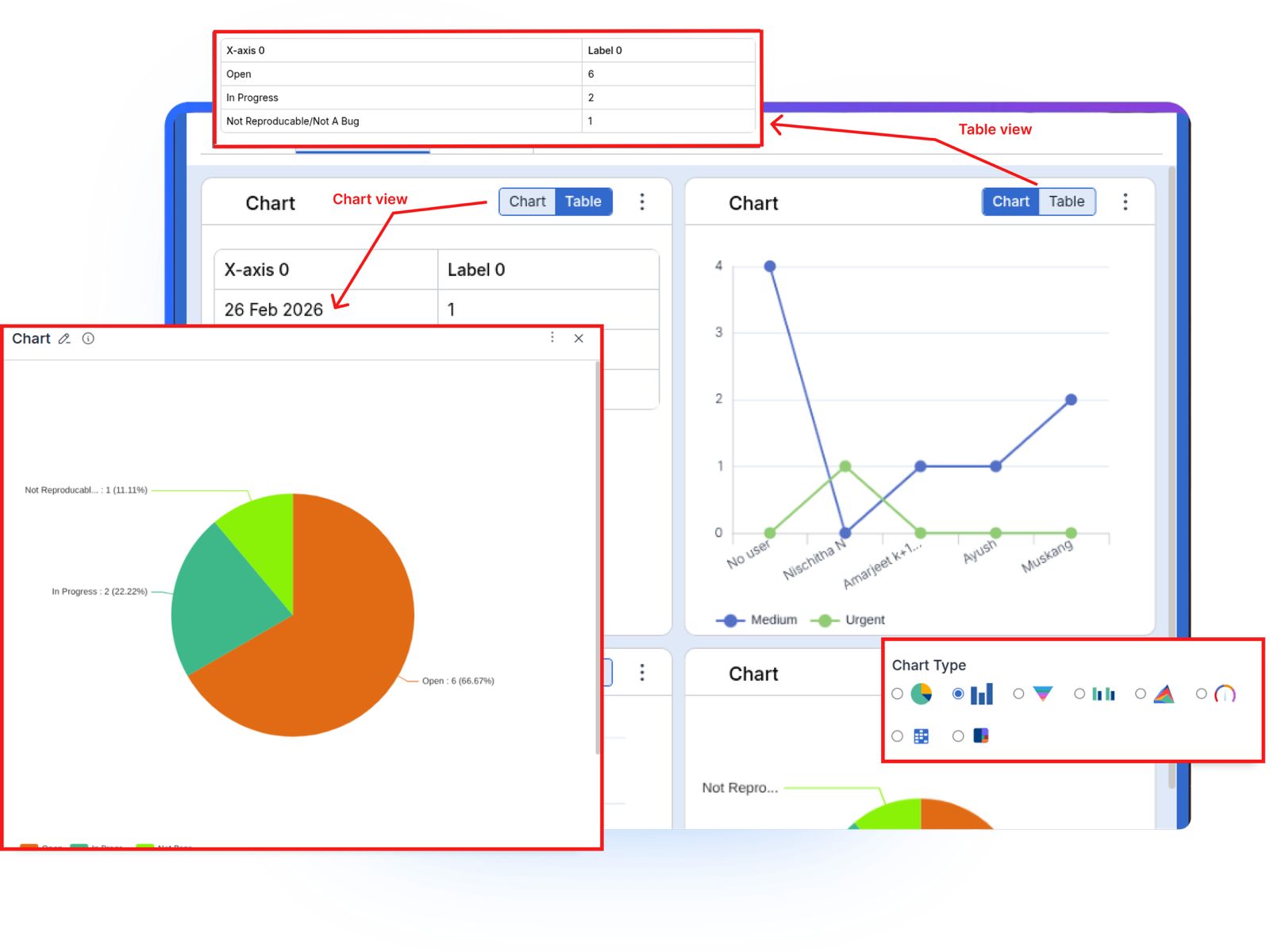
Reporting and Dashboards for Performance Improvement

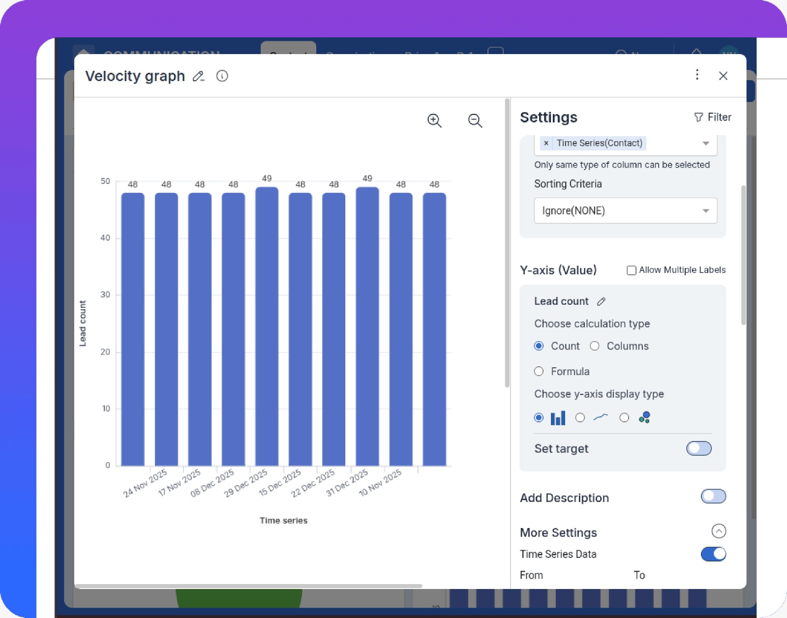
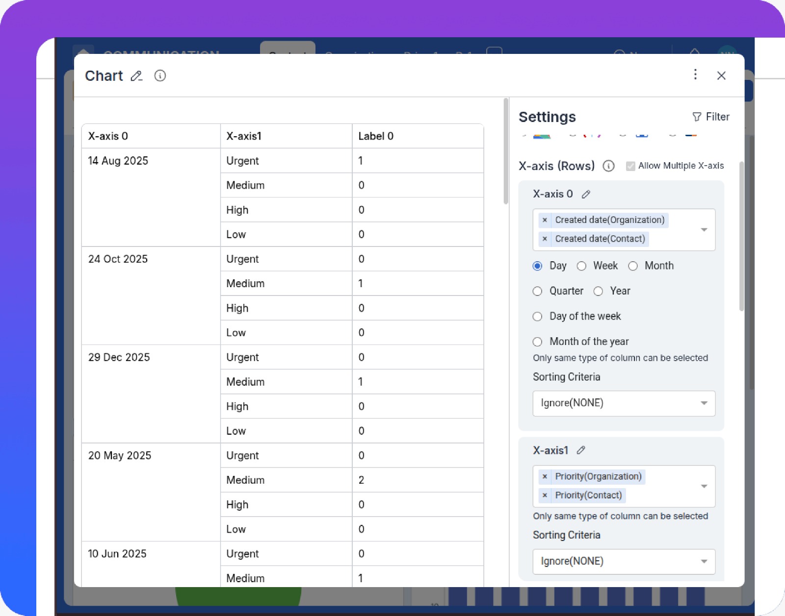
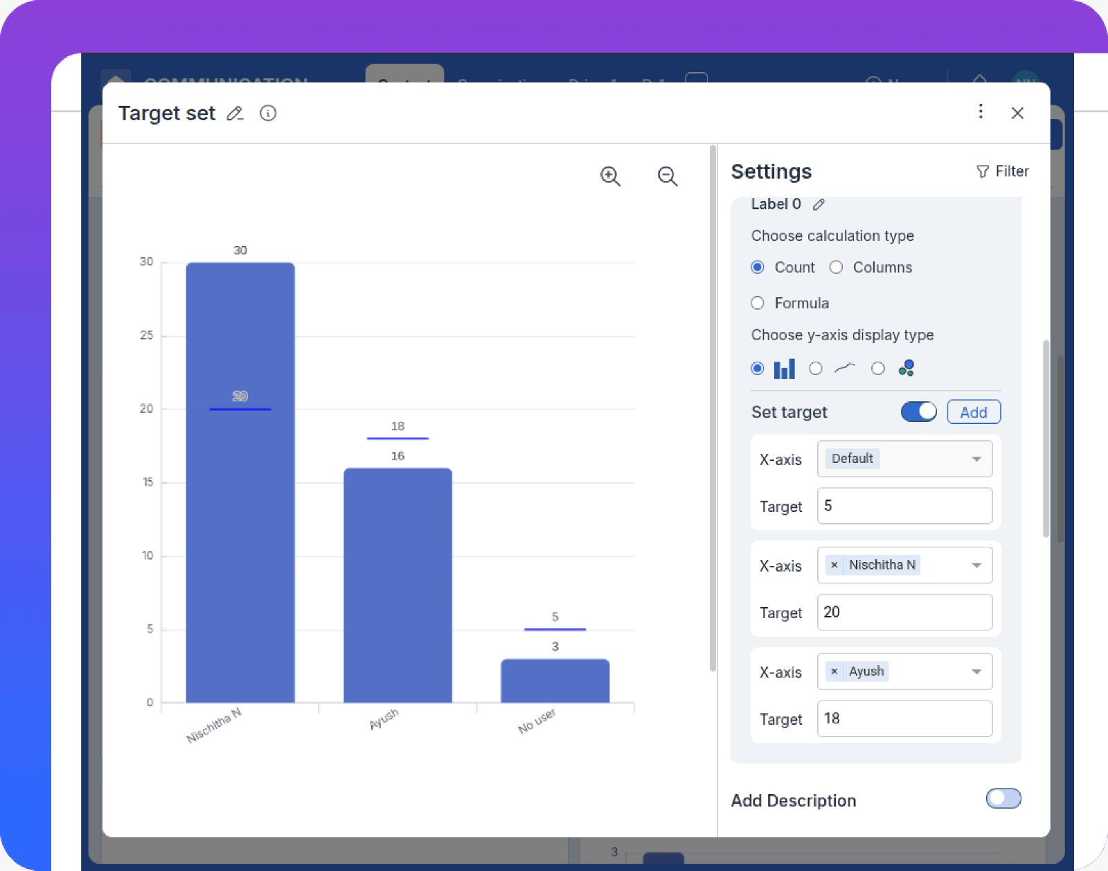
Reporting and Dashboards in Pronnel Teams act as the project's central command center.
They translate raw data from tasks, sprints, and resources into real-time analytics and visual monitors of project health, enabling continuous performance improvement.

Agile reporting and dashboards for data-driven teams.
(4.8) Review Score 4.8

How Does It Work?

Velocity and burnup/burndown charts.

Specialized Agile Graphs

Use pre-built Agile graphs such as Velocity Charts and Burnup/Burndown Charts to track completed work, remaining work, and team capacity across sprints.

Custom data visualizations for KPIs.

Customized Data Visualization

Create custom reports and graphs (Pie, Bar, Line, Heat Maps) pulling data from Tasks, Issues, and Resources to analyze KPIs like Defect Density and Resource Utilization.

Real-time dashboards with targets.

Real-Time Monitoring and Goal Setting

Use real-time dashboards and Target Lines on charts so Project Managers can see immediately whether the team is meeting commitments and spot deviations from the plan.

Who Does This Help?

Project Managers

Track task progress, resource workload, and sprint health in real time to identify bottlenecks and act quickly.

Team Members (Devs/QA)

See personal workloads and task impact clearly, improving accountability and alignment with sprint goals.

Leadership & Stakeholders

Monitor overall project and portfolio health through high-level KPIs and milestone status for informed decisions.

How Are We Different?

Unified Cross-Functional Analytics
Focus on Continuous Performance Improvement
Highly Customizable Views
Cross-functional analytics from multiple modules.
Unified Cross-Functional Analytics
Cross-functional analytics from multiple modules.
Focus on Continuous Performance Improvement
Trend graphs for retrospectives.
Highly Customizable Views
Customizable personal views and filters.

What All Does It Do?

Velocity chart showing performance trends.

Identify the Problem

Monitor the Velocity Chart and other key metrics to spot drops in performance or inconsistency.

How it works?

Use historical velocity and sprint completion data to quickly see when delivery patterns change.

Advantages

Untitled-1
Early Warning
Detect issues in team throughput before they become schedule risks.
Untitled-1
Better Forecasting
Base future commitments on real performance, not assumptions.

Drill Down with Analytics

Switch to custom Reports showing Task Duration and Defect Density to analyze where problems originate.

How it works?

Combine Task and Issue data in tailored reports to see which components or task types cause delays or defects.

Advantages

Untitled-1
Root Cause Insight
Identify which work types or areas need targeted improvements.
Untitled-1
Focused Effort
Direct improvement efforts where they will have the biggest impact.
Custom report highlighting long-running tasks and high-defect areas.
Correlation view of components versus defects and duration.

Correlate Data

Discover which components or task types consistently show the highest Task Duration and Defect Density.

How it works?

Use filters and grouping to compare multiple dimensions—like component, team, or sprint—to see patterns over time.

Advantages

Untitled-1
Deeper Understanding
See how different variables interact to affect delivery speed and quality.
Untitled-1
Strategic Targeting
Support long-term refactoring or process changes with solid evidence.

Monitor the Change

Set Target Lines on charts for upcoming sprints and monitor whether metrics move in the desired direction.

How it works?

Configure targets for metrics like Velocity, Defect Density, or Task Duration and track actual performance against them.

Advantages

Untitled-1
Feedback Loop
Verify whether changes are delivering the expected improvements.
Untitled-1
Continuous Optimization
Keep iterating on processes using clear, visual feedback.
Dashboard with target line for key metrics.

Pronnel solves multiple problems.

Analytics becomes more powerful when paired with strong execution. Explore solutions that feed data into your dashboards.

Road Map

Plan, visualize, and align work across timelines to ensure teams stay focused on priorities and long-term goals.

Round Arrow Right Streamline Icon: https://streamlinehq.com

Issue And Bug Tracking

Log, prioritize, and resolve issues and bugs efficiently while tracking status and accountability.

Round Arrow Right Streamline Icon: https://streamlinehq.com

Agile Project Management

Plan, assign, and track project tasks with structured boards that keep teams aligned and work moving forward.

Round Arrow Right Streamline Icon: https://streamlinehq.com

Collaboration

Collaborate directly on tasks with comments, shared files, and updates in one unified workspace.

Round Arrow Right Streamline Icon: https://streamlinehq.com

Sprint Management

Manage multiple sprints simultaneously by planning, prioritizing, tracking, reviewing, and refining each sprint within defined timelines.

Round Arrow Right Streamline Icon: https://streamlinehq.com

Epic,Story & Tasks Issues

Manage epics, stories, tasks, and related issues in a single view for better structure and traceability.

Round Arrow Right Streamline Icon: https://streamlinehq.com

Drive Continuous Improvement with Data-Driven Dashboards

Move from gut-feel to evidence-based decisions using unified Agile reporting.

Machine Learning Streamline Icon: https://streamlinehq.com

Agile Metrics & Velocity

Track Velocity, Burnup/Burndown, and other Agile metrics to forecast capacity and commitments more accurately.

Machine Learning Streamline Icon: https://streamlinehq.com

Resource & Workload Analytics

Analyze Effort Hours, workload distribution, and utilization to balance teams and avoid burnout.

Machine Learning Streamline Icon: https://streamlinehq.com

Quality & Defect Reporting

Monitor defect trends and resolution times to improve quality across releases.

FAQs: We have answers to your Questions

How does the Velocity Chart help with planning?

The Velocity Chart measures the average amount of work (Story Points) the team completed in past sprints. Project Managers use this to forecast how many Stories the team can realistically commit to in upcoming sprints.

What is the difference between a Burnup and a Burndown Chart?

Burndown Charts show remaining work over time, helping track progress within a sprint. Burnup Charts show completed work versus total scope, making it easier to see scope changes and overall delivery progress.

Can I track my team's time spent on tasks?

Yes. Pronnel supports Effort Hours tracking alongside Sprint Points so you can generate Resource Utilization reports and compare estimated versus actual time for improved cost and capacity planning.

What types of dashboards does Pronnel provide for teams?

Pronnel offers real-time dashboards for sprint health, task progress, workload distribution, issue status, and overall project performance.

Can dashboards be customized for different roles?

Yes. Dashboards can be tailored for Project Managers, team members, and leadership, ensuring each role sees the metrics most relevant to them.

How do reports help identify bottlenecks?

Reports highlight delays, blocked tasks, and uneven workload distribution, allowing teams to address issues early and keep work moving.

Are reports updated in real time?

Yes. All dashboards and reports update in real time based on task and sprint activity, providing accurate and up-to-date insights.

Can reports be used across multiple projects?

Yes. Pronnel supports cross-project reporting, giving teams and stakeholders a unified view of performance across initiatives.

What Our Clients Say

Happy Client Review Ross
Ross

Sales & Marketing Manager in United Arab Emirates

Quote Left Streamline Icon: https://streamlinehq.com

A positive experience. Very feature rich. Very adaptable and configurable. You won't feel "nickle-and-dimed" from the product as pretty much everything is included.

Quote Right Streamline Icon: https://streamlinehq.com
Happy Client Review Faisal
Faisal

Business Development Head in United Arab Emirates

Quote Left Streamline Icon: https://streamlinehq.com

Love the user interface and the straightforward navigation. Tailoring the CRM was effortless, thanks to the amazing customization options.

Quote Right Streamline Icon: https://streamlinehq.com
Happy Client Review Serah
Serah

Executive Assistant in India

Quote Left Streamline Icon: https://streamlinehq.com

Ease of use and efficiency with which I could see which all tasks have been done and what is yet to do

Quote Right Streamline Icon: https://streamlinehq.com

Pronnel's keeps you on track

Get your personal work companion today!

Get Started Book A Demo See Pricing