Advanced Insights with Multi-Dimensional Charts in Pronnel
Looking to dig deeper into your board data? Pronnel’s Advanced Charts go beyond basic comparisons by enabling multi-dimensional analysis. These charts help you analyze complex relationships, spot trends over time, and evaluate stacked or grouped metrics in a single view. In this tutorial, we’ll walk you through each advanced chart type and how to use it effectively—including powerful configurations like Multiple X-axis, multi-Y, and multi-stack options.
How Advanced Charts Differ from Comparative Charts
Comparative Charts such as Pie, Bar, and Funnel are useful for analyzing data across a single dimension—like priority or assignee. In contrast, Advanced Charts enable multi-dimensional insights by allowing you to visualize relationships between multiple fields simultaneously.
Advanced Charts are ideal when you want to:
- Compare metrics across two or more fields, such as Bucket, Priority, and Assignee
- Visualize progression over time or across statuses using multiple X-axis
- Break down data into layered components with stack fields (e.g., category within team)
- Spot trends, bottlenecks, or performance variations using custom formulas
Advanced Chart Types
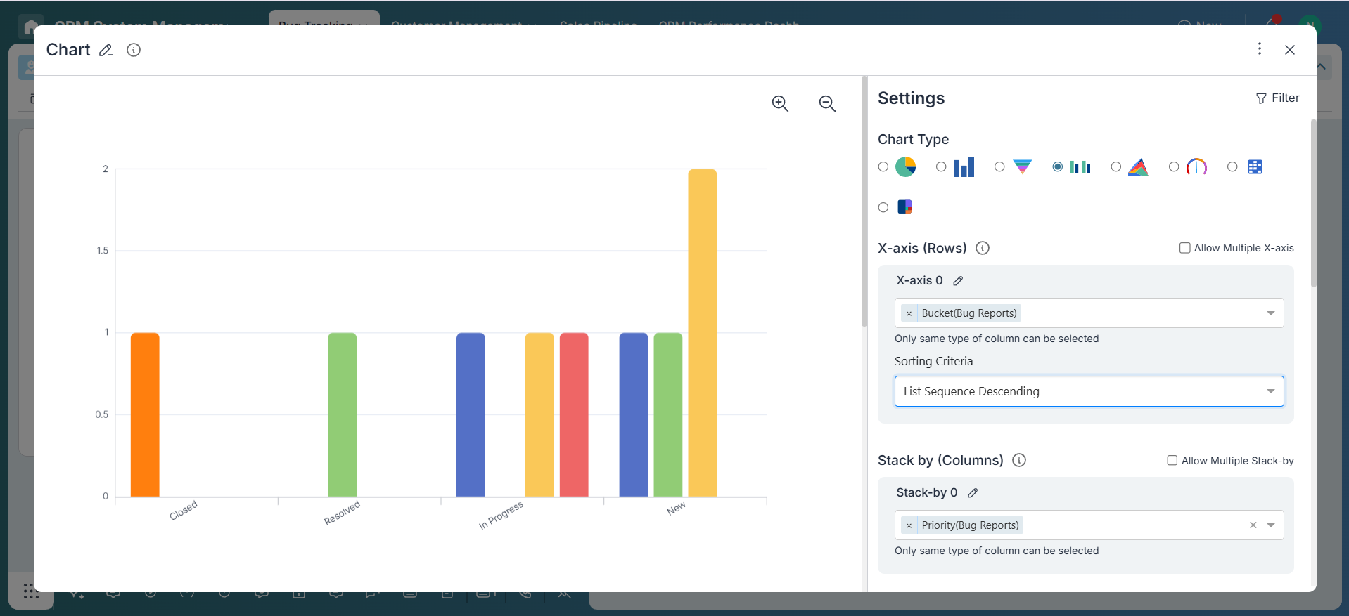
1. Multi-Bar Chart
The Multi-Bar Chart displays groups of bars side-by-side for each category on the X-axis. You can configure multiple stack fields and even use multiple X-axis fields to create more granular comparisons.
Supports: Multiple X-Axis fields, multiple Stack by, and multiple Y-Axis metrics.
Example: Compare the number of tasks across Buckets and Months, broken down by Priority and Assignee. Each grouping will display several bars side-by-side, highlighting team distribution and task criticality.
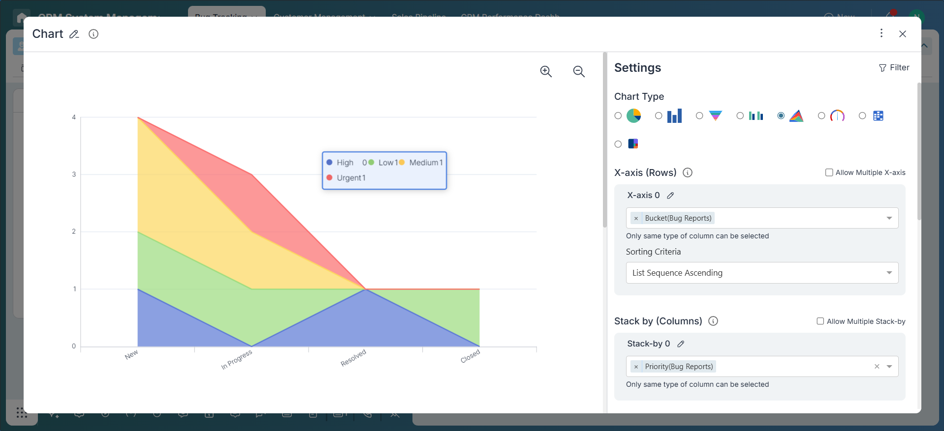
2. Stacked Area Chart
Stacked Area Charts show how different sub-categories contribute to the overall total across an X-axis (like Date or Status). You can layer multiple stack fields to create a rich visual narrative.
Supports: Multiple X-axis values (e.g., Status and Date), and multi-stack fields (e.g., Priority and Department).
Example: Track bug volume across Status and Week, stacked by both Priority and Team.
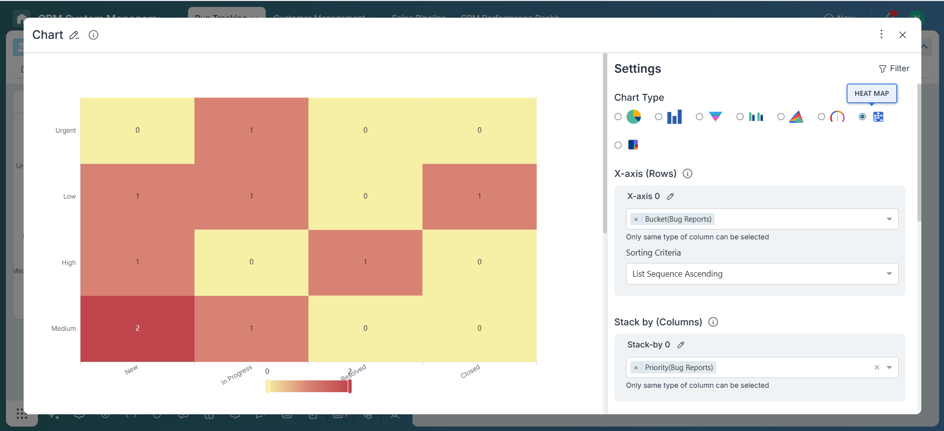
3. Heatmap
Heatmaps use color intensity to represent the concentration of values across two categorical dimensions. Ideal for spotting high or low activity zones.
Supports: Single X and Y axis. For more dimensions, consider using Multi-Bar or 100% charts.
Example: View task distribution by Bucket and Priority—darker cells highlight more dense or critical workload areas.
4. 100% Chart
100% Charts normalize values to display each group as a full bar (100%), showing proportional breakdowns across dimensions. With multi-stack and Multiple X-axis support, they help compare relative contributions in depth.
Supports: Multiple X axis and multi-stack (e.g., show breakdown of Assignee and Priority across Buckets and Teams).
Example: View the percentage distribution of bugs by Priority and Assignee across different Buckets and Modules. You’ll see how work is distributed and whether it’s balanced.
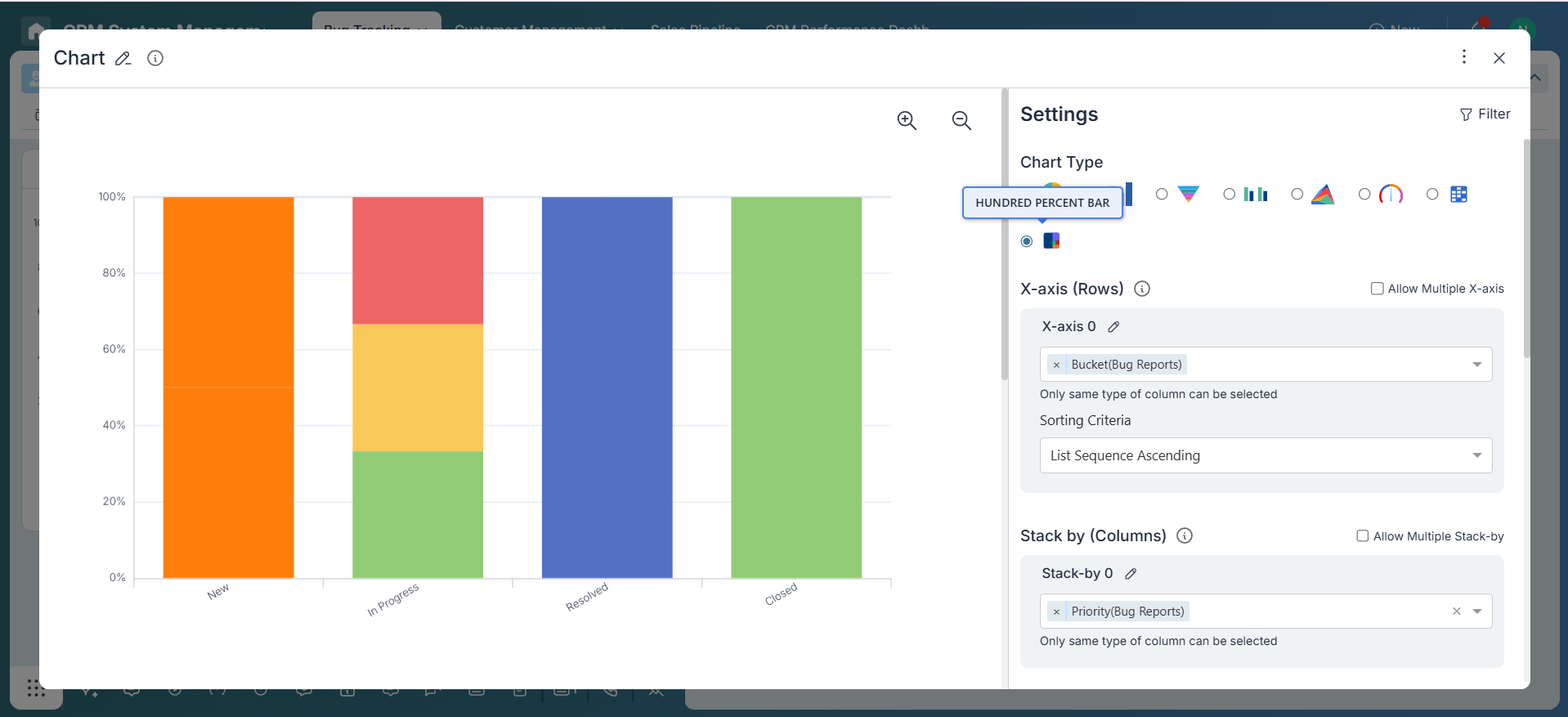
Chart Configuration
-
X-Axis (Primary and Secondary)
Select one or more fields to represent on the X-axis—such as Bucket, Status, Month, or Team. Multiple X-axis support allows nested or grouped analysis for more granularity.
-
Stack / Series Fields
Choose one or more fields to stack or group data within each X-axis value—e.g., Priority, Assignee, Category. Multi-stack reveals the layered structure within categories.
-
Y-Axis Metrics
Define what to measure—Count of items, SUM of numeric fields, AVERAGE, or custom Formulas (e.g., AVG Response Time). You can add multiple Y-axis metrics in some charts using custom widgets.
Best Practices
- Use Multi-Bar for side-by-side comparison across categories and stack fields.
- Use Stacked Area to show contribution trends over time or workflow stages.
- Use Heatmap for a quick view of density or activity concentration across two categories.
- Use 100% Chart when you need to compare proportions across multiple X-axis and stack fields.
- Leverage Multiple X-axis when you want to slice data by more than one dimension (e.g., Project > Month).
- Apply Multi-Stack to break down categories by team, priority, or role within the same chart.
Applying Filters
Use filters to fine-tune your dataset. For example, restrict data to the last 30 days, only show items with a specific status, or filter by team or tags. This ensures your charts reflect the most relevant information for your goal.
Conclusion
Advanced Charts in Pronnel empower you to unlock deeper insights by visualizing data across multiple dimensions. With flexible support for Multiple X-axis, multi-Y, and multi-stack configurations, you can tailor your analysis to fit complex business needs. Whether it's identifying patterns, tracking workload distribution, or evaluating performance metrics, these charts offer the precision and context required for informed decision-making.
Frequently Asked Questions About Advanced Multi-Dimensional Charts in Pronnel
When should I choose an advanced chart over a standard one?
When you need multi-field relationships, time trends, or layered breakdowns beyond a single dimension.
Can I use multiple X or Stack fields in a single chart?
Yes. Multi‑Bar, Stacked Area, and 100% Charts support multiple X‑axis and Stack fields.
Can I apply custom formulas for the Y‑axis?
Yes. Use formulas for averages, percentages, weighted scores, and other derived metrics.
Are advanced charts available on all boards?
Most boards support them if data includes fields like Priority, Assignee, Status, or Date and charts are enabled.
Can I export these charts?
Dock a chart widget to use the export icon; screenshots also work for reports.