Visualizing Process Performance with Overview in Pronnel
In Pronnel, every Board represents a unique Process. To improve and optimize these processes, measurement is key. That’s where the Overview tab comes in. Unlike other views like Kanban, Grid, or Gantt, Overview provides a dedicated analytics space with configurable charts and number widgets—helping Admins and Editors monitor key metrics and make informed decisions.
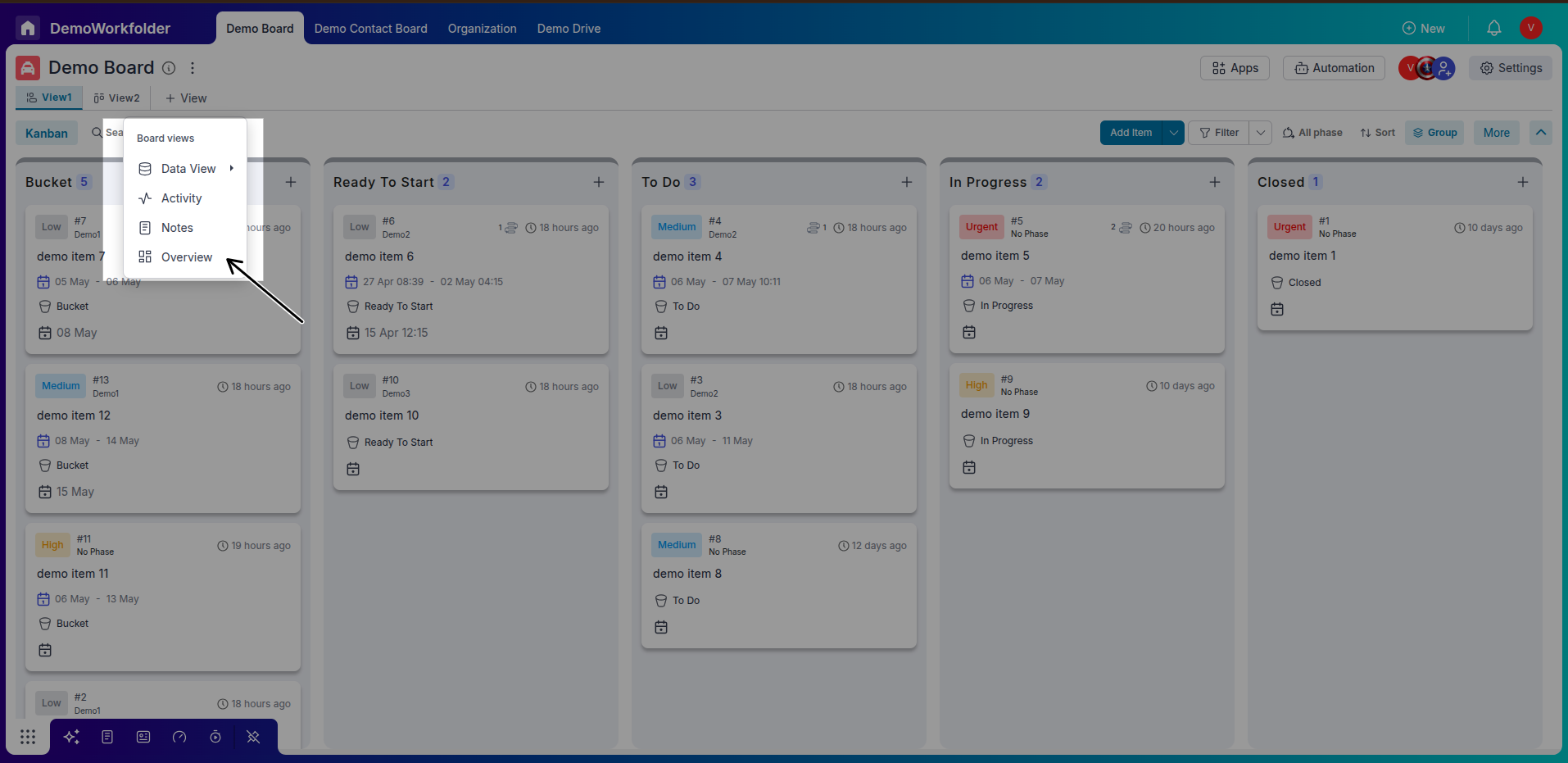
Step 1: Accessing Overview
Create Overview for your board
Click the “+view” button at the top of your board to create a new overview. You can then rename this view and save it for specific needs or teams.
There are two modes view and Edit so When you want to do some changes do not forget to change mode to edit
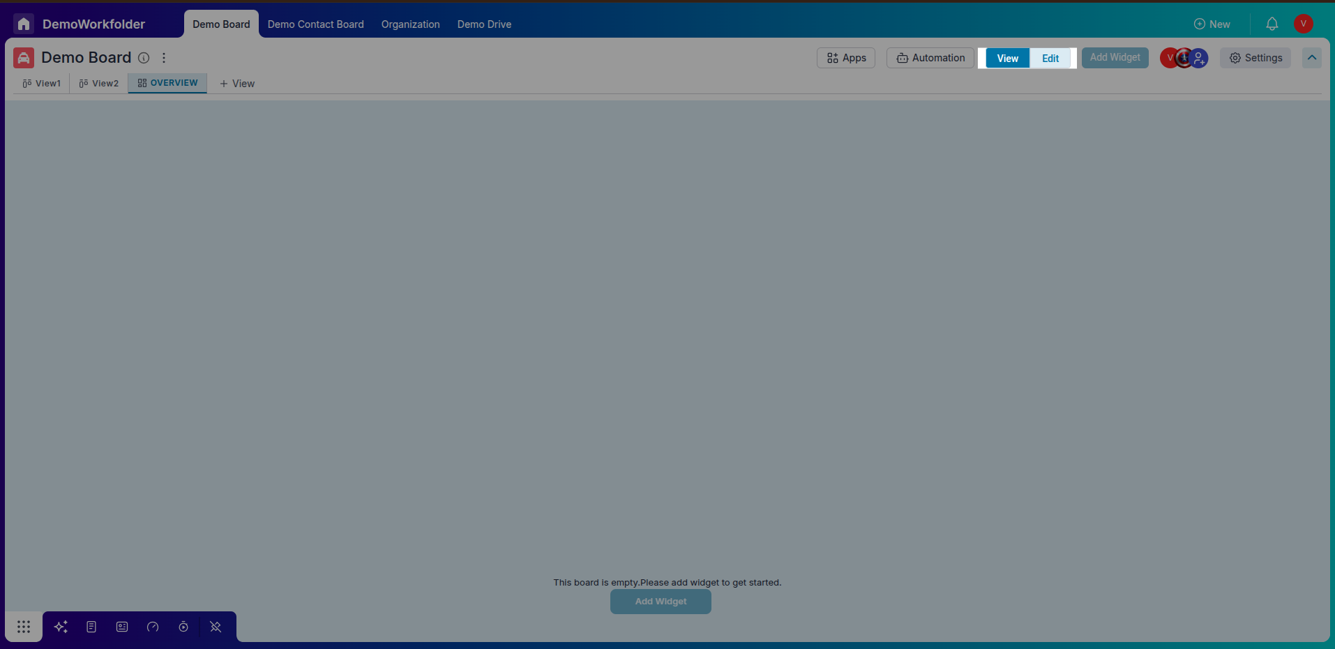
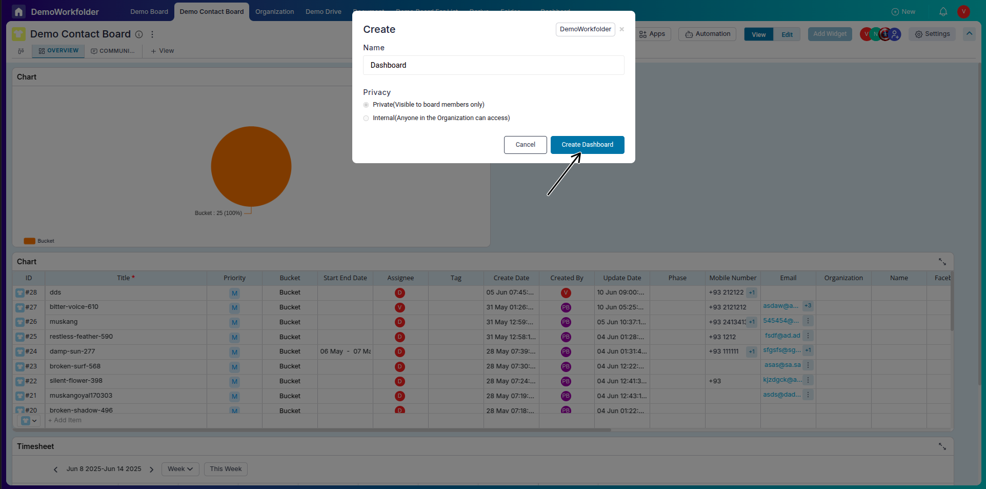
Step 2: Creating a Widget
-
Click on “+ Add Widget”:
In the Overview tab, click the + Add Widget button to begin creating a new chart or number widget.
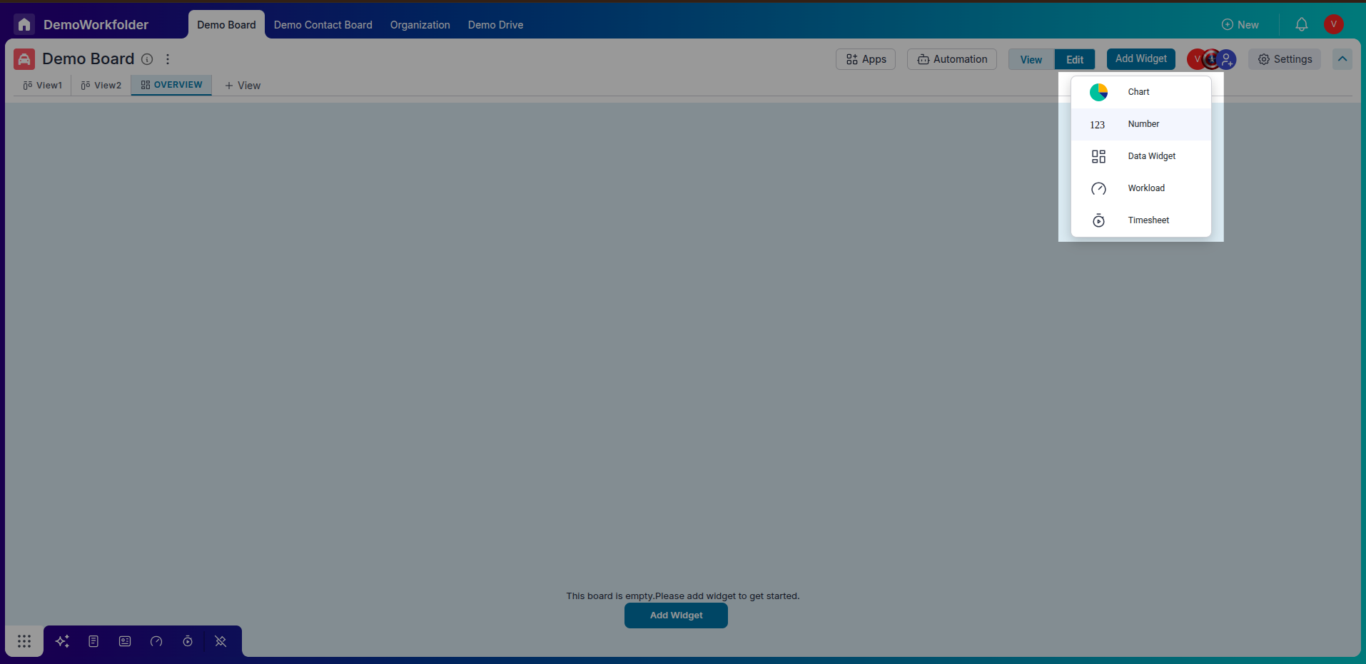
-
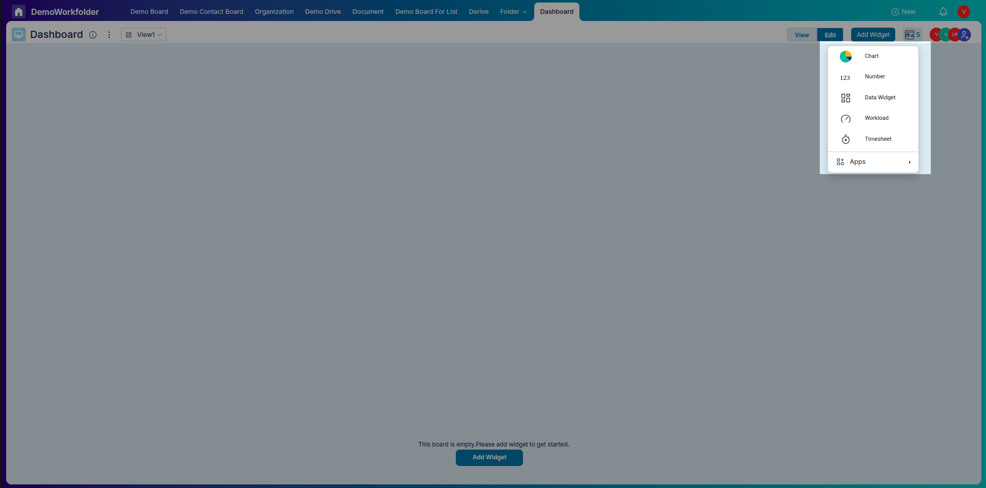
Select Widget Type:
Choose from options like Chart, Number, Data Widget,Workload, or Timesheet.
Step 3: Configuring Chart Widgets
-
Select Data Attributes:
For each chart, define the x-axis and y-axis based on the attributes you want to visualize.
-
Enable Stack By (Optional):
For stacked graphs, choose the attribute to stack by for grouped comparisons.
-
Multiple Y-Axis Support:
In Line and Bar charts, you can select multiple y-axes to compare different metrics side by side.
Step 4: Customizing Chart Display
-
Add Titles and Descriptions:
Name your chart and optionally describe what insights it provides.
-
Axis Labels and Sorting:
Add meaningful labels for the x and y axes. Choose to sort values in ascending or descending order.
-
Legend Positioning:
Display the chart legend horizontally or vertically based on visual preference.
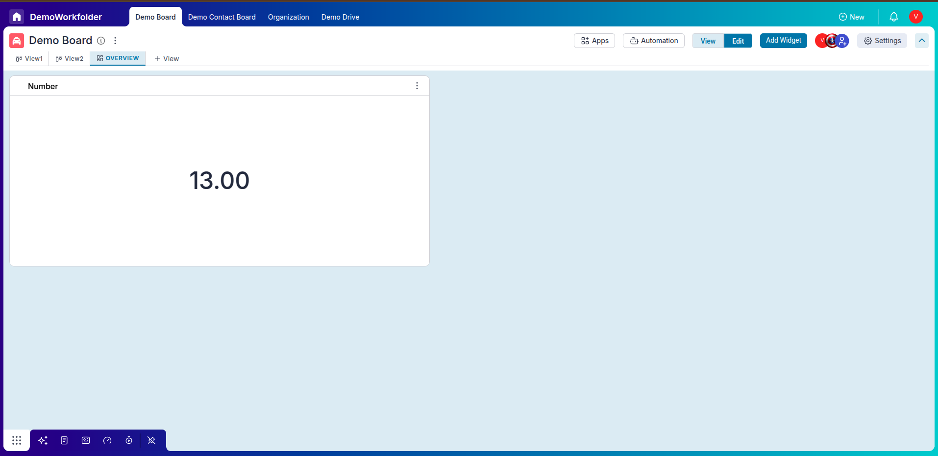
Step 5: Number Widgets with Live Data
-
Choose Attribute to Calculate:
Pick any attribute (e.g., Task Count, Total Hours, Revenue) and apply arithmetic operations like sum or average.
-
Real-Time Updates:
These widgets display live values, making it easier to track KPIs without digging into raw data.
Step 6: Editing and Removing Widgets
-
Edit Existing Widgets:
Click the edit icon on any widget to modify its settings, axes, chart type, or data source.
-
Delete Unused Widgets:
Remove widgets that are no longer needed using the delete (trash) icon.
Step 7: Benefits of Overview
-
All Insights in One Tab:
Get a bird’s-eye view of your process performance in a single dashboard.
-
Custom Widgets:
Design charts that match your business metrics—no fixed format or constraints.
-
Better Decision-Making:
Track trends over time, compare data, and spot bottlenecks or opportunities quickly.
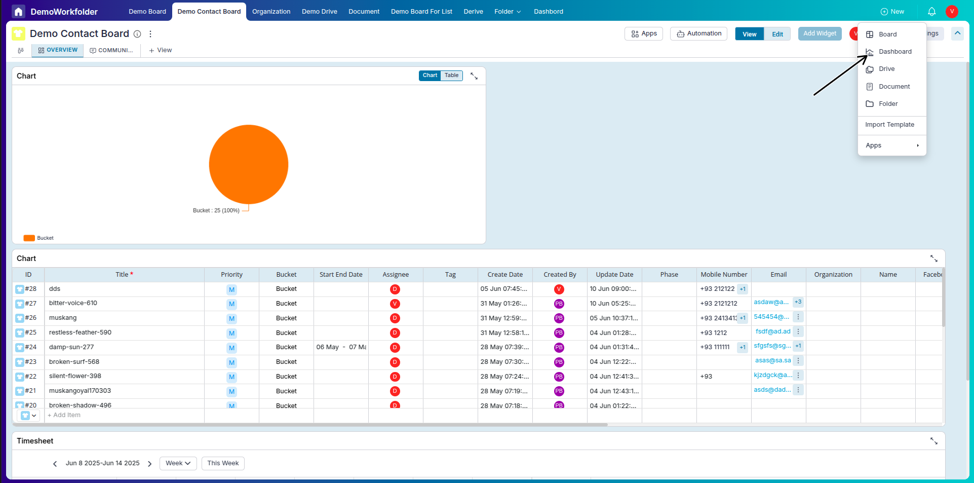
Understanding the Dashboard in Pronnel
The Dashboard in Pronnel serves as a unified space to monitor performance metrics across multiple boards within the same Workfolder. Unlike the Overview tab, which is specific to one board and the connected boards, the Dashboard gives a bird's-eye view of all your processes—making it ideal for managers and admins handling multiple workflows.
-
Accessing the Dashboard:
You can create the Dashboard from the main navigation bar on the top-left side of your screen. Select the Workfolder for which you want a consolidated view.
-
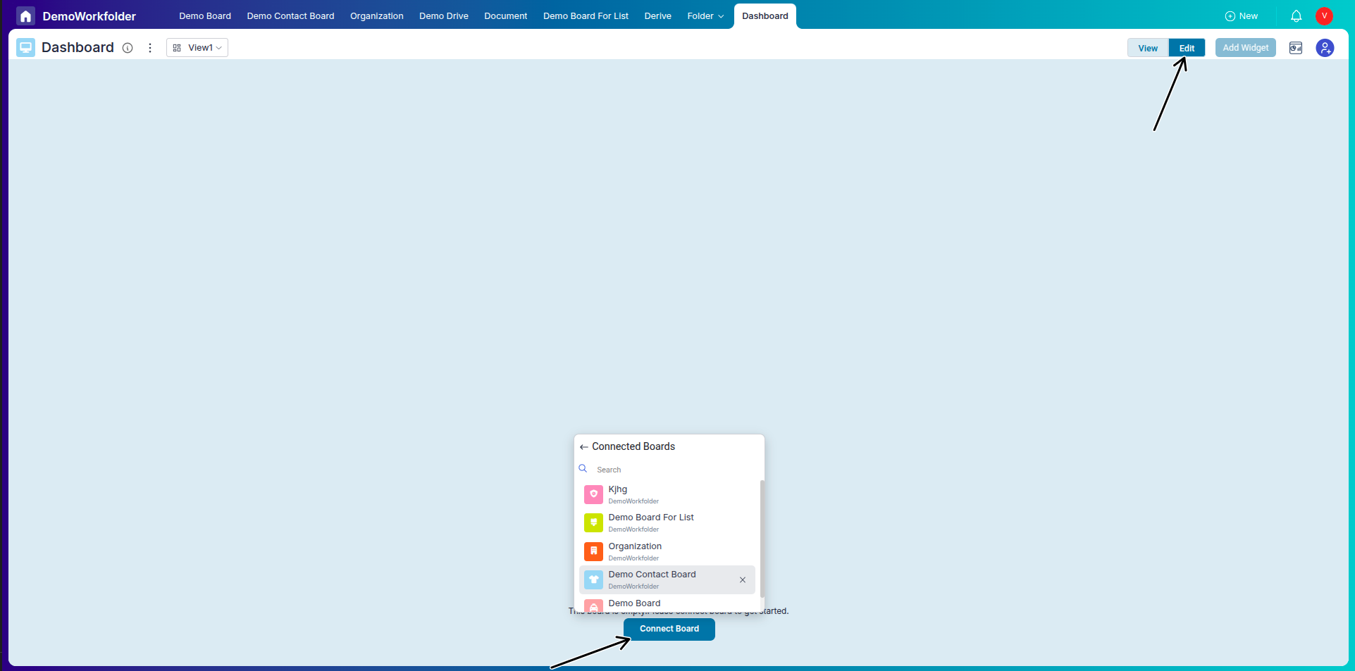
Connecting Boards:
To start using the Dashboard, you must connect one or more boards from the same Workfolder. Once connected, their data becomes available for widgets.
-
Widget Variety:
The Dashboard and overview supports all widget types: Charts, Number Widgets, Data Widgets, Workload, and Timesheet. These help you track KPIs, effort distribution, or status breakdowns across workflows.
-
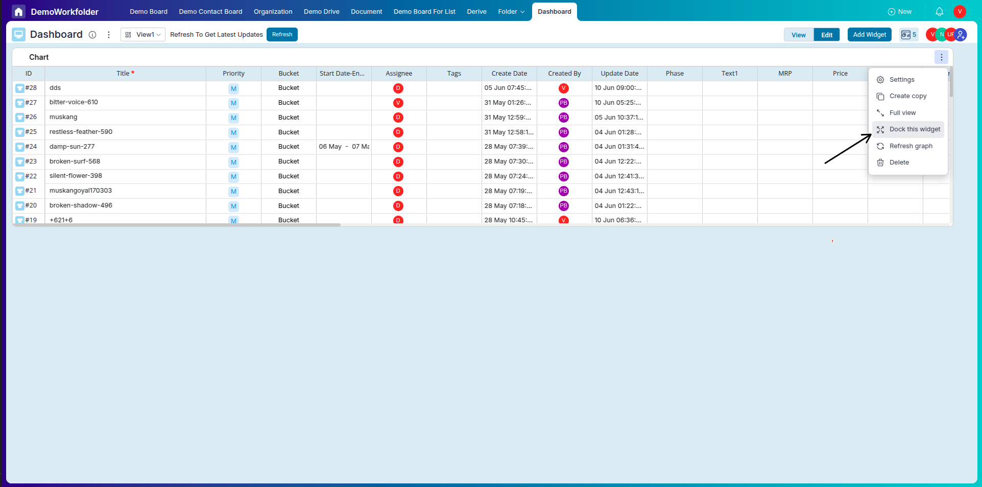
Docking in Data Widgets:
You can dock a Data Widget to access item-level views like the column layout or item form. Docking is allowed only when a single Data Widget is present. If you add another widget, docking is disabled automatically.
-
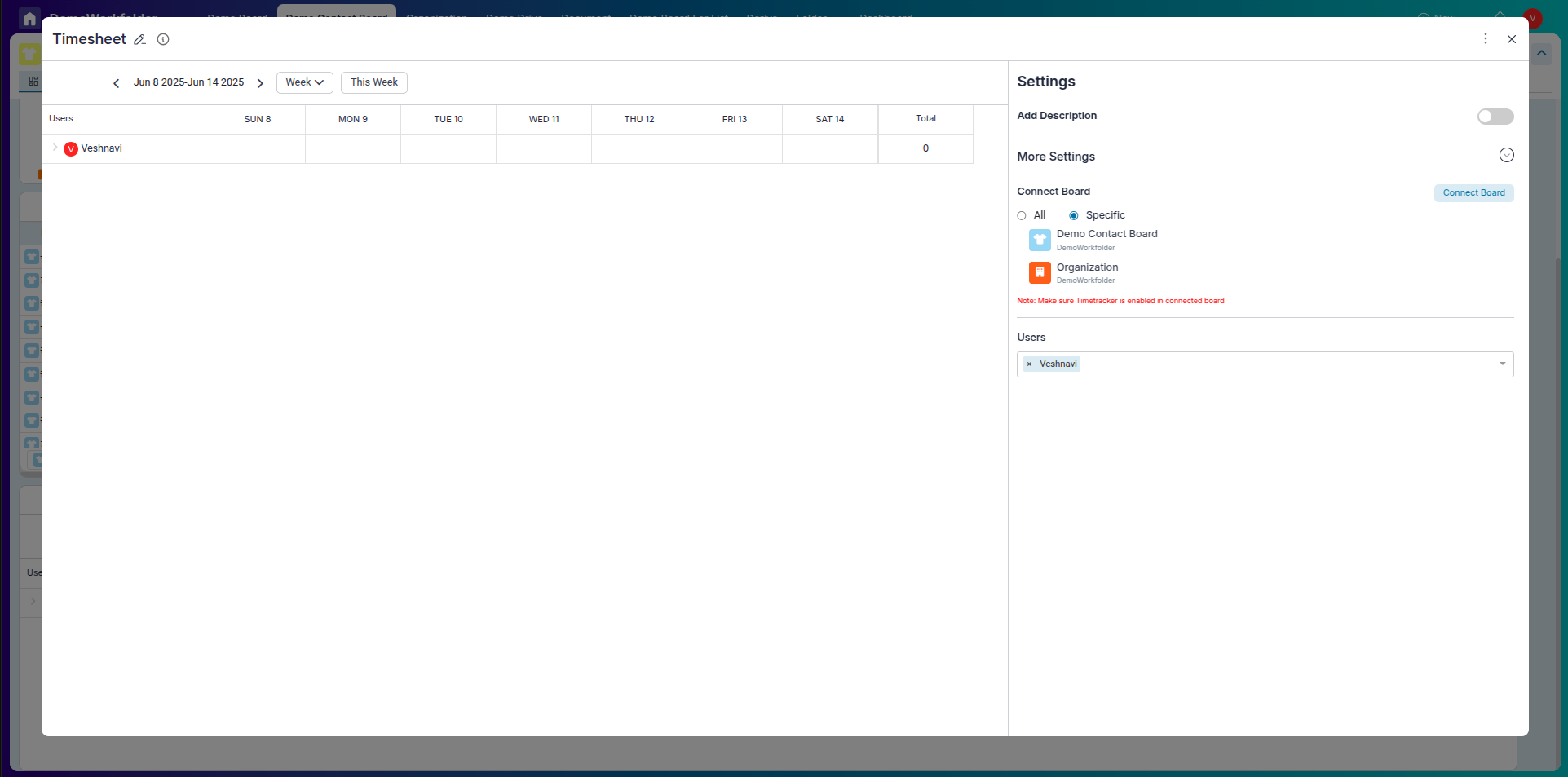
Using Workload and Timesheet Widgets:
After connecting boards, you can add Workload and Timesheet widgets to analyze how team effort is distributed or time is being spent across processes.
-
Customization and Real-Time Data:
Widgets on the Dashboard are fully customizable and reflect real-time data. You can drag to reposition them and use filters for specific views (e.g., by Assignee, Status, Date Range).
Overview and Dashboard in Pronnel
-
Board Scope:
Overview is specific to a single board—it only visualizes data from that board and its connected board (if any). In contrast, the Dashboard is a centralized view where you can connect multiple boards from the same Workfolder.
-
Widget Variety:
Both Overview and Dashboard support various widget types—Chart, Number, Data Widgets, Workload, and Timesheet. However, in Dashboard, these widgets pull data from multiple connected boards.
-
Adding Workload and Timesheet:
In Dashboard, you can add Workload and Timesheet widgets only after connecting the relevant boards. These widgets help visualize team effort and time tracking across processes.
-
Board Connection Requirement:
Overview doesn’t require you to manually connect other boards—it uses data from the current board and its connected boards. Dashboard requires users to manually connect all boards they want to analyze.
-
Use Case Difference:
Use Overview for quick board-specific insights and Dashboard when you need a consolidated view across multiple boards in a workfolder.
-
View Modes:
Both Overview and Dashboard offer View and Edit modes. You must switch to Edit mode to make changes to widgets.
-
Performance Insights:
Both views help visualize process performance, but Dashboard gives more cross-board intelligence while Overview keeps it streamlined and focused per board.
-
Accessibility:
Overview is accessed via a tab in each board. Dashboard is accessed from the Board lists and serves as a workspace-level analytics hub.
Frequently Asked Questions About Overview Tab in Pronnel
Can I add more than one Overview tab?
Yes. Each board can have multiple Overview tabs with multiple widgets.
Who can create or edit widgets?
Admins, Editors, and users with restricted edit access can create and modify widgets.
Can I download chart data?
Yes. Chart data can be downloaded.
What chart types are available?
Line, Pie (donut), Bar, Stacked Bar, and Number widgets.
Can I view multiple Y axes?
Yes. Line and Bar charts support multiple Y-axis values.
What does “Stack By” do?
Groups Y-axis values by an attribute (e.g., team or status) to show parts of a whole.
Is Overview real-time?
Yes. Widgets reflect live data.
Can I rearrange widgets?
Yes. Drag widgets to reposition them on the canvas.
Is there a limit to widgets?
No hard limit. Add as many as needed.
Can I apply filters to widgets?
Yes. Filter by assignee, status, date range, and more during configuration.