Using Comparative & Breakdown Charts in Pronnel
Want to visually compare data across categories or stages? Pronnel’s Donut/Pie, Bar, and Funnel Charts are designed to help teams identify trends, breakdowns, and performance metrics. In this tutorial, we’ll walk you through how to create and customize these charts within your Dashboards or Overview Views.
Getting Started
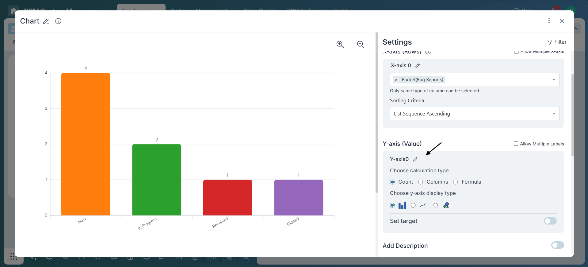
To add a chart, go to your Dashboard or Overview View and click on the Add Widget button. From the options, choose Chart. You can then select a chart type that fits your reporting needs. When working with bug reports, charts help visualize key metrics like assignee workload, priority distribution, and progress through resolution stages.
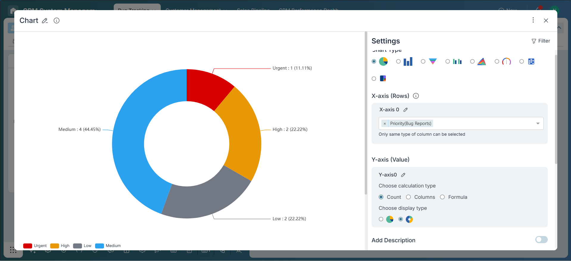
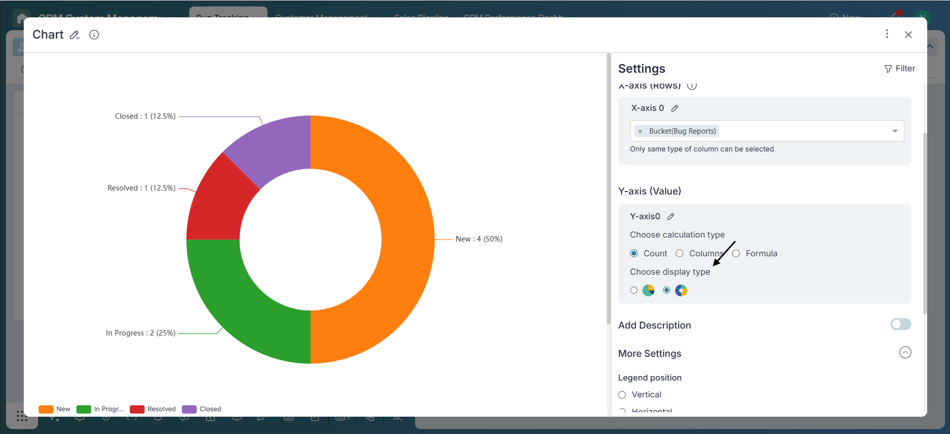
Pie/Donut Chart: This chart is useful for viewing the distribution of bugs based on a single attribute, such as priority. For example, you can create a Pie Chart to quickly understand how many bugs are categorized as High, Medium, or Low priority. This gives your team immediate insight into where the most critical issues are concentrated.
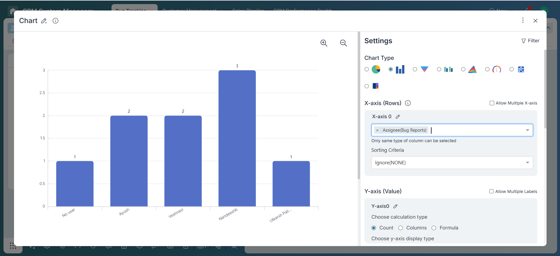
Bar Chart: Bar Charts are perfect for comparing bug volumes across assignees or buckets. You can use this chart to see how many bugs each team member is handling, or how bugs are distributed across different modules or product areas (buckets). This helps in balancing workload and identifying modules that may need extra attention.
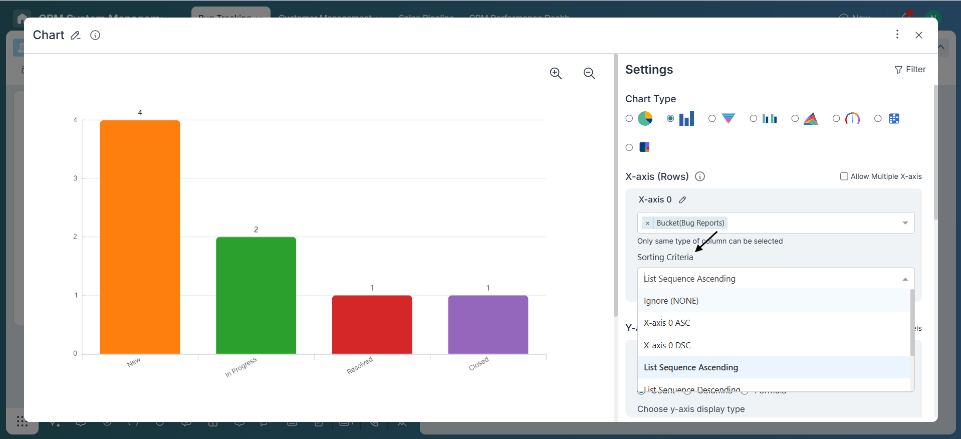
Funnel Chart: Funnel Charts are excellent for tracking the resolution progress of bugs through different stages. In a typical workflow, bugs move through buckets like New, In Progress, Resolved, and Closed. This chart helps visualize how many bugs are in each stage and where they may be getting stuck, allowing teams to improve their triage and resolution process.
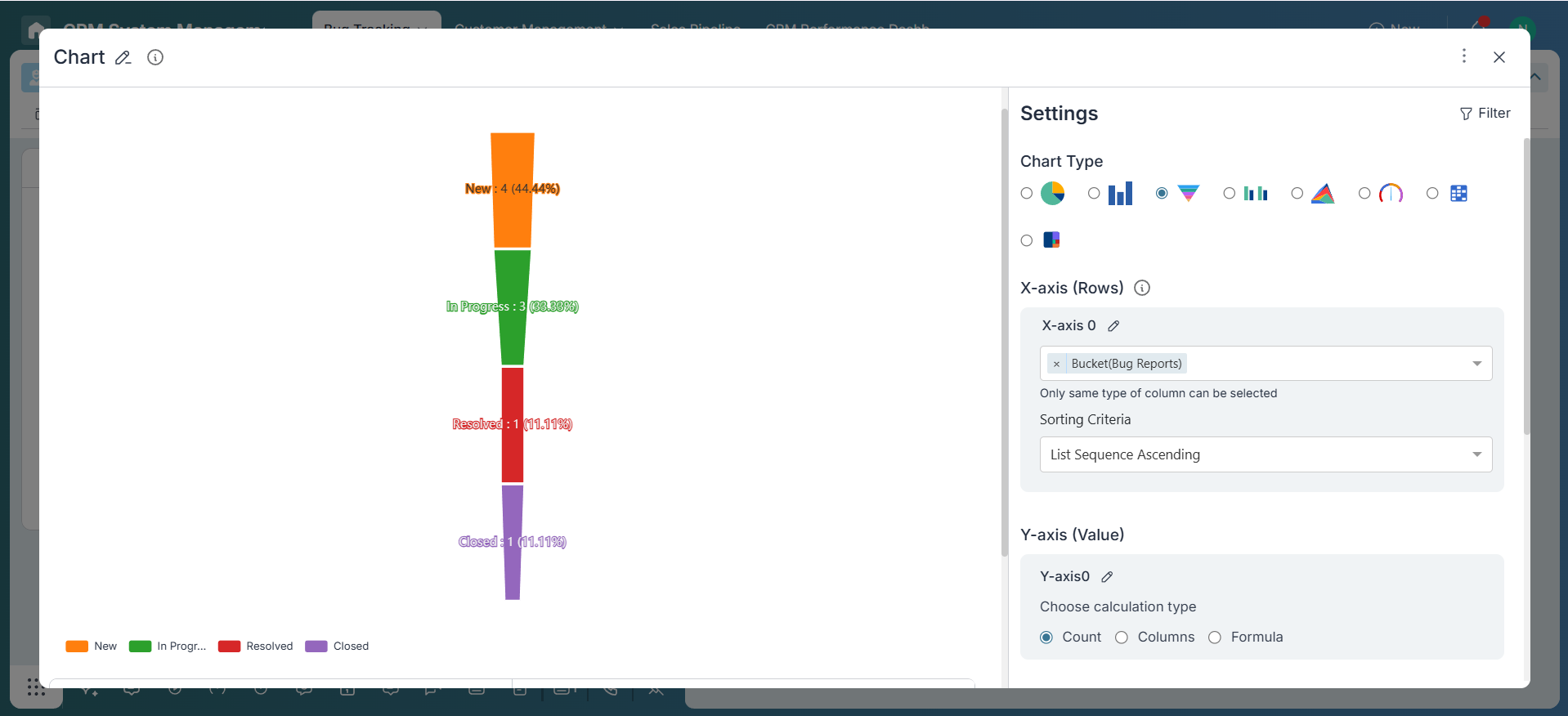
Chart Configuration
Let’s use a sample case: Bug Reports. You want to know how bugs are distributed among team members.
-
X-Axis Configuration
Pie/Donut Charts: These charts allow grouping by a single category field, but do not support any kind of sorting.
Bar Charts: These support one or more fields of the same type—such as Created By, Assignee, or Collaborator (all Name-type fields). You can sort Bar Charts using different criteria. Sorting by X-Axis lets you arrange data labels in ascending or descending order. Sorting by Y-Axis arranges the bars based on values like the count of items or the sum of a specific field. Lastly, List Sequence sorting organizes data based on the custom sequence defined in dropdown or status-type fields.
Funnel Charts: These are designed to represent a process or flow with defined stages. They display items in a specific order, making them ideal for tracking progress through structured steps like sales pipelines, hiring flows, or support ticket resolutions.
-
Y-Axis Value
Decide how the data should be measured. You can start with the default option, Count, which simply counts the number of items in each category. If you need more specific insights, use Field-Based Metrics to apply functions like SUM or AVG on numerical fields. For even more advanced analysis, choose Formula to apply custom calculations.
Bar Charts Only: You also have the flexibility to add multiple Y-axis metrics, allowing you to compare different data points side by side in a single chart.
-
Display Type
Bar Charts: Choose how you want your data to be visualized. Options include Bar for standard bar representations, Line for trend visualization, or Scatter for identifying patterns and distributions.
Pie/Donut Charts: Select between Pie or Donut display styles. While both show proportional data, Donut Charts provide a central space which can be useful for emphasizing totals or context labels.
-
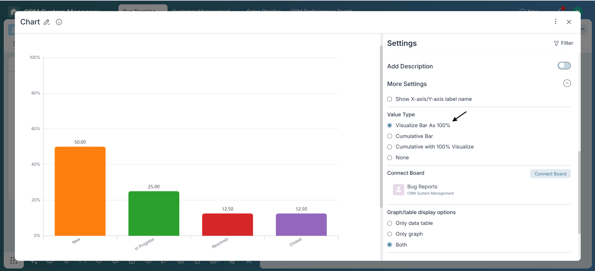
Value Type (Bar Chart Only)
Control how bar values appear:
- None: Show raw numbers.
- Visualize Bar as 100%: Normalize all bars to 100% length.
- Cumulative Bar: Show running totals.
- Cumulative with 100% Visualize: Combine cumulative and normalized view.
-
Description (Optional)
Use the description field to explain the chart context, e.g., “Tracking open bugs across assignees for this sprint.”
-
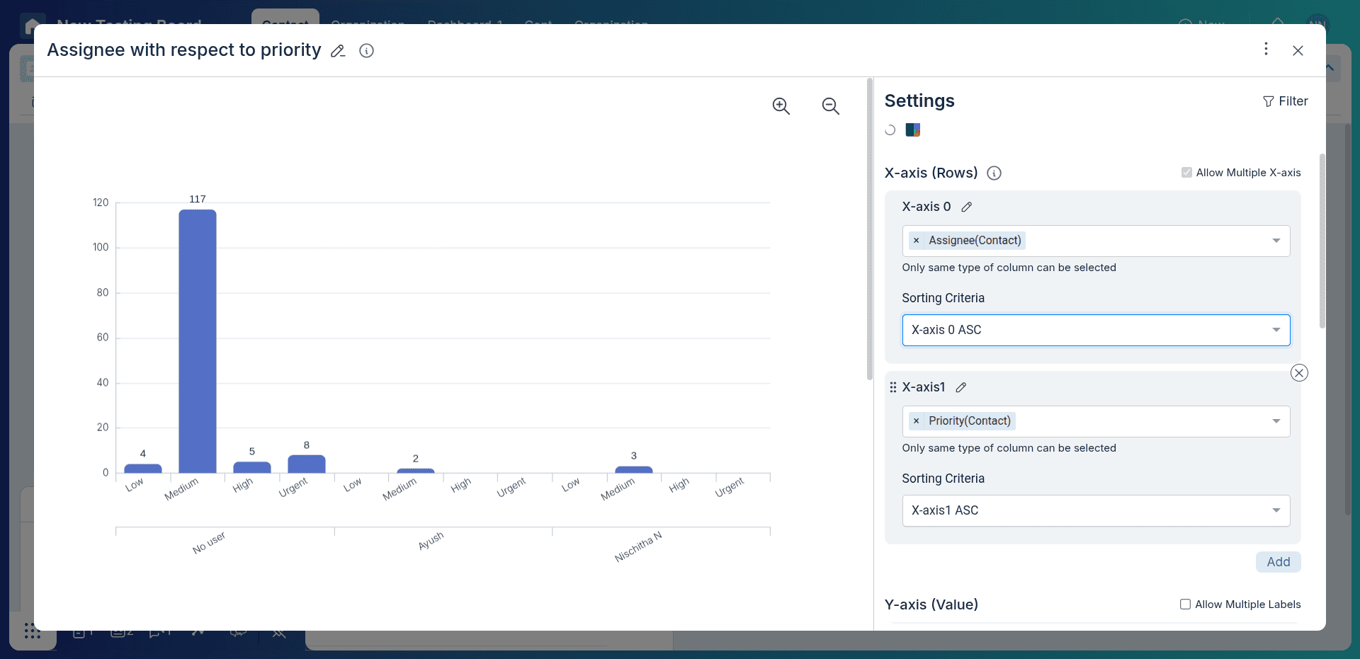
Multiple x-axis/Y-axis/Stack By
Multiple x-axis/Y-axis/Stack By allows you to group data by multiple fields.For example, you can group data by both assignee and priority, which will help you see how many bugs are assigned to each priority level for each assignee.
Multiple x-axis/Stack By: These support one or more fields of the same type—such as Created By, Assignee, or Collaborator (all Name-type fields). You can sort Bar Charts using different criteria. Sorting by X-Axis lets you arrange data labels in ascending or descending order. Sorting by Y-Axis arranges the bars based on values like the count of items or the sum of a specific field. Lastly, List Sequence sorting organizes data based on the custom sequence defined in dropdown or status-type fields.
Multiple Y-axis: These support one or more fields of the same type—such as numeric fields (e.g., numeric-type fields). You can sort Bar Charts using different criteria. Sorting by X-Axis lets you arrange data labels in ascending or descending order. Sorting by Y-Axis arranges the bars based on values like the count of items or the sum of a specific field. Lastly, List Sequence sorting organizes data based on the custom sequence defined in dropdown or status-type fields.
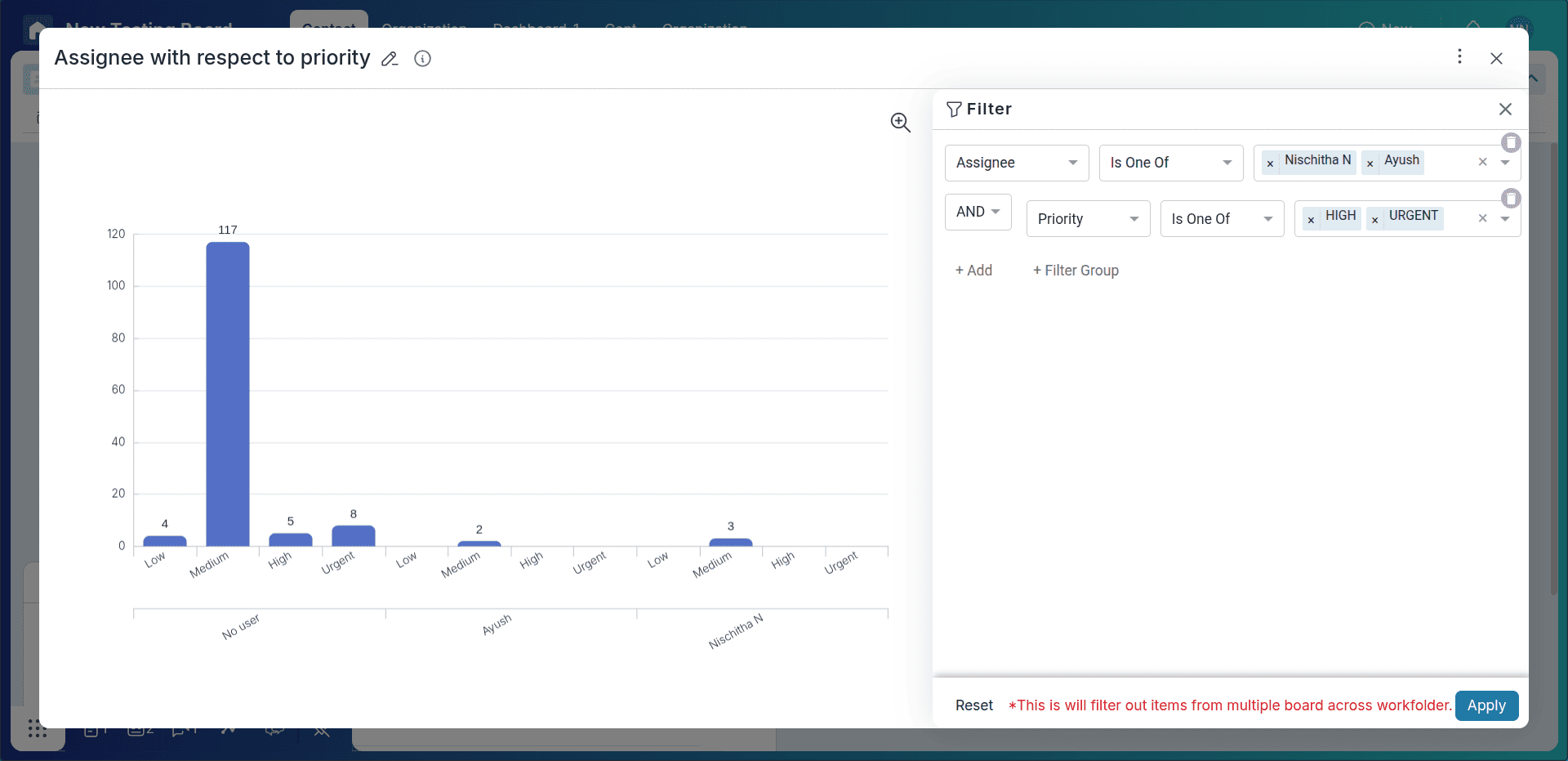
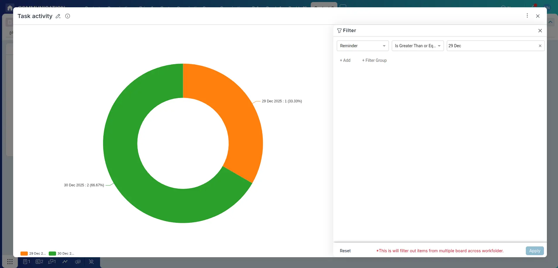
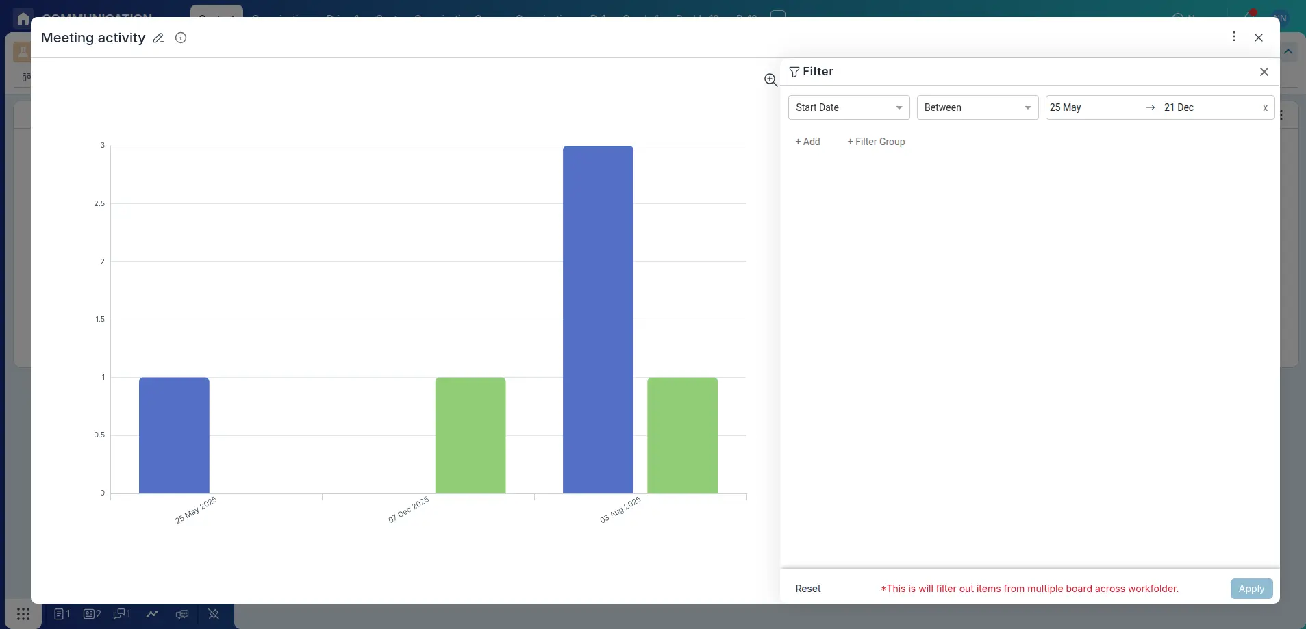
Applying Filters
Use the Filter button in the chart widget’s top-right corner to narrow your data—filter by assignee, status, date range, or custom fields.If you want to apply multiple filters, you can use the AND or OR operator to combine them.Pronnel also supports each axis filter
View Call Activity
View the call activity such as call duration,call summary ,number of call connected/disconnected calls,etc.
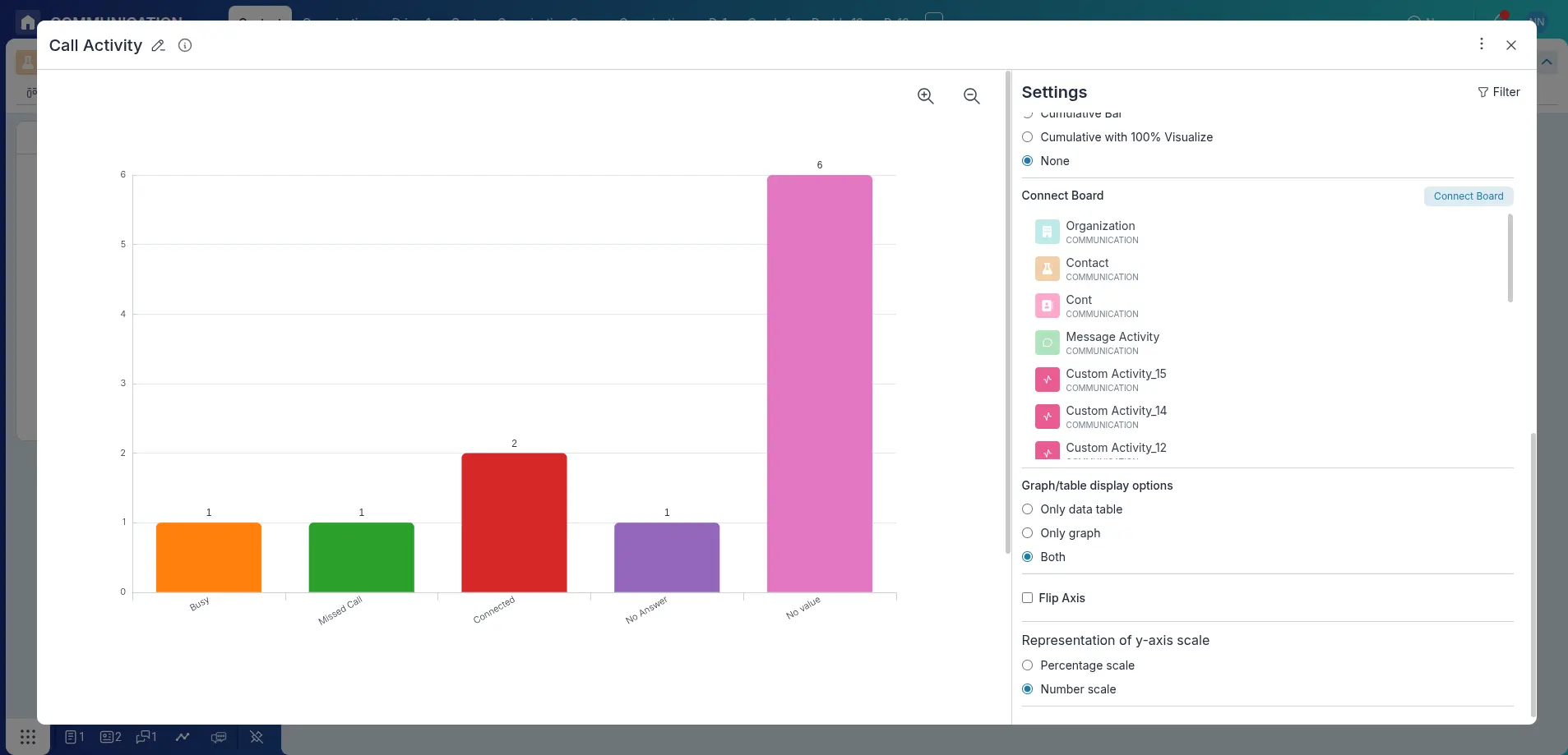
- Connect call activity to a chart by clicking on the Connect Board button in the chart widget’s top-right corner.
-
Once connected, all Call Activity fields will be available for chart creation.
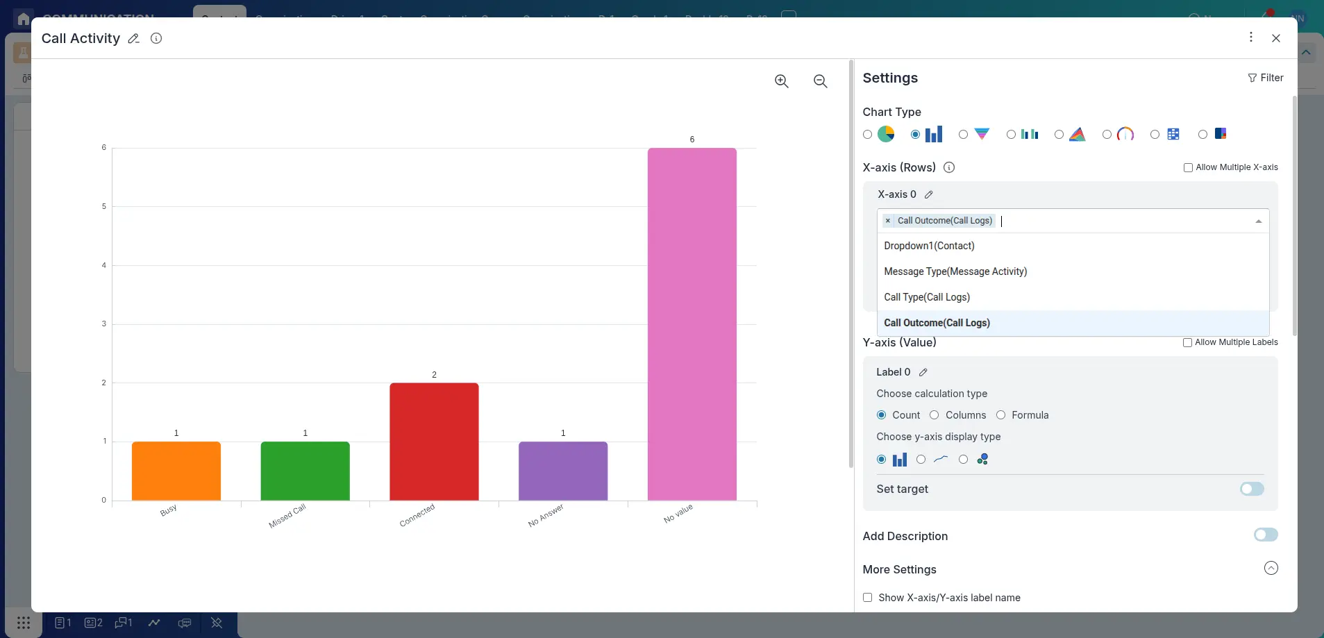
- X-axis: Select call-related dimensions such as call duration, call summary, call type, or call outcome etc.
- Y-axis: Choose how the data should be measured—by count, a numeric column, or a custom formula.
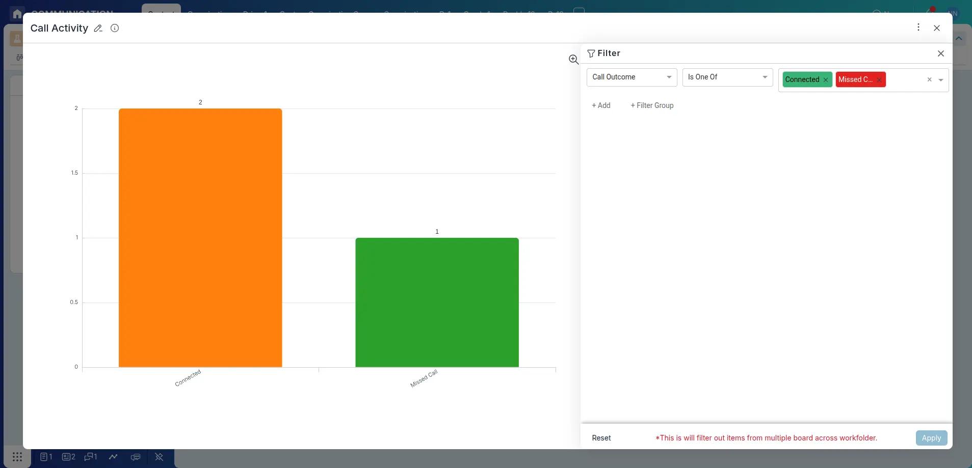
- Call Outcome: Indicates the result of the call, such as Connected, Busy, Missed Call, Voicemail, or Failed. Useful for analyzing call success rates.
- Call Type: Specifies whether the call is Incoming or Outgoing, helping you track agent activity and call direction trends.
- Date: Displays the date on which the call was logged, enabling time-based analysis and reporting.
- Pulse: Represents the call pulse or interval data, useful for understanding call frequency and activity patterns.
- Call Duration: Shows the total length of the call, allowing insights into average call handling time and agent performance.
- Agent: Shows the Agent who has handled the call
- Once the columns are connected, you will see the call activity in the chart.If you want to see the call activity in a different way, you can change the chart type to a different type.
- Apply filters to the chart to see the call activity for a specific time period, assignee, status, etc. by clicking on the Filter button in the chart widget’s top-right corner.
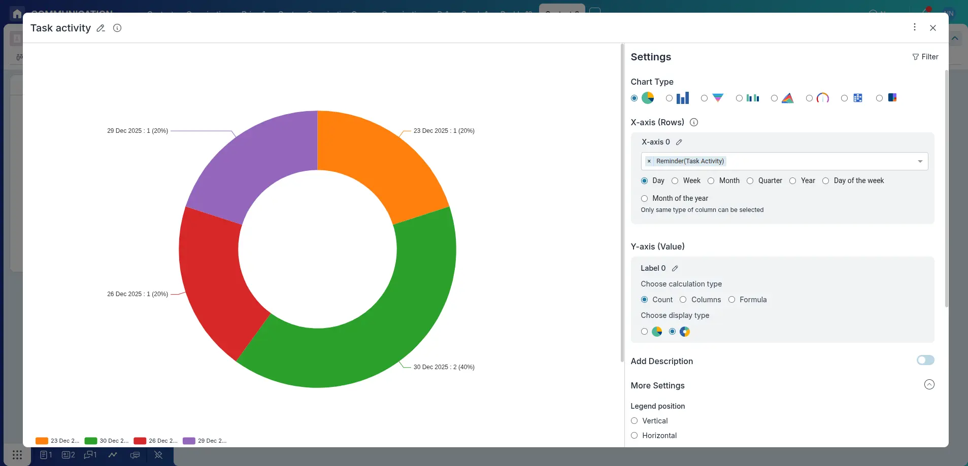
View Task Activity
View the task activity such as created,updated,reminder etc
- Connect call activity to a chart by clicking on the Connect Board button in the chart widget’s top-right corner.
-
Once connected, all Task Activity fields will be available for chart creation.
- X-axis: Select task-related dimensions to view in the chart.
- Y-axis: Choose how the data should be measured—by count, a numeric column, or a custom formula.
- Reminder: Specifies when the reminder for the task has scheduled.
- Created Date: Specifies when the task activity has been created.
- Once the columns are connected, you will see the task activity in the chart.If you want to see the task activity in a different way, you can change the chart type to a different type.
- Apply filters to the chart to see the task activity for a specific time period, assignee, status, etc. by clicking on the Filter button in the chart widget’s top-right corner.
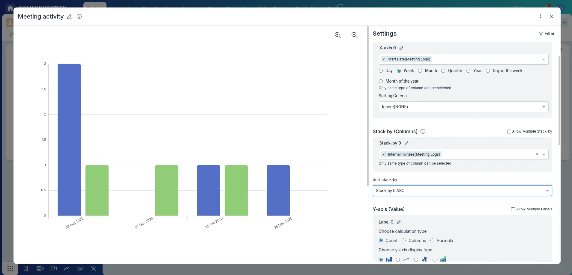
View Meeting Activity
View the Meeting related activity
- Connect Meeting activity to a chart by clicking on the Connect Board button in the chart widget’s top-right corner.
-
Once connected, all Meeting Activity fields will be available for chart creation.
- X-axis: Select task-related dimensions to view in the chart.
- Y-axis: Choose how the data should be measured—by count, a numeric column, or a custom formula.
- Once the columns are connected, you will see the meeting activity in the chart.If you want to see the meeting activity in a different way, you can change the chart type to a different type.
- Apply filters to the chart to see the meeting activity for a specific time period, assignee, status, etc. by clicking on the Filter button in the chart widget’s top-right corner.
View Message Activity
View the Message related activity
- Connect Message activity to a chart by clicking on the Connect Board button in the chart widget’s top-right corner.
-
Once connected, all Message Activity fields will be available for chart creation.
- X-axis: Select task-related dimensions to view in the chart.
- Y-axis: Choose how the data should be measured—by count, a numeric column, or a custom formula.
- Once the columns are connected, you will see the message activity in the chart.If you want to see the message activity in a different way, you can change the chart type to a different type.
- Apply filters to the chart to see the message activity for a specific time period, assignee, status or type etc. by clicking on the Filter button in the chart widget’s top-right corner.
Conclusion
Great job! You've successfully created a chart in Pronnel that brings your data to life. Whether you're tracking bugs, monitoring sales, or analyzing task distribution, these visual tools empower you to uncover insights faster and make smarter decisions. Keep exploring chart options to turn your data into meaningful stories and drive impactful outcomes!
Frequently Asked Questions About Comparative & Breakdown Charts in Pronnel
When should I use Pie or Donut Charts?
Use them to show how a whole breaks into parts (e.g., bug counts by priority or task distribution by status) for quick percentage-based insights.
What’s the best use case for a Funnel Chart?
Visualizing stage progression (e.g., New → In Progress → Resolved → Closed) or sales pipeline conversions.
Can I change chart types later?
Yes. Edit the widget and switch between Pie, Bar, or Funnel depending on the insight needed.
Can I export these charts?
Direct export may be limited; screenshots or full dashboard export are common workarounds.
Can I compare data from multiple boards?
Yes, after connecting boards to the dashboard. Add widgets per board to compare side by side.