Using Gauge Chart for Monitoring Metrics
Gauge Charts in Pronnel are excellent for visualizing single-metric KPIs. Whether you're tracking progress towards a target, workload completion, or bug resolution, Gauge Charts give you a clear visual snapshot. In this tutorial, we’ll walk you through how to create and configure Gauge Chart widgets in Pronnel Dashboards or Overview Views.
Set Up Your Gauge Chart
Navigate to the Dashboard or Overview View within your Pronnel workspace where you'd like to add the Gauge Chart. Once there, click the “Add Widget” button and select “Chart.” From the list of chart types, choose “Gauge Chart.”
Configuring the Gauge Chart Widget
-
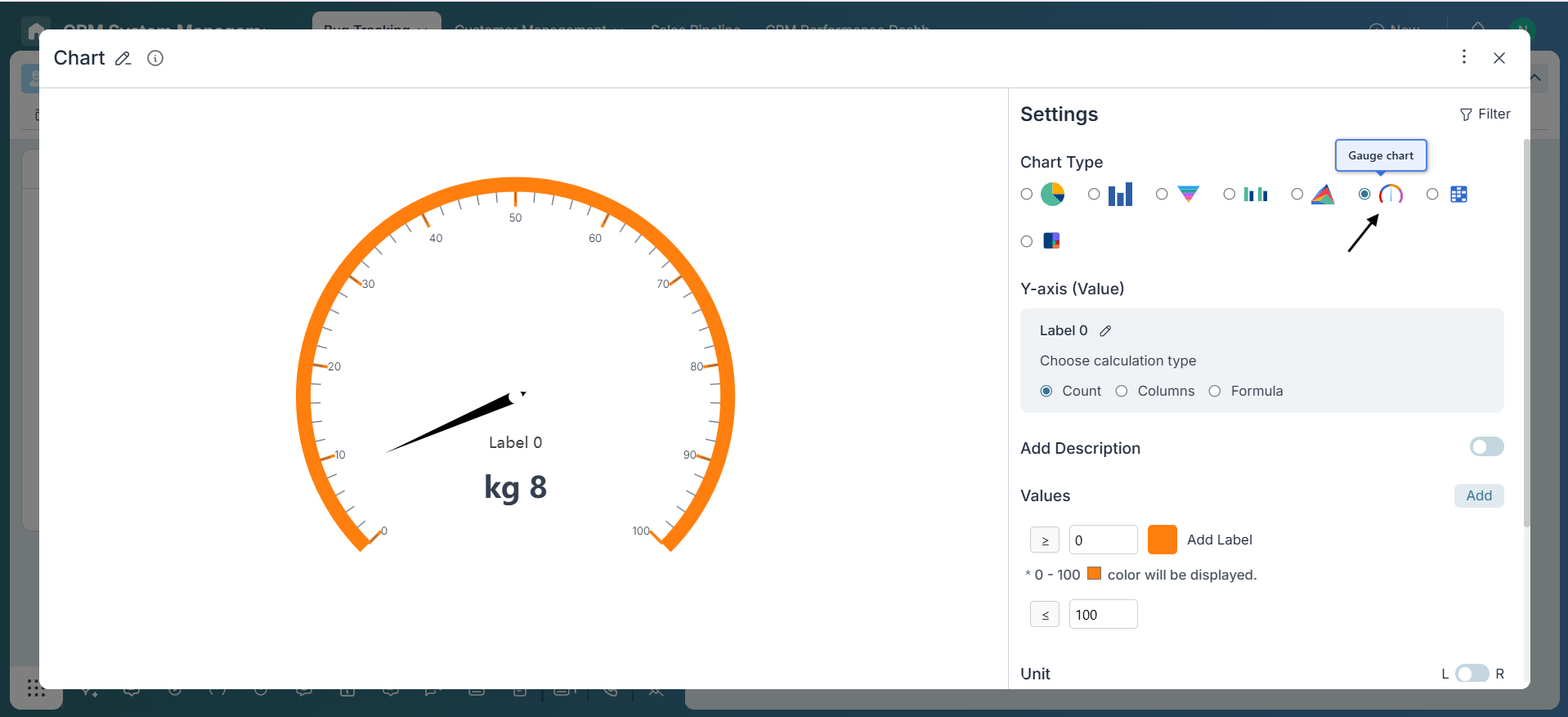
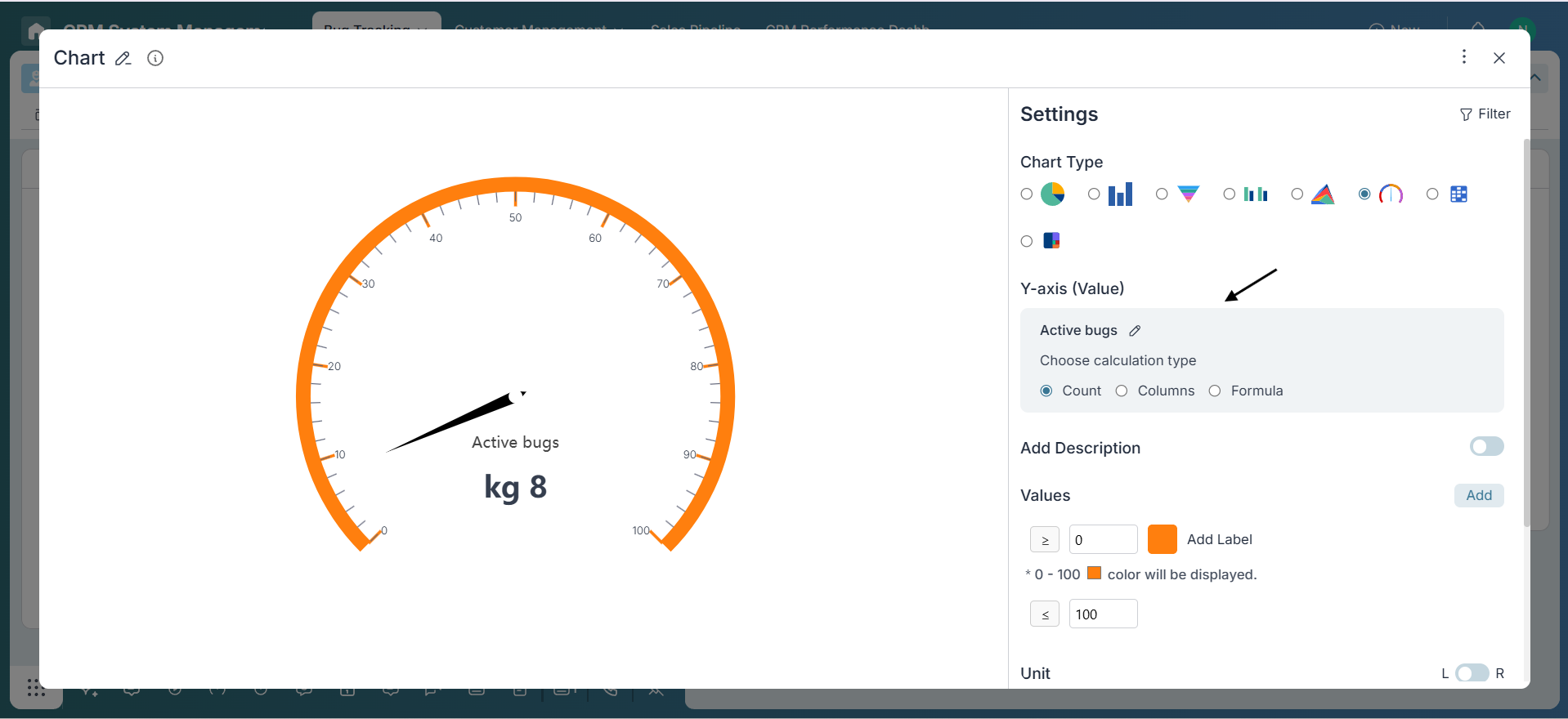
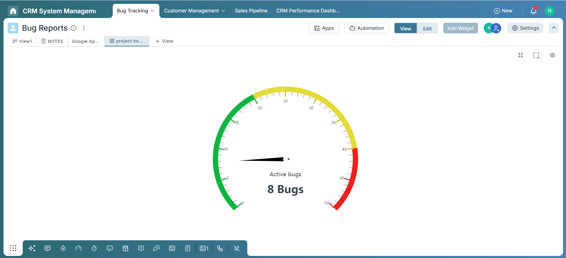
Label Configuration:
Choose a label that reflects what the chart is tracking, such as “Tasks Completed” , “Active Bugs” acoording to the need
-
Value Selection:
Select the Y-axis as Count to display the number of items present in the connected board. For the Columns option, choose a field that supports numeric values. After selecting the column, you can apply one of the available aggregation methods—such as Sum, Average, Median, Min, Max, or Count—to calculate and visualize the data. You can also use the Formula option to build custom expressions, perform operations like addition, and apply more advanced calculations.
-
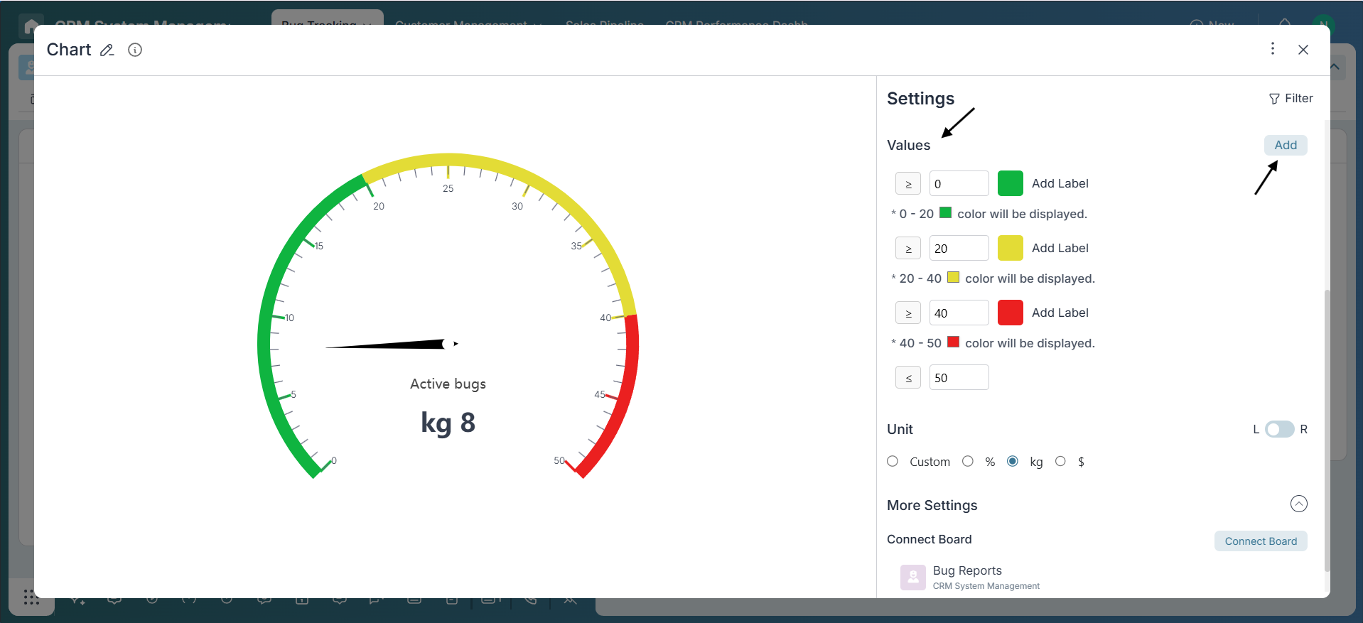
Configure Range and Thresholds:
Set the minimum and maximum values to define the scale of your gauge chart. To add more performance ranges, click the “Add” button. Then, assign colors to each range—use green for optimal, yellow for warning, and red for critical zones. This setup provides a clear visual indicator of performance at a glance.
-
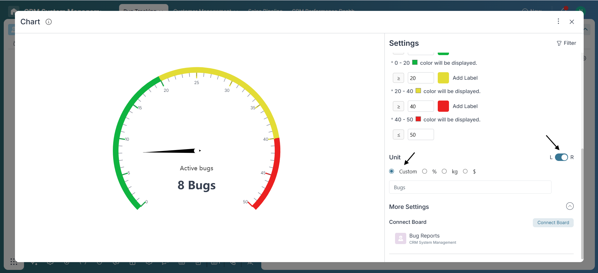
Add Unit:
Select a unit from the available options. If the desired unit isn’t listed, enable the Custom radio button to enter your own. Use the toggle to position the unit: switch left to display it before the number, or right to place it after the number.
-
Adding Description:
Enable the description option and add a brief note to explain the purpose of the metric. This helps team members—especially those unfamiliar with the context—quickly understand what the chart represents.
Apply Filters (Optional)
If needed, use the Filter option located at the top-right corner of the widget to narrow down the dataset. You can filter data by criteria such as team, status, or time range to make the Gauge Chart more relevant and focused.
Final Review
Review the Gauge Chart settings and data visualization to ensure the displayed value is accurate and the color-coded zones are easy to interpret at a glance. Enable Edit Mode in the Overview view, click the three-dot menu on the chart widget, and select “Dock this widget”. This pins the chart, providing a clear view of project health for all team members.
Conclusion:
Well done! You've successfully built a Gauge Chart in Pronnel. Gauge Charts are a powerful way to monitor key metrics at a glance—perfect for tracking KPIs, bug counts, or performance indicators. By leveraging thresholds, dynamic data, and filtering options, you’ve created a clear, real-time visual that brings valuable insight to your workspace. Keep exploring to unlock even more ways to visualize your data effectively!
Frequently Asked Questions About Gauge Chart in Pronnel
What data works best with Gauge Charts?
Single metrics like completion %, target achievement, sales totals, or SLA compliance.
Can I use formulas in Gauge widgets?
Yes. Use Sum, Average, Median, Min, Max, Count, or Formula expressions.
How do I customize color zones?
Define threshold ranges and assign colors (e.g., green/yellow/red) for clarity.
Are descriptions visible to all?
Yes. A description under the chart is visible to viewers with access.
Do Gauge Charts update in real time?
They reflect updates as the underlying data or formula changes.
Can I export a Gauge Chart?
Direct export isn’t available; export the dashboard or take a screenshot.
Can a Gauge show multiple values?
No. It shows one metric. Use Bar/Line charts for comparisons.
How many Gauge Charts per dashboard?
No hard limit. Add as many as needed for your KPIs.