Creating Pie Charts in Pronnel: A Step-by-Step Guide
Pronnel offers powerful tools for visualizing data through Dashboards and Overview Views. Among the array of widgets available, the Pie Chart Widget stands out for its ability to provide a clear representation of data distribution. Whether you're visualizing workload division, task status, or team performance, Pie Charts can help you make sense of the data. In this tutorial, we'll guide you through creating and customizing these charts to effectively showcase your data in Pronnel.
Step 1: Setting Up the Dashboard
To begin, navigate to your Pronnel workspace and access the Overview where you'd like to create the Pie Chart. Alternatively, you can create widgets directly within a Dashboard as well.
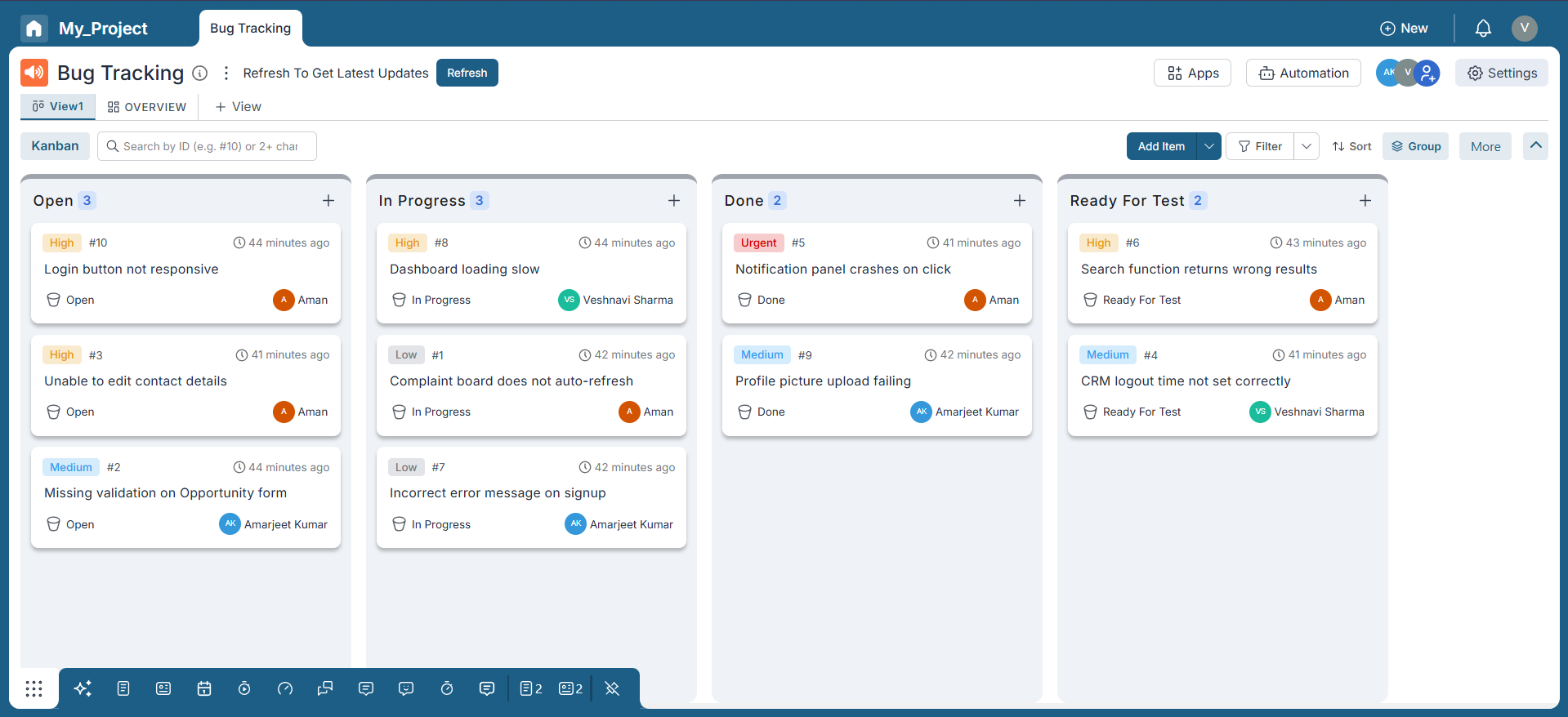
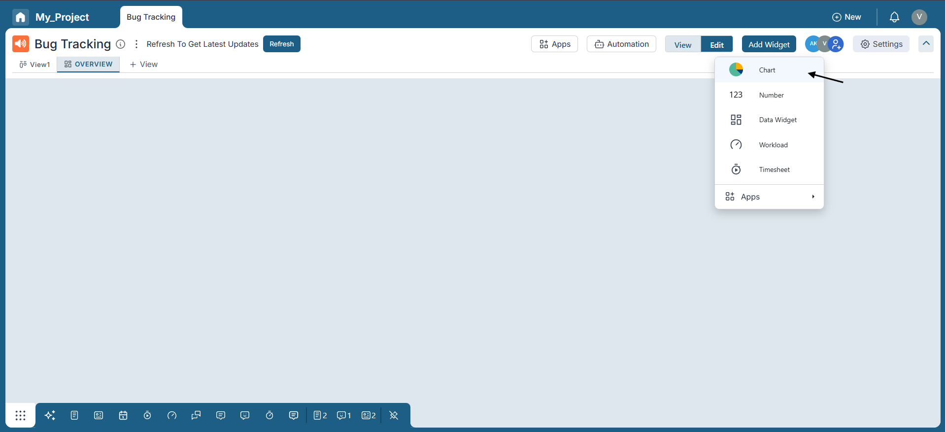
Step 2: Create a New Pie Chart Widget
Click on the top right corner to add a new widget. Select "Chart" and choose "Pie Chart" from the Chart Type options.
Step 3: Configuring the Pie Chart Widget
-
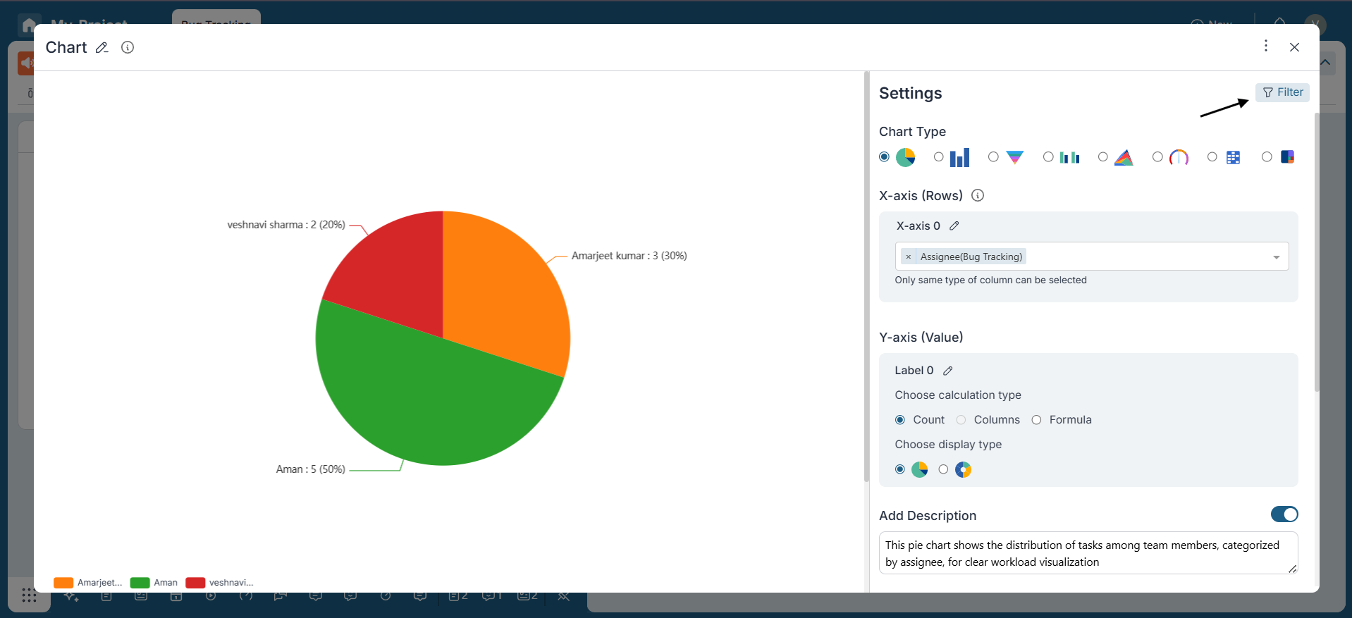
X-Axis Selection:
The X-axis represents the criteria for dividing the data. In this example, we have selected "Assignee" for the X-axis to organize the data accordingly.
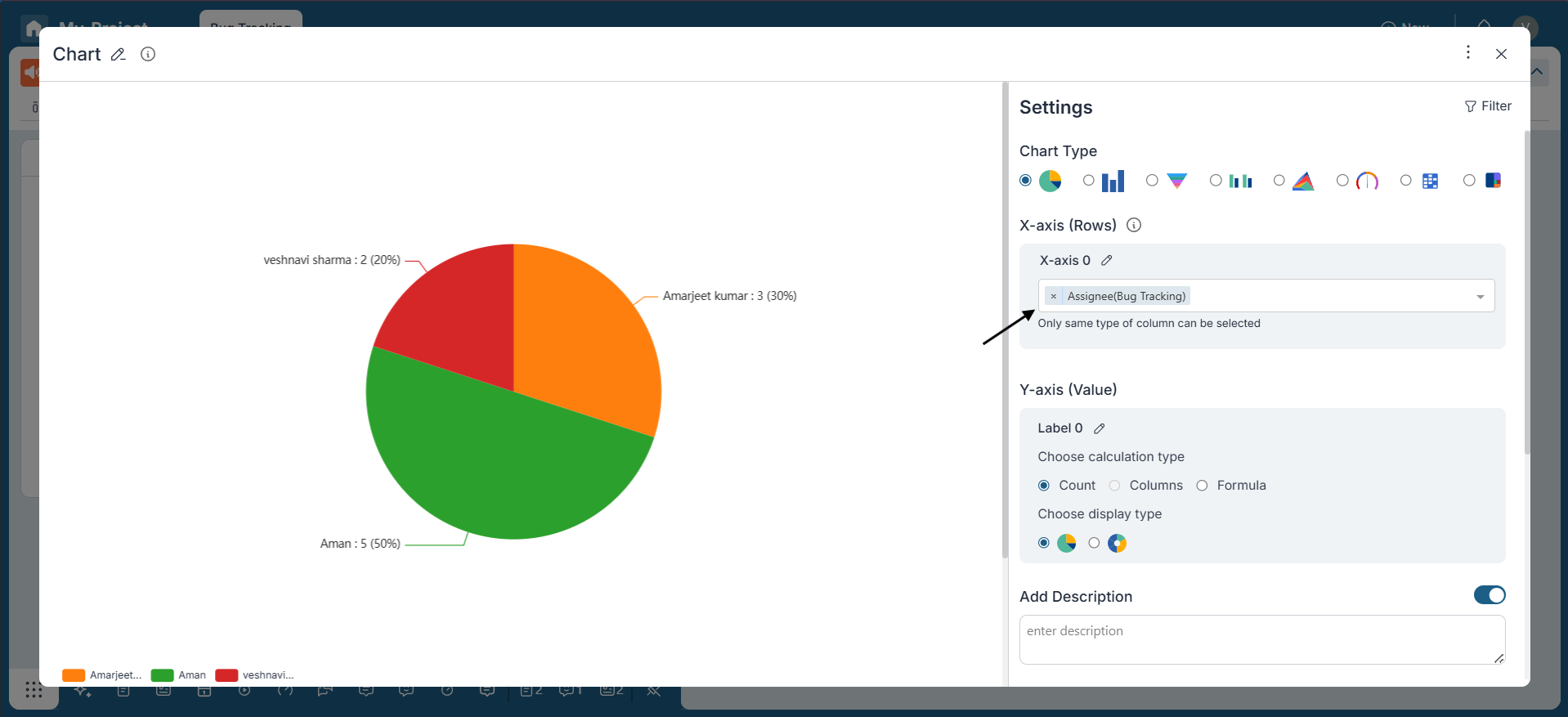
-
Y-Axis Selection:
Select the numerical data that you want to represent in the pie slices. This could be a count of items or any other relevant numerical value. In this case, counting the number of items is a suitable option for visualizing the data.
-
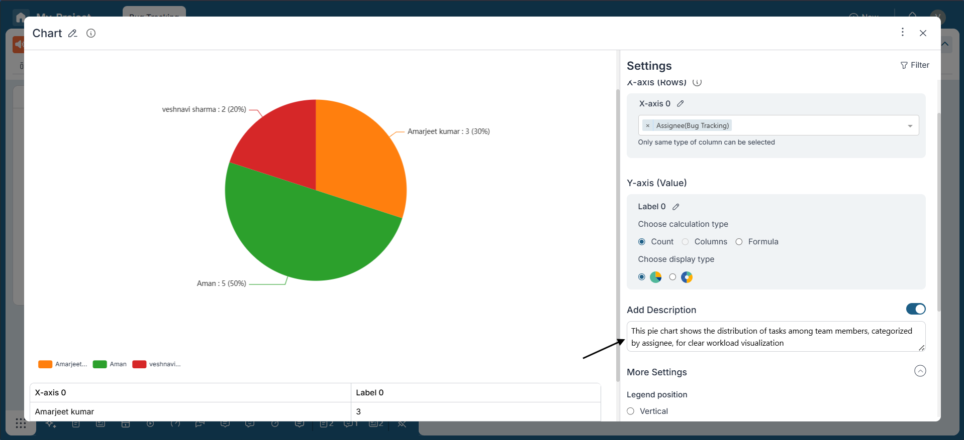
Adding Description:
Enable the "Add Description" option to provide a note explaining the Widget's purpose. This helps users understand the context of the visualization.
-
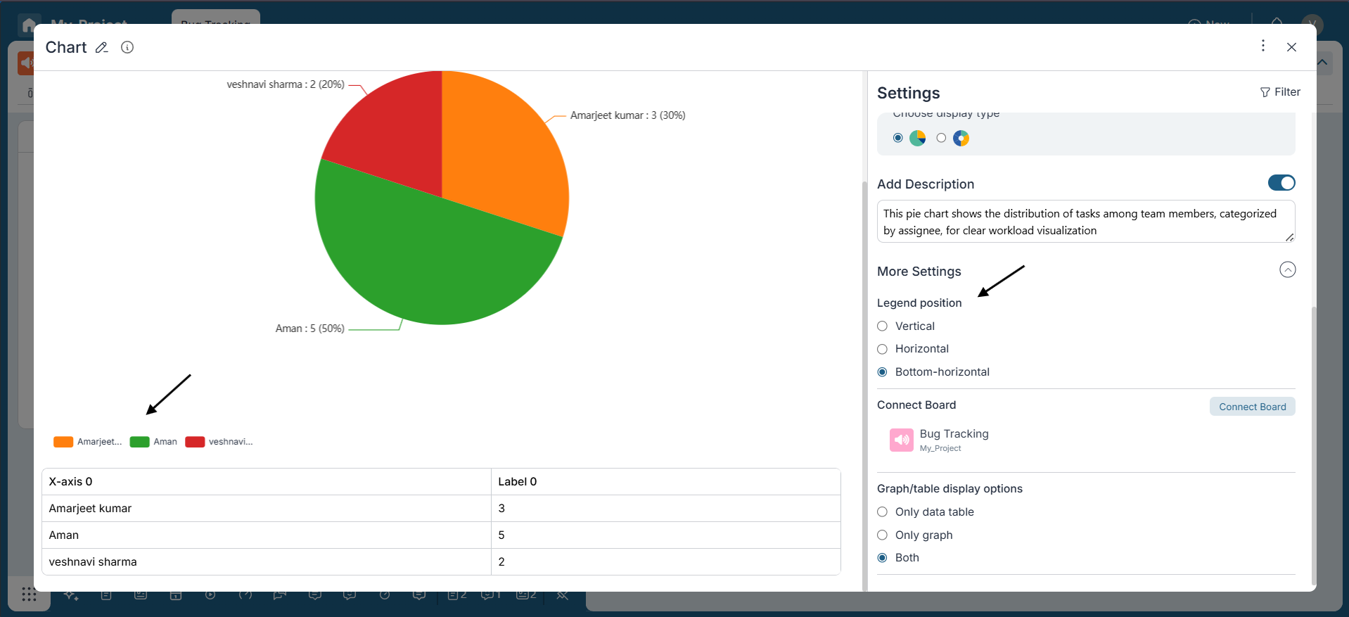
More Settings:
The legend in a Pie Chart helps identify categories by color. You can adjust its position for better readability with options like vertical, horizontal, or bottom-horizontal placement. Positioning the legend effectively ensures improved clarity and organization of the chart.
Step 4: Applying Filters
Utilize the Filter Icon on the top right corner to filter the data based on specific criteria. For instance, we can filter to display only active items, excluding those in Final buckets.
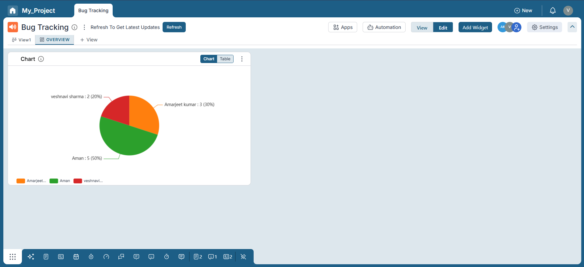
Step 5: Finalizing
Once all settings are configured to your preference, review the Pie Chart to ensure it accurately represents the data.
Conclusion:
Congratulations! You've successfully created a Pie Chart in Pronnel to visualize data distribution. With Pronnel's intuitive interface and customizable settings, you can create informative visual summaries of your data, facilitating better decision-making and analysis within your projects or workflows.
This tutorial provides a comprehensive guide for utilizing Pie Charts in Pronnel, empowering users to communicate effectively and understand data distribution within their boards.
Frequently Asked Questions About Pie Chart Widgets in Pronnel
Can I create Pie Charts in an Overview View?
Yes. You can add Pie Chart widgets directly in an Overview View for seamless, in-context visualization.
What criteria can I use to slice the pie?
Any categorical field such as Assignee, Status, or Priority—choose what best groups your data.
Can I customize the numerical data for slices?
Yes. Use Count or apply numeric operations like Max, Min, Median, Average, or Sum on numeric columns.
Can I add descriptions to a Pie Chart widget?
Enable Add Description to provide context about the chart’s purpose for viewers.
What other settings help fine-tune visualizations?
Adjust legend position, sort order, and select which boards to use as data sources.
How do I filter data for specific views?
Use the Filter icon to refine the dataset based on criteria, focusing the visualization.
Can I sort data in Pie Charts?
Yes. Sort ascending or descending to control the order of categories.
Can I save or export Pie Charts?
Save within Dashboards or Overview Views, and export for reporting and sharing.
Is there a limit to how many Pie Charts I can create?
No hard limit—create as many as needed for your analysis.