Creating Donut Chart Widgets in Pronnel: A Step-by-Step Guide
In Pronnel, Donut Chart Widgets offer a concise and visually appealing way to represent data, mainly when showcasing the proportion of a single value across different groups. This tutorial will guide you through creating Donut Chart Widgets, using an example of analyzing campaign leads and customizing their settings in Pronnel.
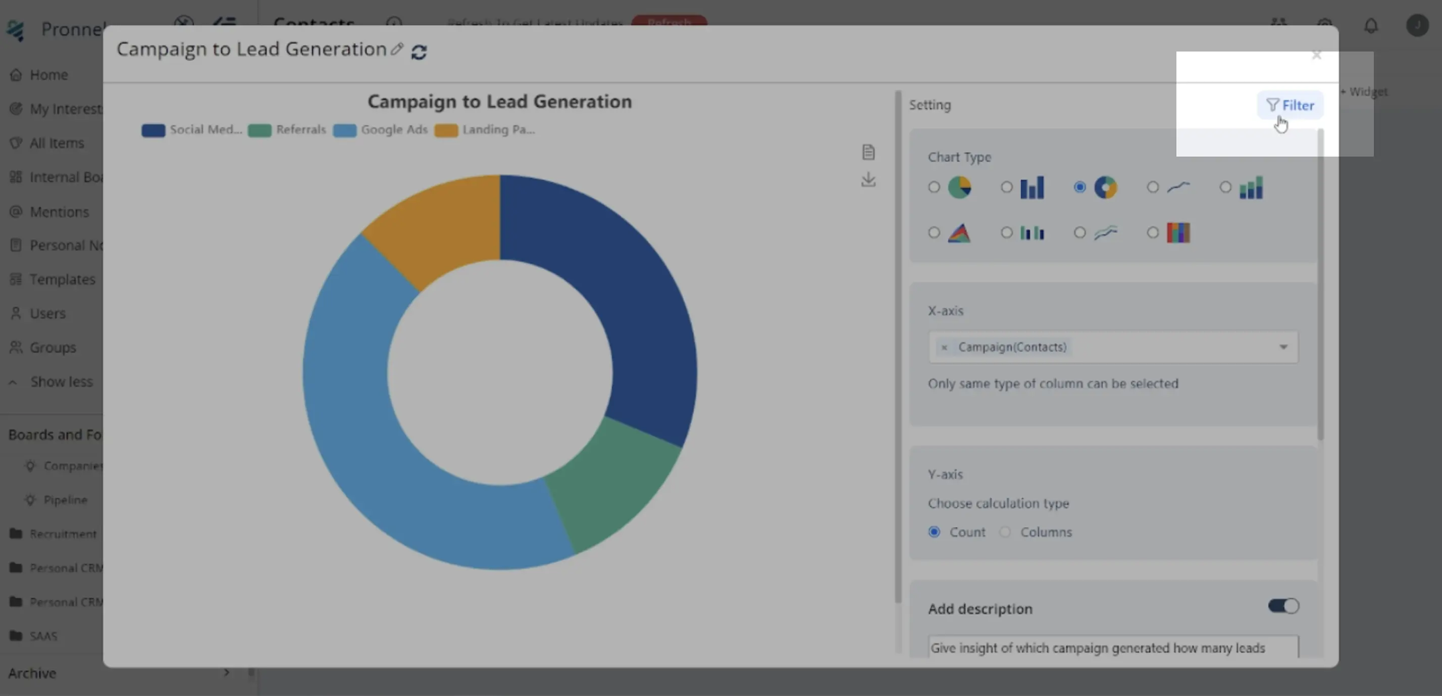
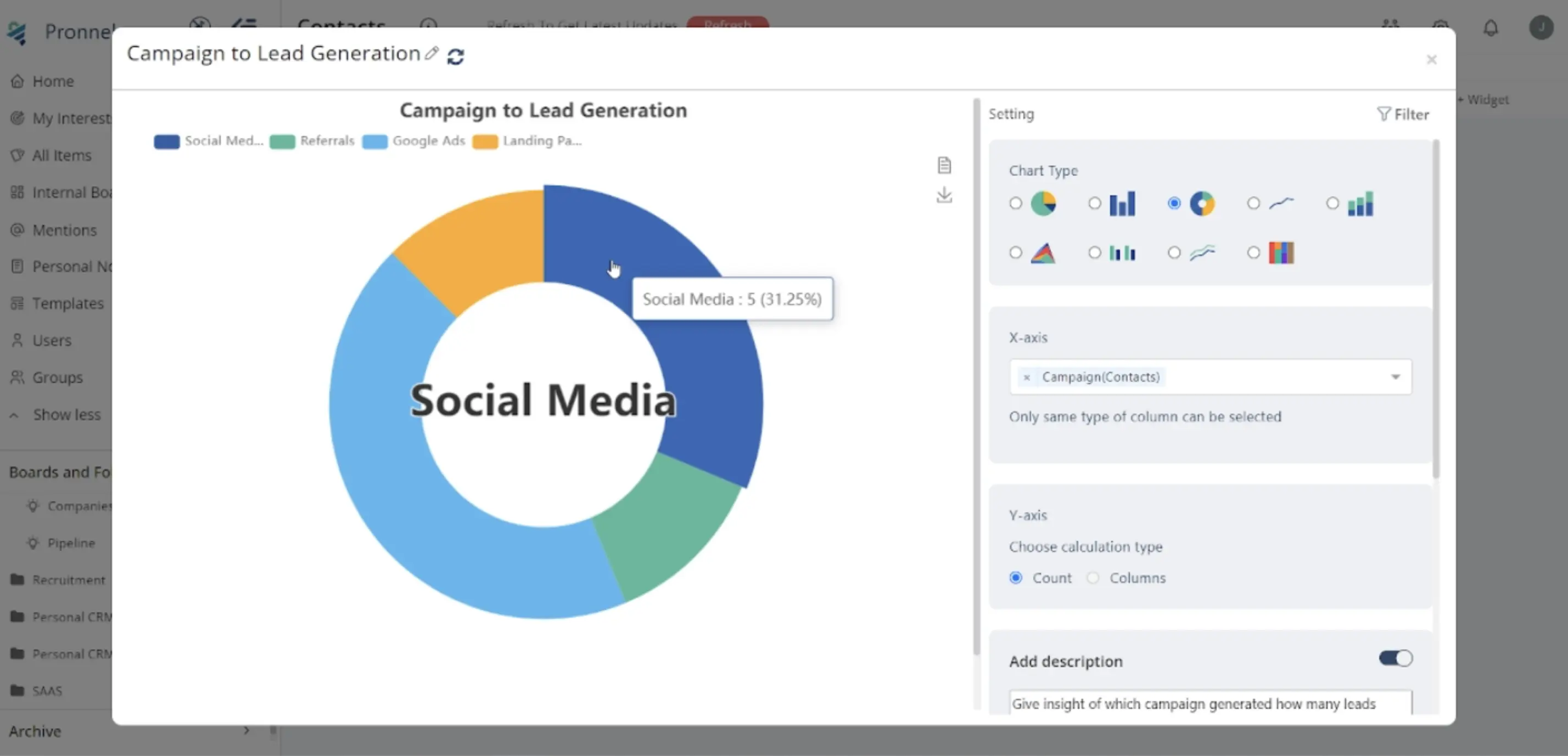
Let's analyze campaign leads to determine which types of campaigns generate the most leads.
1. Introduction to Donut Charts:
Donut charts are effective for displaying proportions within groups.
They visually represent data slices as circle segments, allowing for easy comparison.
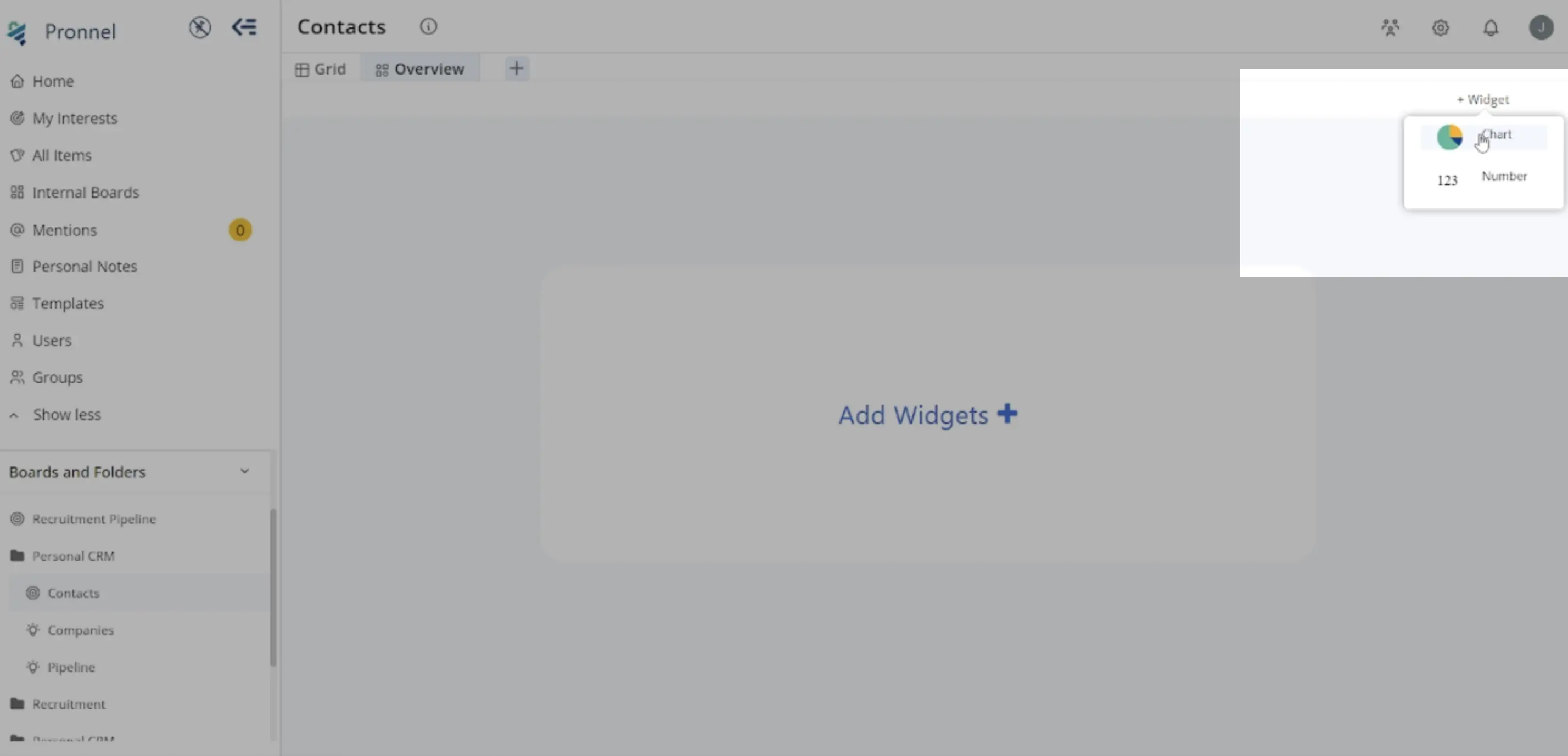
2. Accessing Donut Chart Widget:
- Open Pronnel and navigate to the desired dashboard or overview view.
- Click on the top right corner to create a new widget.
- Choose 'Chart' and 'Donut Chart' from the Chart Type options.
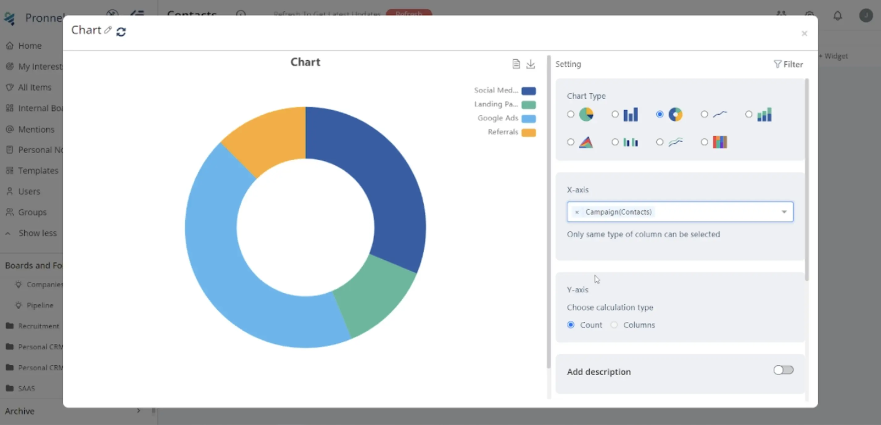
3. Configuring the Donut Chart Widget:
Define X-axis: Select the criteria for slicing the Donut (e.g., Source Campaign).
-
Define Y-axis: Choose the numeric value to display in the slices (e.g., count of leads). Other options include Count, Max, Min, Median, Average, or Sum.
-
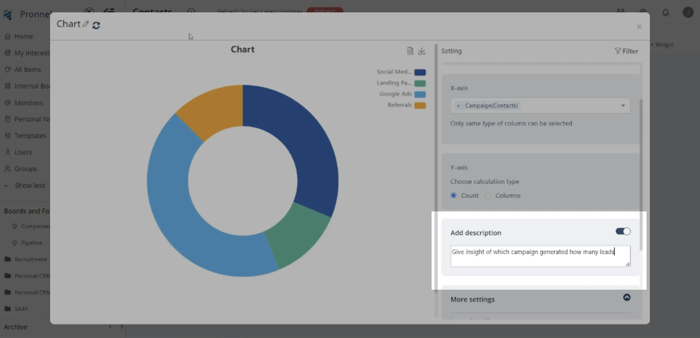
Optionally, enable 'Add Description' to provide context for the widget.
-
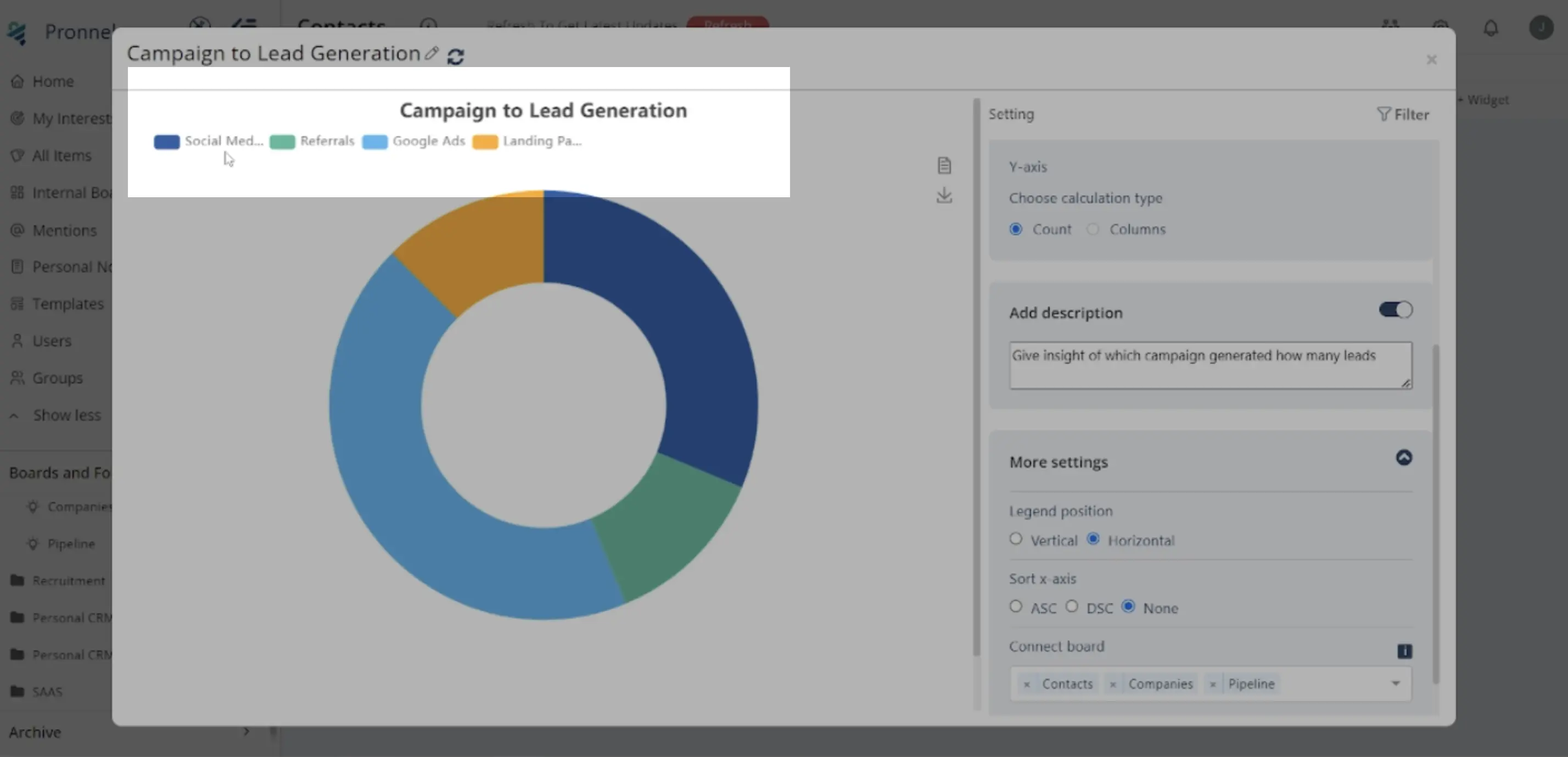
Utilize 'More Settings' to customize legend position, data sorting, and board selection.
4. Example Scenario:
Select 'Source Campaign' for the X-axis and count of leads for the Y-axis.
5. Filtering Data:
- Utilize the Filter Icon to refine data displayed in the Donut chart.
-
For instance, filter data to show leads from a specific sales quarter.
6. Finalizing:
Review the configured settings to ensure accuracy.
7. Interpretation and Analysis:
-
Once added, interpret the Donut Chart to gain insights.
-
Identify which campaign types contribute the most leads.
-
Use this information to optimize future marketing strategies.
8. Best Practices:
- Keep the chart concise and focused on relevant data.
- Ensure clear labelling and legend for easy understanding.
- Regularly update and refine the chart as data evolves.
Conclusion:
Donut Chart Widgets in Pronnel offer a powerful tool for visualizing data, particularly when analyzing proportions within grouped data sets. Following this step-by-step guide and customizing the settings to your specific data and objectives, you can effectively utilize Donut Charts to gain insights and make informed decisions. Experiment with different configurations to best represent your data and enhance stakeholder understanding.
Frequently Asked Questions About Donut Chart Widgets in Pronnel
What is a Donut Chart Widget in Pronnel?
It visualizes proportions of a single value across groups using a circular chart with segmented slices.
How do I access the Donut Chart Widget in Pronnel?
Open your dashboard or overview view, add a new widget, choose Chart → Donut Chart.
What data fits a Donut Chart?
Proportions within grouped data, like distribution of leads by campaign type.
How do I set X-axis and Y-axis?
X-axis: grouping field (e.g., Source Campaign). Y-axis: numeric value (e.g., count of leads).
What options exist for the Y-axis?
Count, Max, Min, Median, Average, or Sum—pick based on your analysis needs.
Can I add a description?
Yes. Enable Add Description to explain the widget’s purpose and context.
How do I filter data?
Use the Filter icon to refine the dataset (e.g., show a specific quarter only).
Best practices for Donut Charts?
Keep it concise, label clearly, and refresh periodically as data evolves.
How do I interpret insights?
Identify which categories contribute most and use that to optimize future strategy.