Building Custom Graphs with Pronnel's Hundred Percent Bar Chart Widget
In Pronnel, custom dashboards allow users to visualize data from their boards in meaningful and insightful ways. One such powerful tool is the Hundred Percent Bar Chart Widget. This widget provides a clear overview of data distribution, which is particularly useful for understanding categorical data's composition and proportions. In this tutorial, we'll create a Hundred Percent Bar Chart Widget to visualize priority-wise completed tasks over a month.
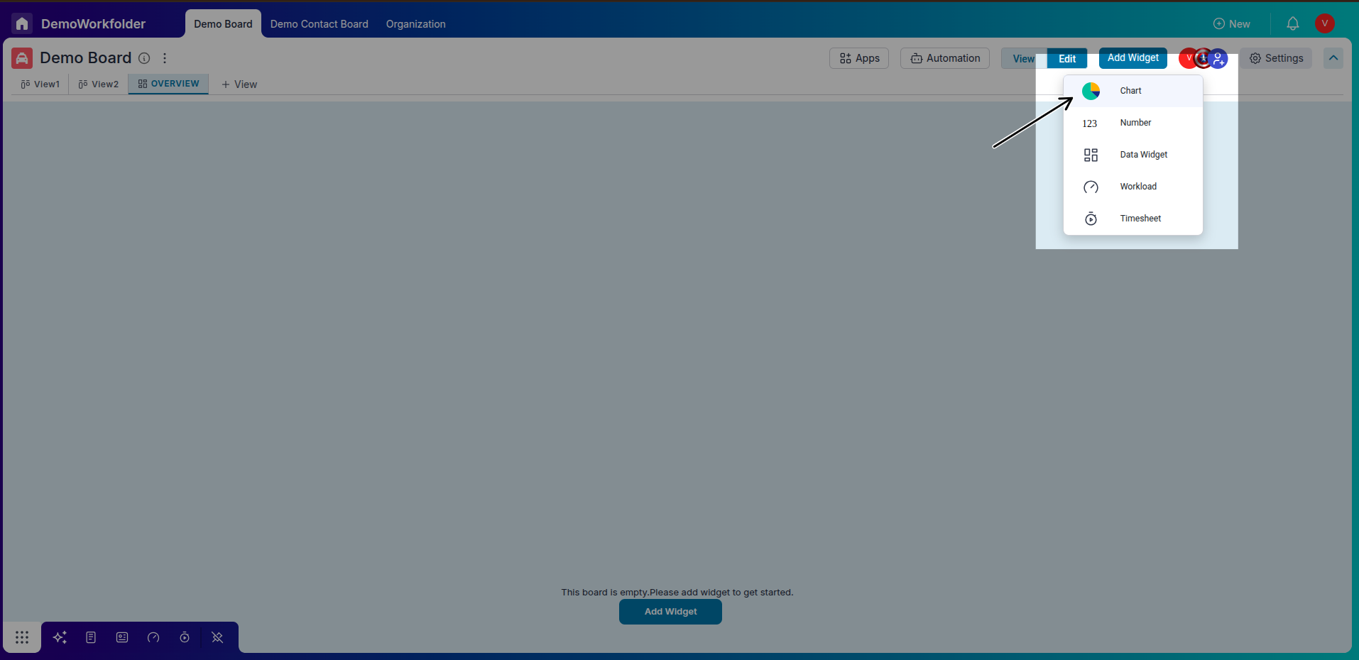
Step 1: Accessing Pronnel Dashboard
-
Login to Pronnel:
Log in to your Pronnel account and access the Dashboards section.Start by logging into your Pronnel account and accessing the dashboard where you want to create the Hundred Percent Bar Chart Widget.
-
Create New Widget:
Click on the "Create New Widget" option at the dashboard interface's top right corner. Select "Chart" from the widget options.
-
Select Hundred Percent Bar Chart:
In the chart type selection, choose "Hundred Percent Bar Chart" to create the desired visualization.
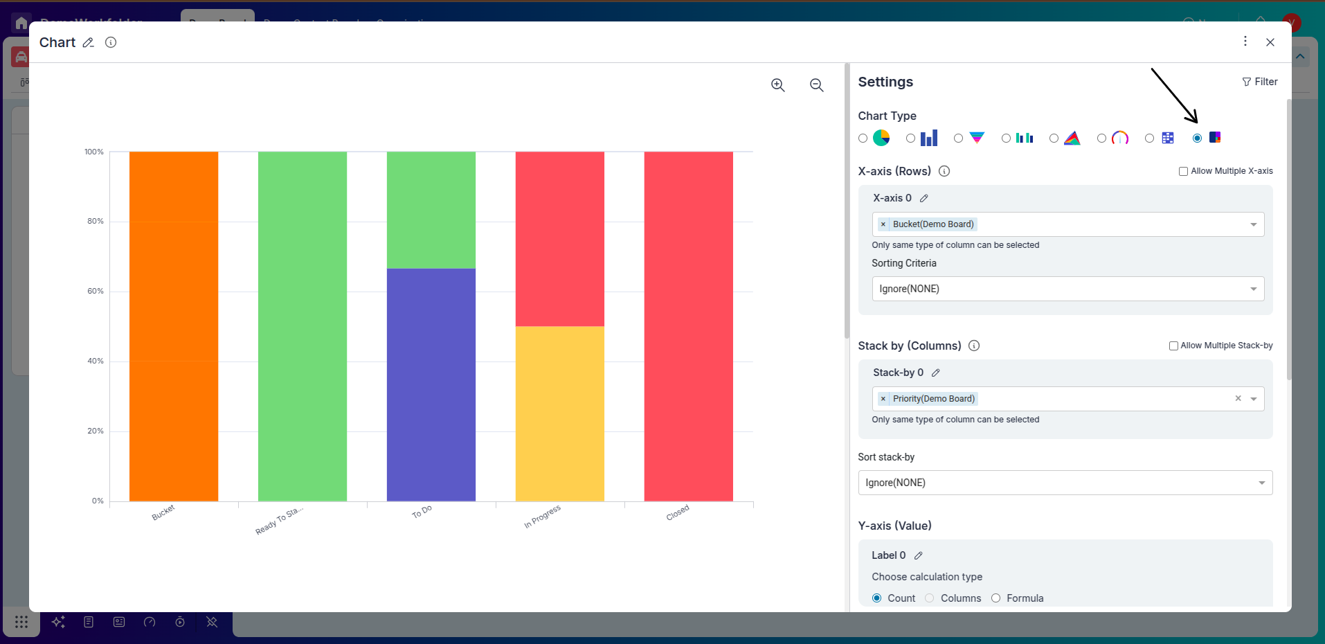
Step 2: Configuring Widget Settings
-
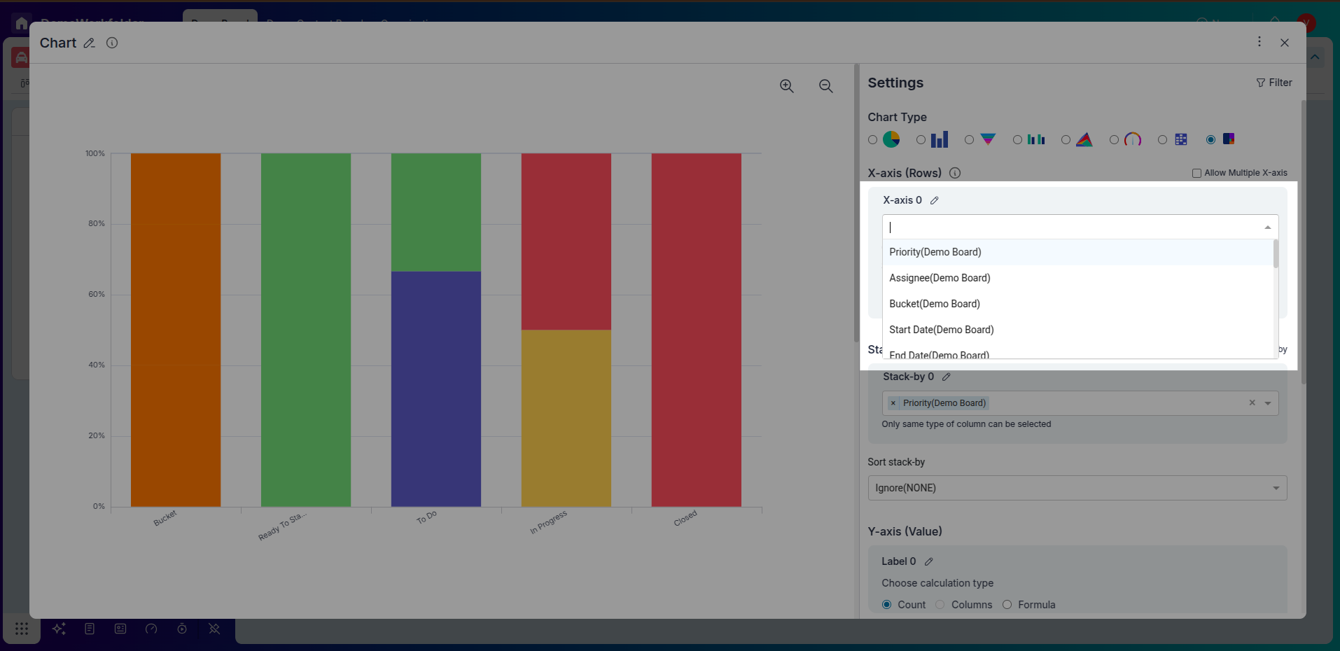
X-axis Selection:
The x-axis typically represents the categories or groups being compared. In our example, we'll select "Task End Date (month-wise)" to represent time intervals.
-
Y-axis Selection:
The y-axis represents the percentage scale. Choose the appropriate number-type column to represent the count of items. For our example, we'll directly count the number of completed tasks.
-
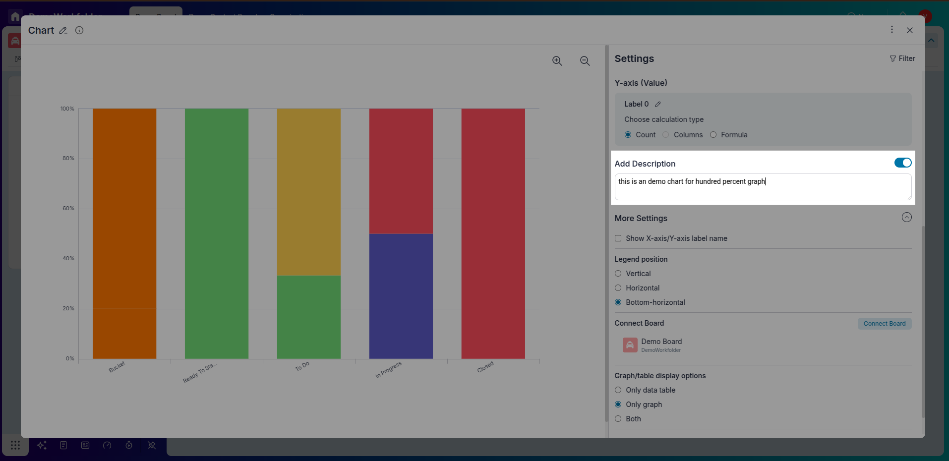
Additional Description:
Optionally, enable the "Add Description" option to add a note explaining the widget's purpose. This enhances collaboration and understanding among team members.
-
More Settings:
Customize the chart further by providing labels to the x-axis and y-axis for better clarity. Adjust the legend position, sort data, or choose specific boards to create the chart. You can also flip the chart if necessary.
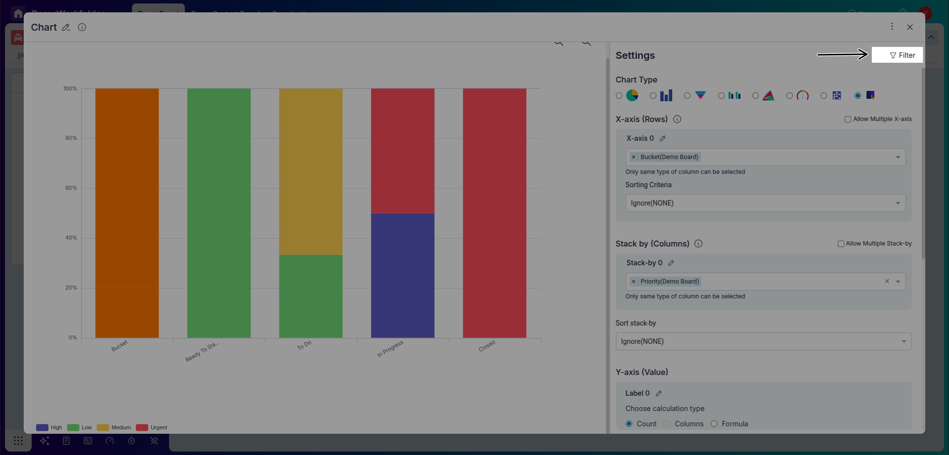
Step 3: Filtering Data
-
Apply Filters:
Utilize the Filter icon in the widget's top right corner to specify the information you want to include in the Hundred Percent Bar Chart. In our example, we'll filter data to show only completed tasks in the "Final" bucket.
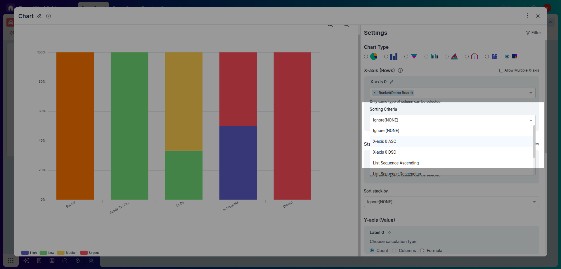
Step 4: Stack By
-
Apply stack by:
The “Stack By” feature allows users to group chart data in layers, showing how different sub-categories contribute to the whole. When using two fields, it adds a second level of breakdown within each bar or column.
Step 5: Finalizing
-
Review and Confirm:
Take a moment to review the widget settings, ensuring all parameters are configured correctly according to your visualization needs.
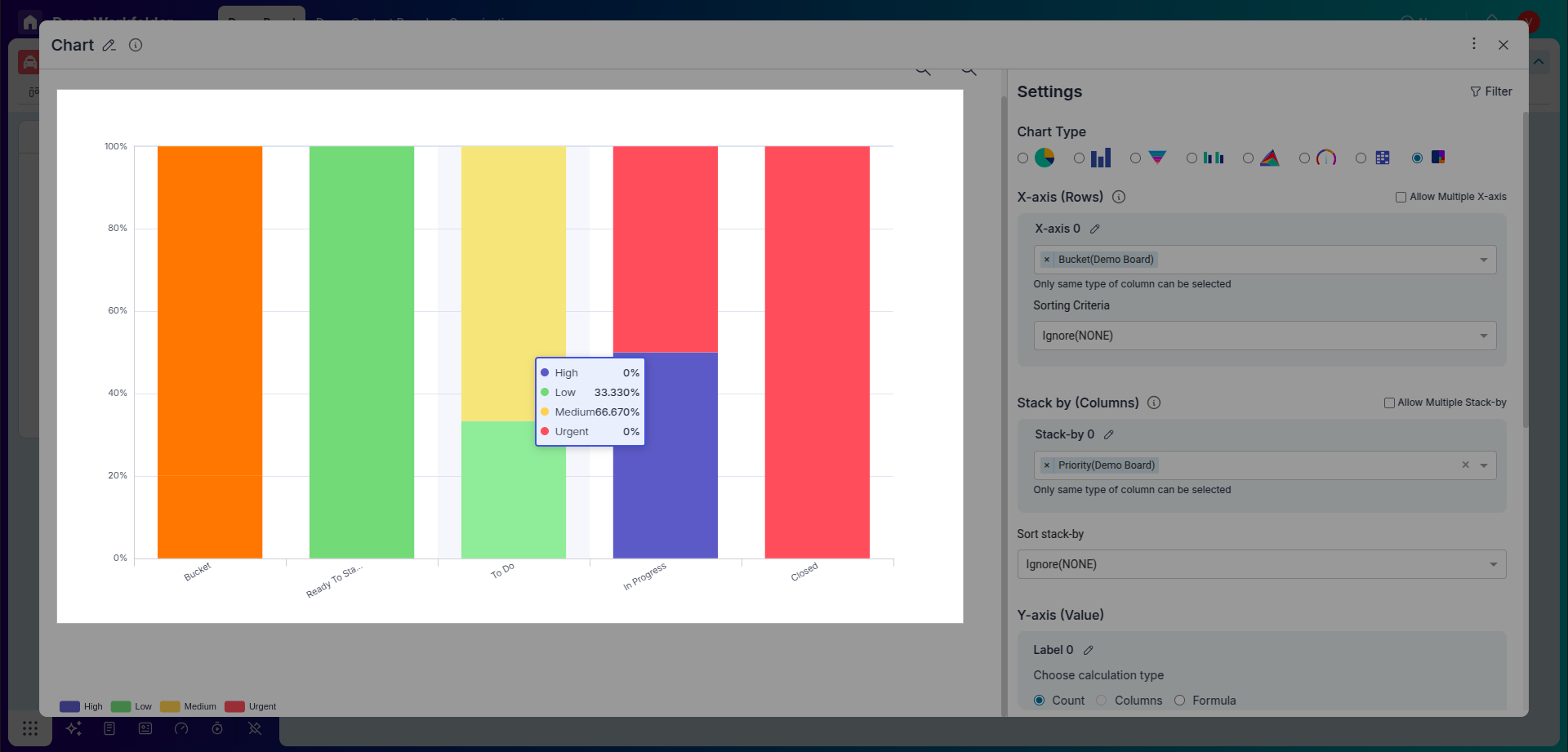
Step 5: Interpretation and Analysis
-
Interpret the Chart:
After adding the Hundred Percent Bar Chart Widget to your dashboard, analyze the visualization to gain insights into priority-wise completed tasks over different months. Each bar's segments represent the relative contributions of urgent, high, medium, or low-priority tasks
-
Iterative Analysis:
Continuously monitor and analyze the chart as new data comes in. Use the insights gained to make informed decisions and optimize task management strategies.
Conclusion
Pronnel's Hundred Percent Bar Chart Widget offers a powerful way to visualize categorical data distribution, such as priority-wise completed tasks over time intervals. Following this tutorial, you can create insightful visualizations to understand your data better and drive informed decision-making. Experiment with different configurations and filters to tailor the chart to your needs, unlocking deeper insights into your workflow and task management processes.
Frequently Asked Questions About Hundred Percent Bar Chart Widget
What is Pronnel's Hundred Percent Bar Chart Widget used for?
It visualizes categorical data distribution (e.g., priority-wise completed tasks over time) to show proportions clearly.
How do I access the widget in Pronnel?
Open your dashboard, click Create New Widget, choose Chart, then select Hundred Percent Bar Chart.
What does the X‑axis represent?
Categories or groups (e.g., month-wise Task End Date).
How is the Y‑axis represented?
Percent scale; often a count or metric normalized to 100% per category.
Can I add a description?
Yes—enable Add Description to explain the widget’s purpose.
What customization options exist?
Labels, legend position, sort order, source boards, flip chart, etc.
How do I filter data?
Use the Filter icon to include only relevant items (e.g., completed tasks).
Can I revisit the widget?
Save the widget with a descriptive title to reuse and analyze anytime.
What insights can I gain?
Understand proportional contributions (e.g., urgent/high/medium/low) across time.
How do I optimize workflow with these insights?
Monitor trends and adjust priorities or resources to improve efficiency.