Creating Stacked Line Charts in Pronnel Dashboards
Pronnel offers a powerful feature called Dashboards, allowing users to create visually appealing summaries of board activities using various widgets. One such widget is the Stacked Line Chart, which effectively illustrates data trends by layering lines to showcase the cumulative contribution of different data segments over time.
In this tutorial, we will create a Stacked Line Chart to represent priority-wise tasks completed in a month.
Step 1: Setting up the Dashboard
-
Navigate to Dashboards:
Log in to your Pronnel account and access the Dashboards section.
-
Create a New Dashboard or overview:
If you don't have an existing dashboard or overview, create a new one where you'll add your Stacked Line Chart widget.
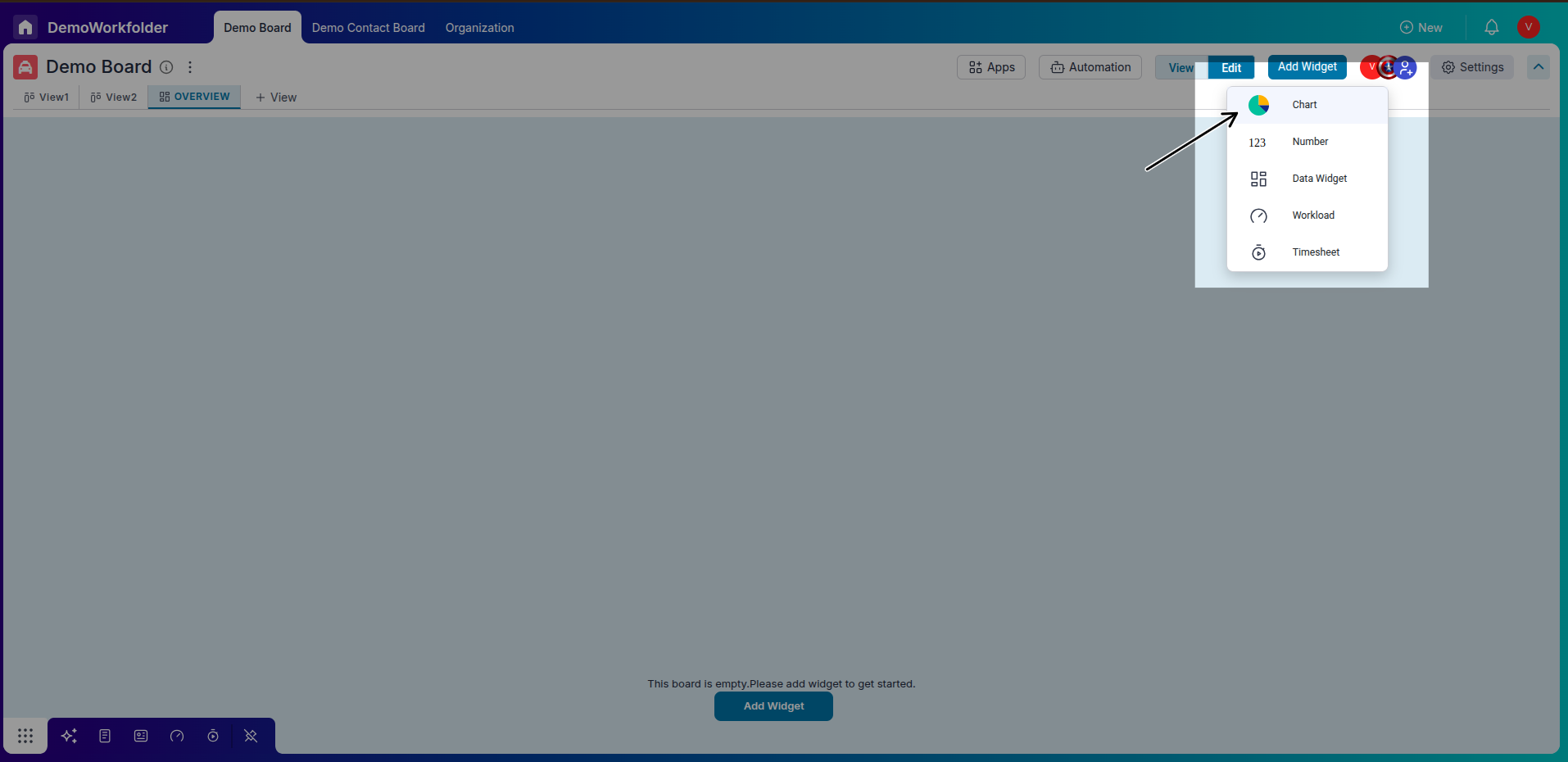
Step 2: Adding a Stacked Line Chart Widget
-
Access Widget Creation:
In the dashboard interface, locate the option to add a new widget. Click on it to begin creating a new widget.
-
Select Chart Type:
Choose "Chart" as the widget type, and then select "Stacked Line Chart" as the type,multi bar,stack bar,stack line.
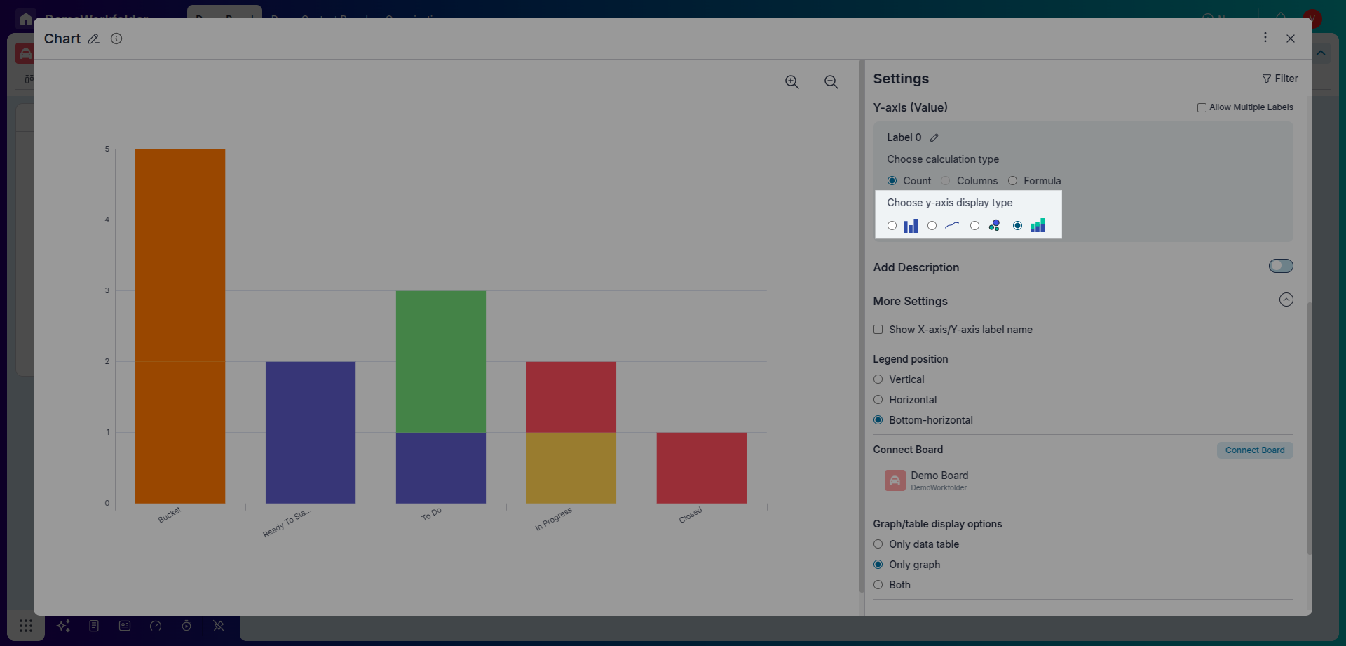
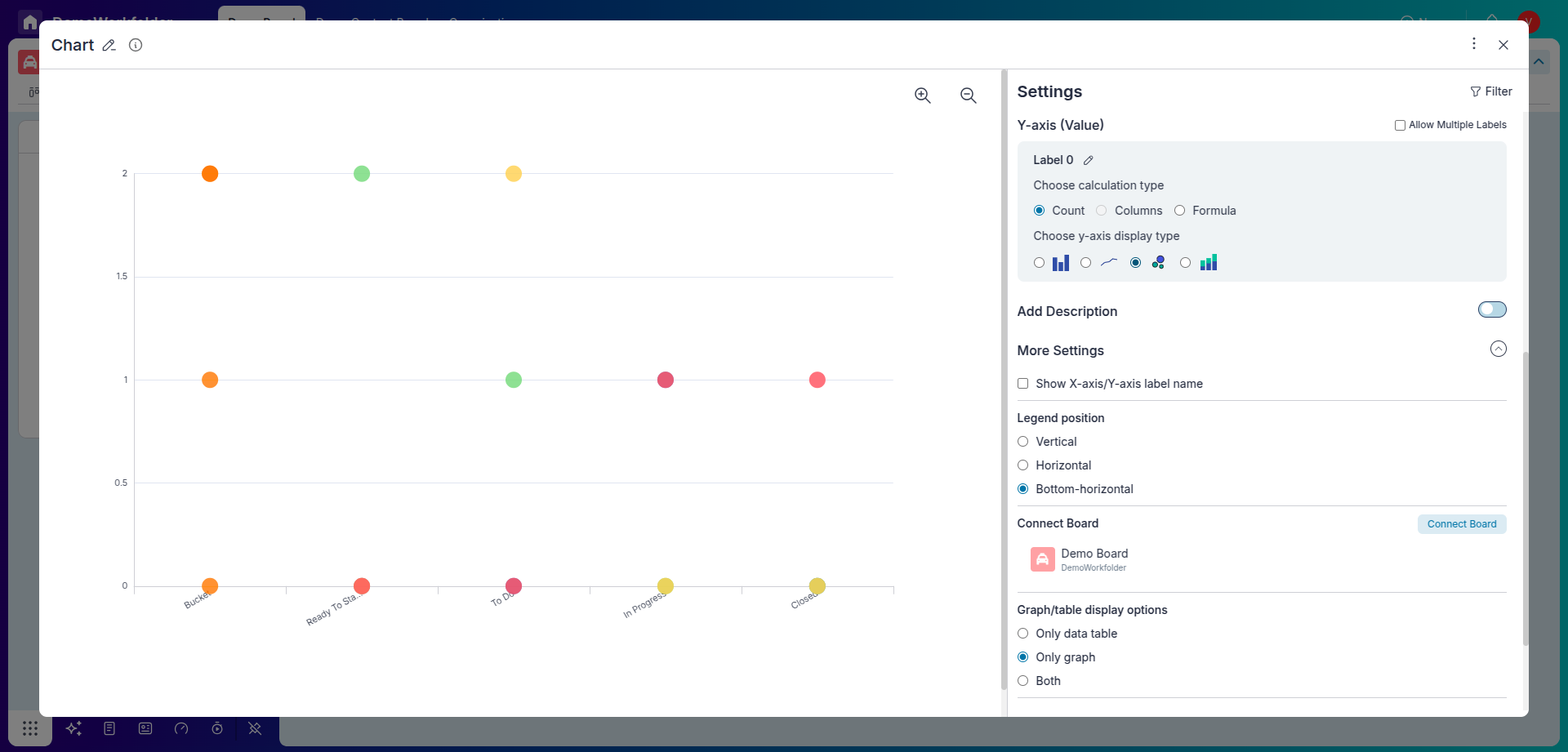
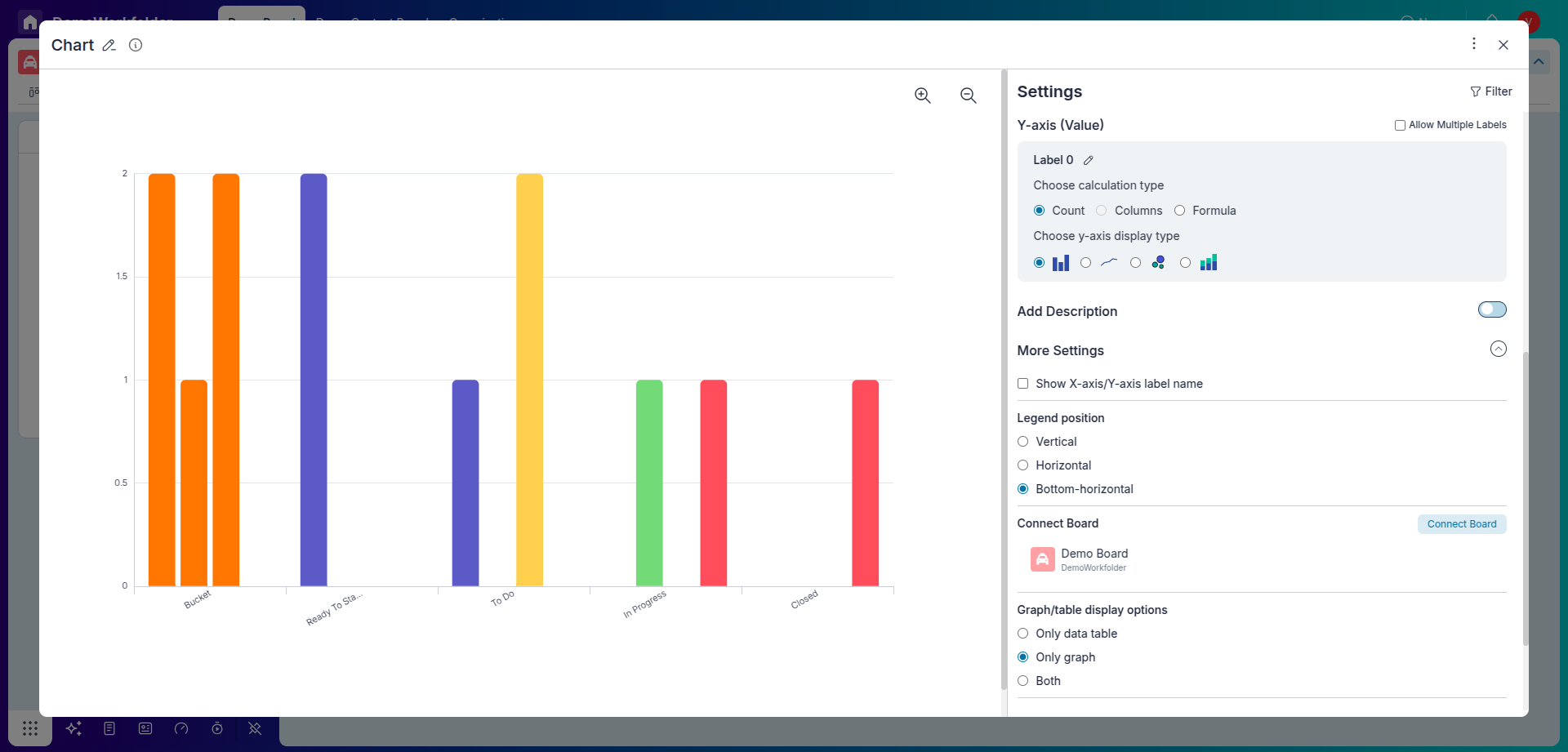
Step 3: Configuring the Stacked Line Chart Widget
-
Define X-axis Values:
Choose the X-axis values to showcase a series of values over time. For our example, select "End Date", organized monthly.
-
Specify Y-axis Data:
Determine the numerical data to be displayed on the Y-axis. You can count the number of items directly or choose other numerical operations such as Count, Max, Min, Median, Average, or Sum on a specific column.
-
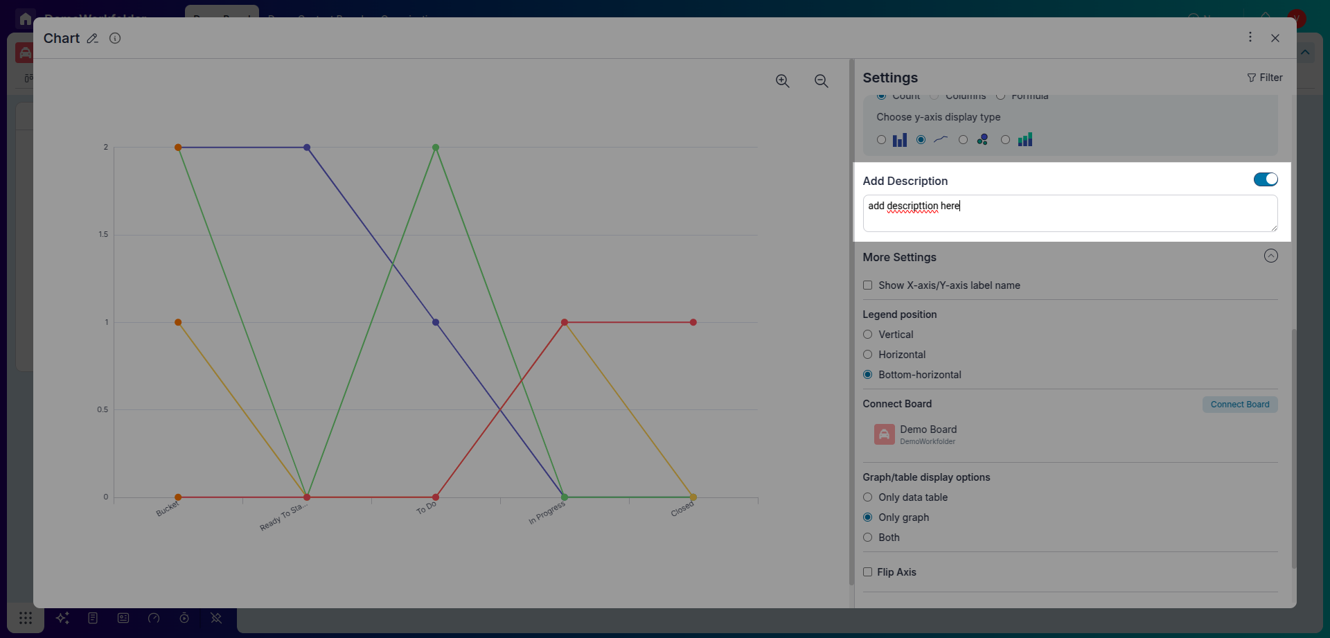
Add Description:
Activate the "Add Description" feature and insert a brief note detailing the widget's objective for better understanding.
-
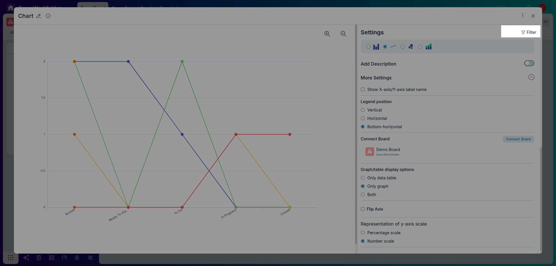
More Settings:
Customize the chart further by labelling the x-axis and y-axis, modifying the legend's orientation, organizing data in ascending or descending order, or selecting specific boards to create the Stacked Line Chart.
-
Filter Data:
Use the Filter Icon to select specific data for the chart. For instance, you can display only the data for items in particular buckets.
-
Invert Chart:
If needed, you can invert the chart to swap the roles of the x-axis and y-axis.
Step 4: Finalizing the Stacked Line Chart
-
Review:
Once you've configured all the settings, save your Stacked Line Chart widget and review it to ensure it accurately represents the desired data trends.
-
Adjustments (If Necessary):
If the chart needs adjustments, you can edit the widget settings to refine it further.
Conclusion:
Congratulations! You have successfully created a Stacked Line Chart in your Pronnel dashboard, visually representing priority-wise tasks completed in a month. This chart lets you easily track and analyze data trends over time, bringing transparency to your board activities. Experiment with different configurations and settings to tailor your Stacked Line Chart to your needs and preferences. Happy charting!
Frequently Asked Questions About Stacked Line Chart Widgets in Pronnel
How do I access Dashboards in Pronnel?
Log in and open Dashboards from the main menu to create and manage widgets.
What is a Stacked Line Chart?
A chart that layers multiple series to show cumulative trends over time.
Can I create Stacked Line Charts in boards?
Yes. Add a Chart widget and select Stacked Line Chart in Dashboards or Overview Views.
What data fits a Stacked Line Chart?
Time-based trends by category, like monthly completed tasks segmented by priority.
How do I add the widget?
Create a new widget → Chart → Stacked Line Chart, then configure axes and values.
What customization options are available?
Set X-axis (time), choose Y values (count or numeric ops), add description, labels, legend, sorting, and filters.
Can I adjust the chart later?
Yes. Open widget settings anytime to refine configuration.
Is there a limit to the number of charts?
No. Add as many charts as needed for your analysis.
Where can I learn more?
See documentation or contact support for advanced widget customization.