Creating Bar Chart Widgets in Pronnel Boards: A Step-by-Step Tutorial
Bar charts are a powerful way to visualize data, offering clear insights into key metrics and distributions. In Pronnel Boards, you can use the Bar Chart Widget to represent data effectively.
This tutorial will guide you through creating Bar Chart Widgets to visualize the distribution of tasks across different statuses or stages, helping you track progress and workload with ease.
Step 1: Accessing Dashboard Creation:
Begin by accessing your Pronnel workspace. In the relevant Work Folder, you can create a new Dashboard or use an existing Overview View to display widgets. When setting up the Dashboard, ensure that the appropriate boards are connected so that the data is accurately reflected in your Bar Chart Widget.
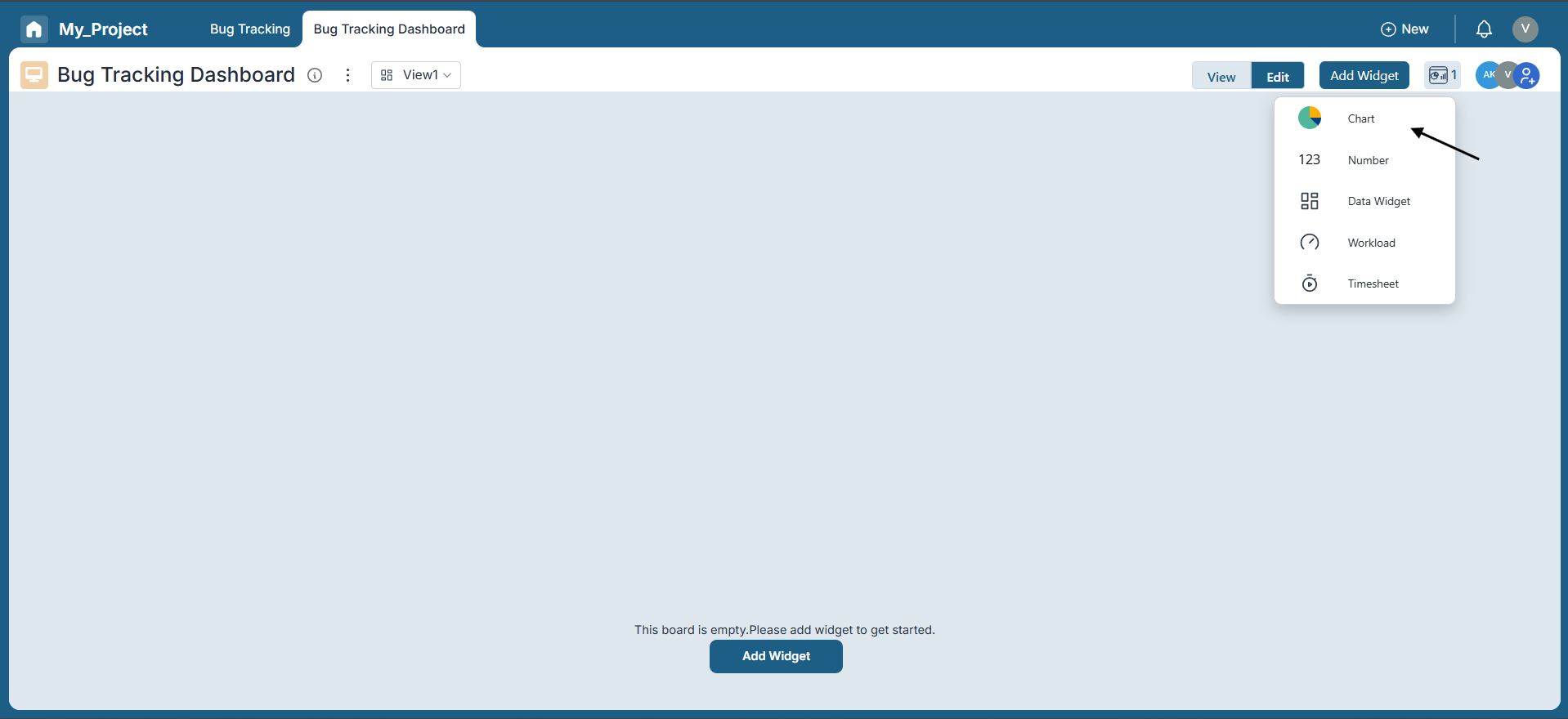
Step 2: Creating a Bar Chart Widget:
Once your dashboard is ready, click the top-right corner to add a new widget. Choose the "Chart" option, then select "Bar Chart" from the available chart types.
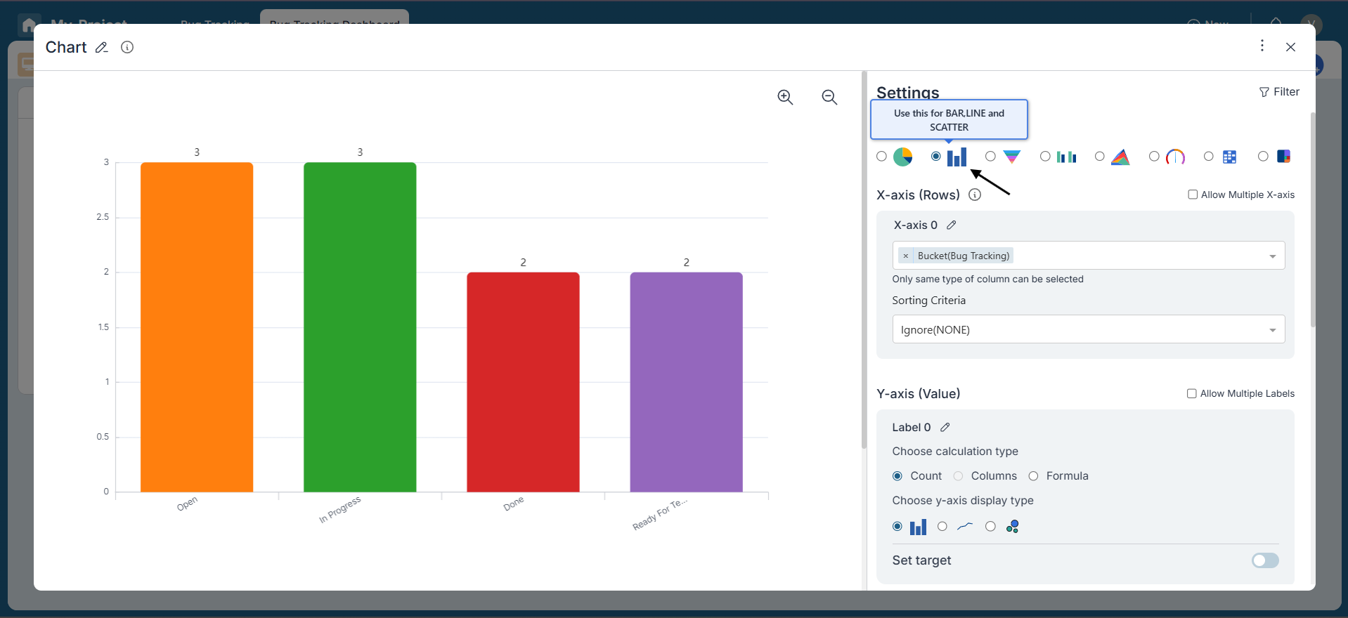
Step 3: Configuring the Bar Chart Widget::
Upon selecting the Bar Chart Widget, you'll need to configure its settings:
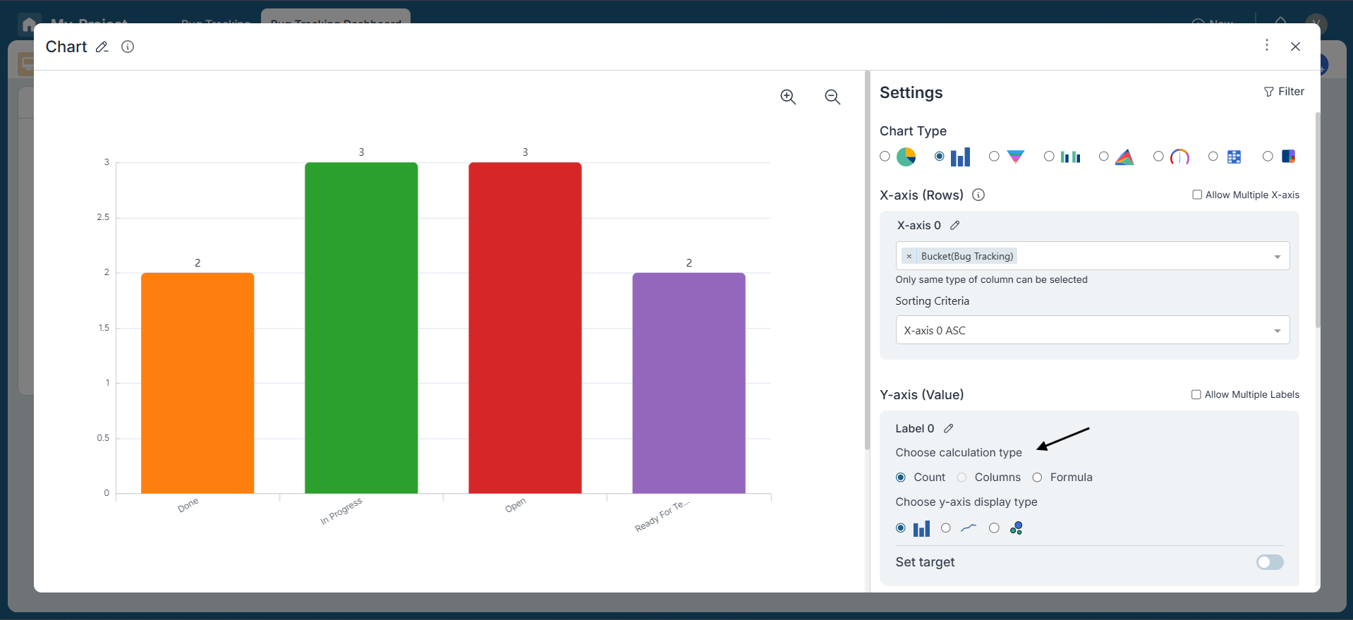
X-Axis:
The X-axis represents the horizontal axis and displays data categories. For our example, select a bucket representing task status (e.g., "Open," "In Progress," "Done"). You can also apply sorting criteria on the X-axis to control the display order of categories.
Y-Axis:
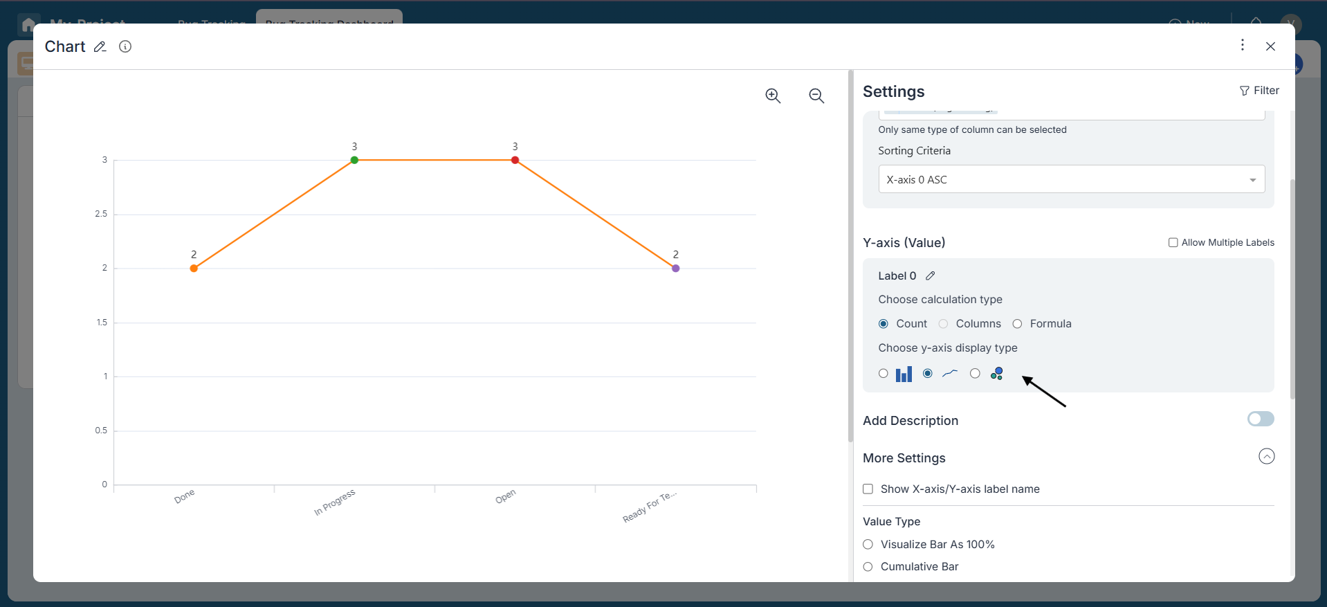
Choose the metric to display on the Y-axis. You can select the calculation type as Count, choose from available Columns, or use a custom Formula. Formulas allow arithmetic operations like Sum, Average, Median, Min, Max, and more—offering flexibility to tailor the chart based on your analysis needs.
Within the Y-axis settings, you can also select a Display Type—Bar, Line, or Scatter—to represent your data visually in the most meaningful format.
Additionally, you can set a Target or Upper Limit on the Y-axis. This helps you visually benchmark performance by adding a reference line that indicates goals, thresholds, or expected values.
Add Description:
Enable the "Add Description" option to include a note explaining the widget's purpose. This helps others understand the widget's context and relevance.
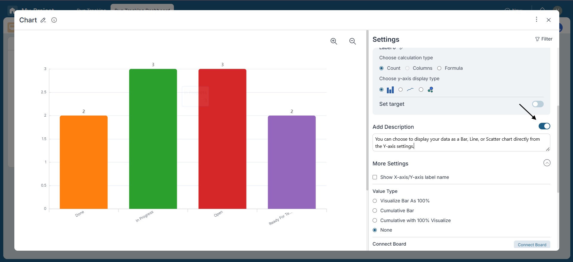
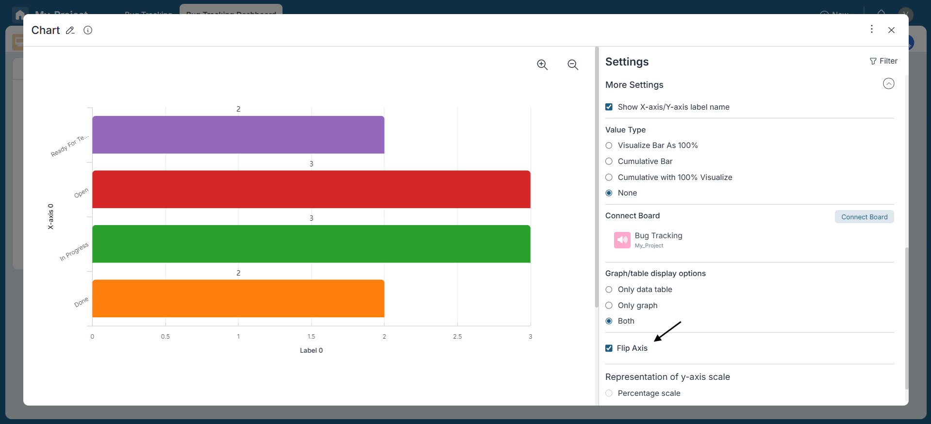
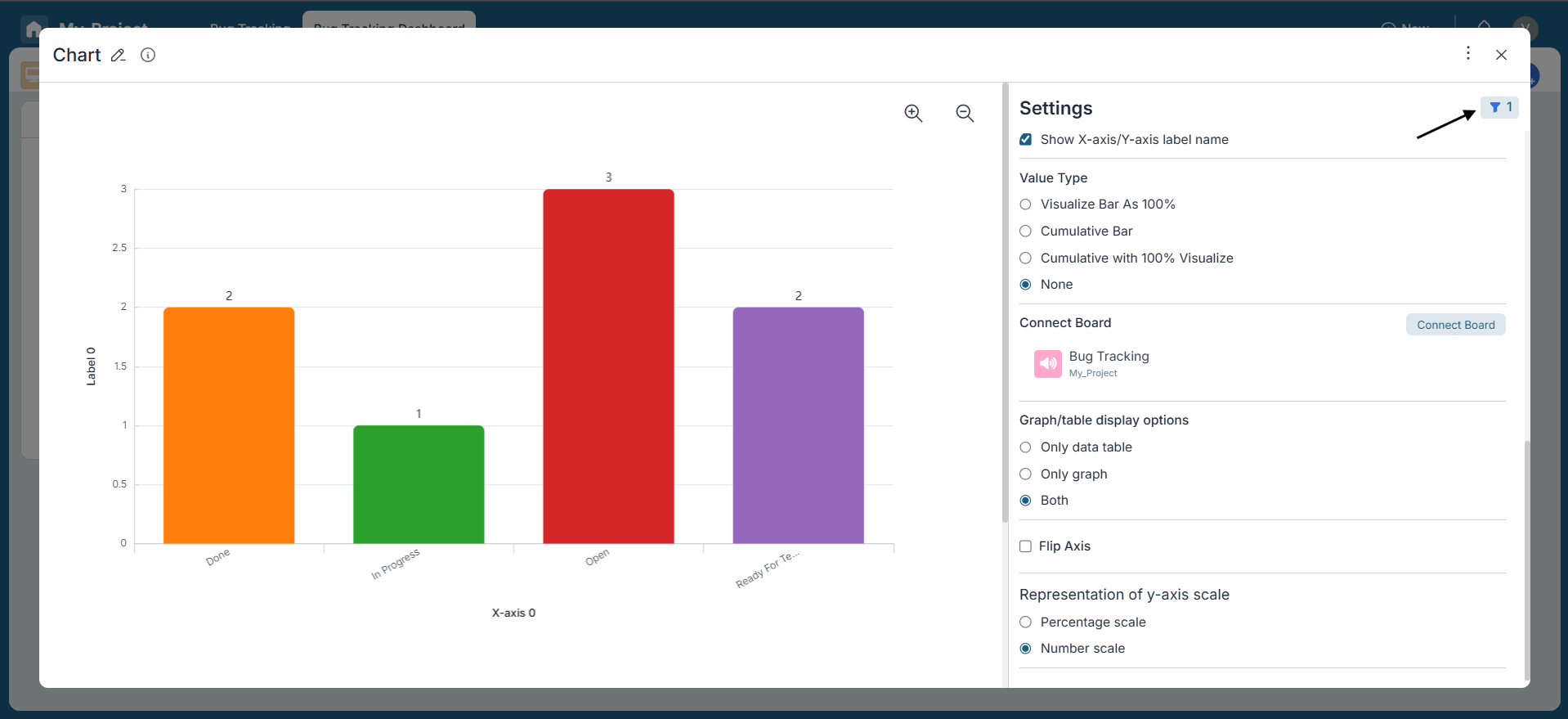
More Settings:
- Customize your Bar Chart widget further using the available settings:
- Show or hide X-axis and Y-axis label names.
- Select the value type representation—choose between percentage scale or number scale.
- Visualize bars as 100%, cumulative, or cumulative with 100% visualization.
- Flip the chart to switch the orientation of axes.
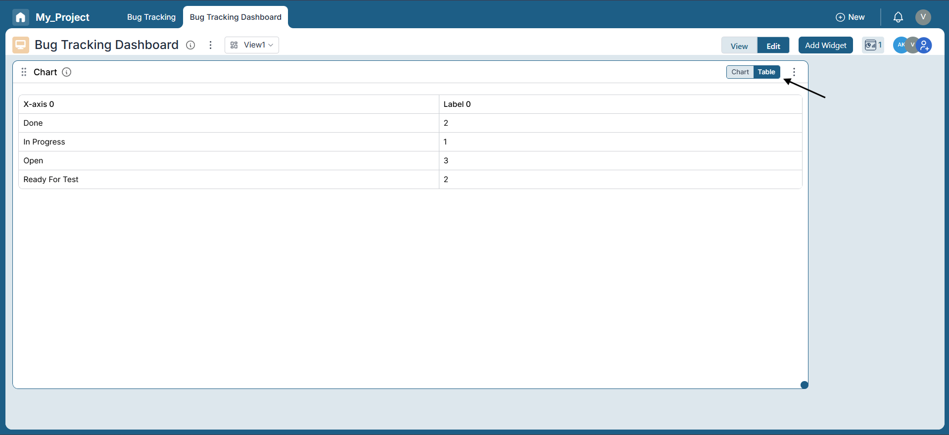
- Choose how you want the chart and data table displayed: graph only, table only, or both.
- Connect one or more boards such as Bug Tracking or My_Project to pull data dynamically.
Step 4: Filtering Data:
Utilize the filter icon located at the top-right corner to refine the data displayed in the Bar Chart.
For instance, if you want to focus on active tasks only, you can filter to exclude functions in the "Final" bucket, providing a clearer view of task status division.
Step 5: Review:
Review the configured settings to ensure they meet your requirements. You can also toggle between chart and table views to visualize the data as needed.
Conclusion:
Congratulations! You've successfully created a Bar Chart Widget in Pronnel Boards to visualize task status distribution. This allows you to monitor progress across different stages and gain clear insights. Feel free to explore additional settings and filters to customize your chart for deeper analysis and better decision-making.
Frequently Asked Questions About Bar Chart Widgets in Pronnel Boards
What is a Bar Chart Widget in Pronnel Boards?
A Bar Chart Widget displays categories and their values as bars, offering a clear overview of data distributions and metrics.
How do I access dashboard creation in Pronnel?
Create a new Dashboard in your Work Folder or add widgets to an Overview View. Ensure the correct boards are connected.
What data can I visualize with a Bar Chart?
Task status distribution, project progress, issues, or any numerical values grouped by a category field.
How do I configure the X-Axis?
Pick a categorical field (e.g., status buckets like Open, In Progress, Done) and optionally sort categories.
What options exist for the Y-Axis?
Use Count, a numeric column, or a Formula (Sum, Average, Median, Min, Max). You can also set a target line.
Can I add a description to the widget?
Yes. Enable Add Description to explain purpose and context to viewers.
How can I further customize the Bar Chart?
Show/hide axis labels, choose percentage or number scale, flip axes, select graph/table/both view, and connect multiple boards.
How do I filter data?
Use the filter icon to focus on subsets (e.g., exclude Final bucket to see only active tasks).
Can I review settings before finalizing?
Yes. Toggle between chart and table and review all settings before saving.
Any tips to maximize effectiveness?
Apply relevant filters, connect the right boards, and refine settings periodically to reflect current data and goals.