Creating Stacked Bar Chart Widgets in Pronnel: A Step-by-Step Guide
Pronnel Boards offer powerful tools like Overview Views and Dashboards to summarise your data and activities concisely. One such tool is the Stacked Bar Chart Widget, which enables users to visualize data in a 3-dimensional bar chart format, allowing for data grouping based on multiple variables.
In this tutorial, we will walk through the process of creating a Stacked Bar Chart Widget to display the distribution of tasks among different users based on priority
Step 1: Accessing Pronnel Dashboard
Begin by logging into your Pronnel account and navigating to the desired board from which you wish to pull data. Once on the board, locate the option to create a new widget, typically found in the top right corner of the screen.
Step 2: Selecting Chart Type
From the widget creation menu, choose the "Chart" option, then select "Stacked Bar Chart" as the chart type.
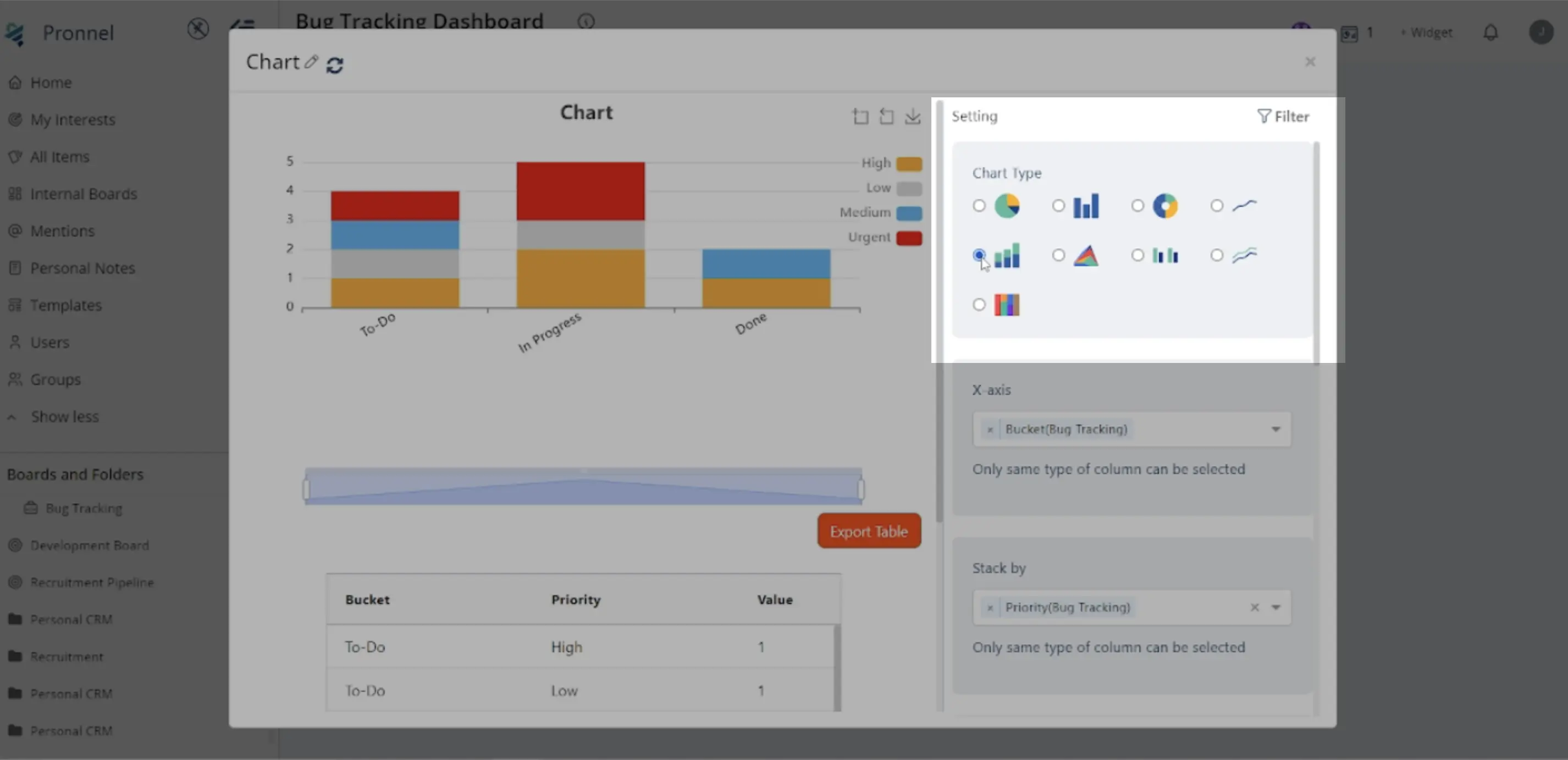
Step 3: Configuring Stacked Bar Chart Widget Settings
After selecting the Stacked Bar Chart type, you'll need to configure the widget settings:
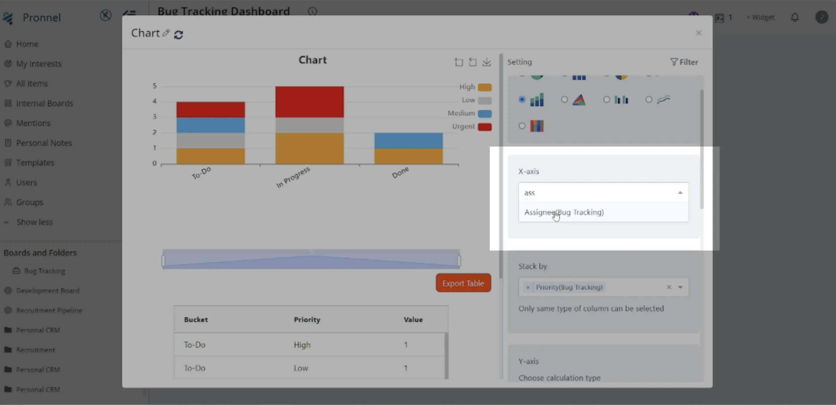
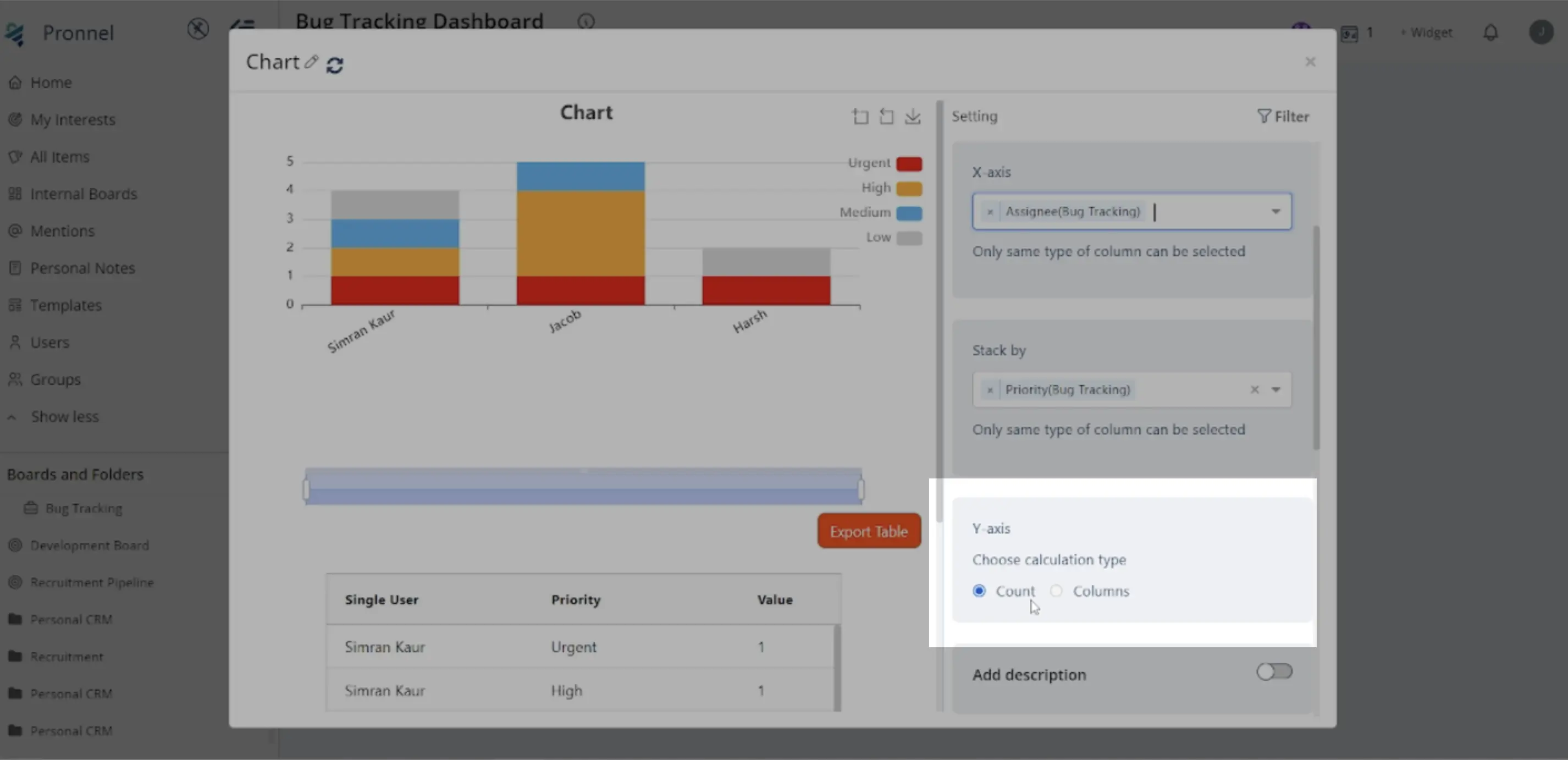
X-Axis and Y-Axis Configuration:
Choose the variables to represent on the X and Y axes. For our example, select "Assignees" for the X-axis and "Priority" for the Y-axis.
Value to Display:
Decide what value to display in the stacked bar chart. This can be a count of items or any numerical column. For our example, we'll count the number of tasks directly.
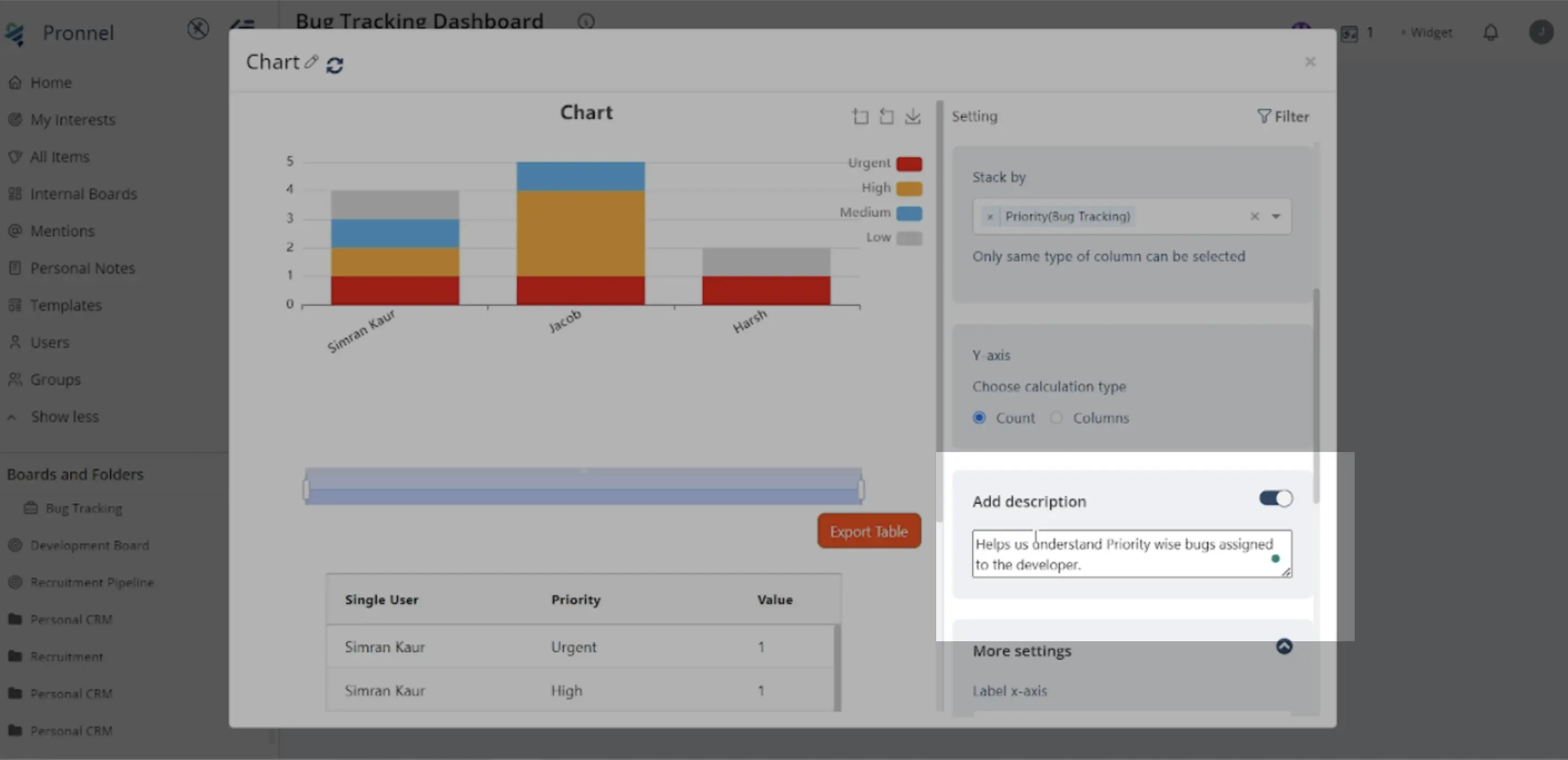
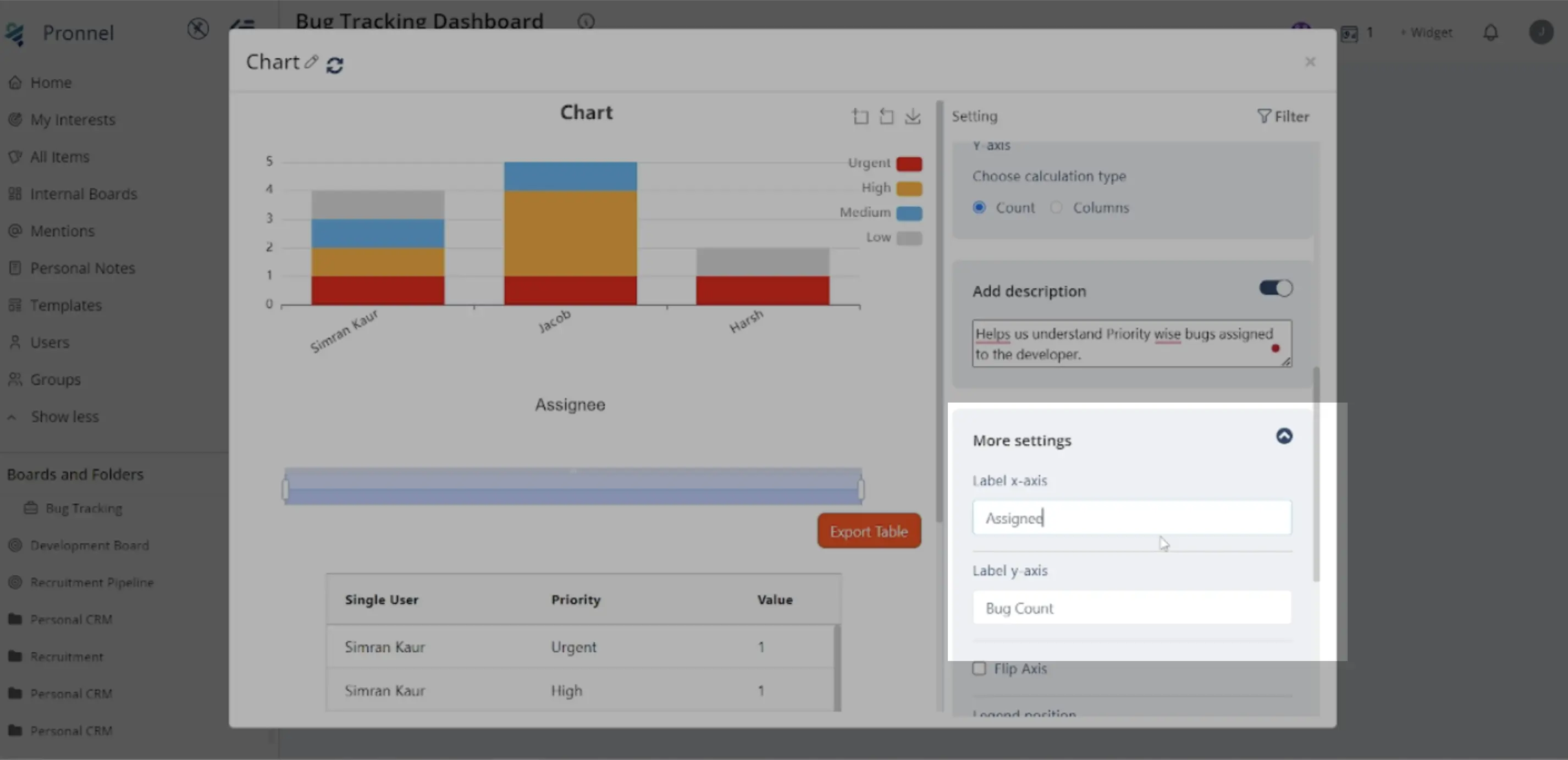
Additional Settings:
Enable the "Add Description" option to provide a note explaining the widget's purpose. This helps users understand the widget's context and significance.
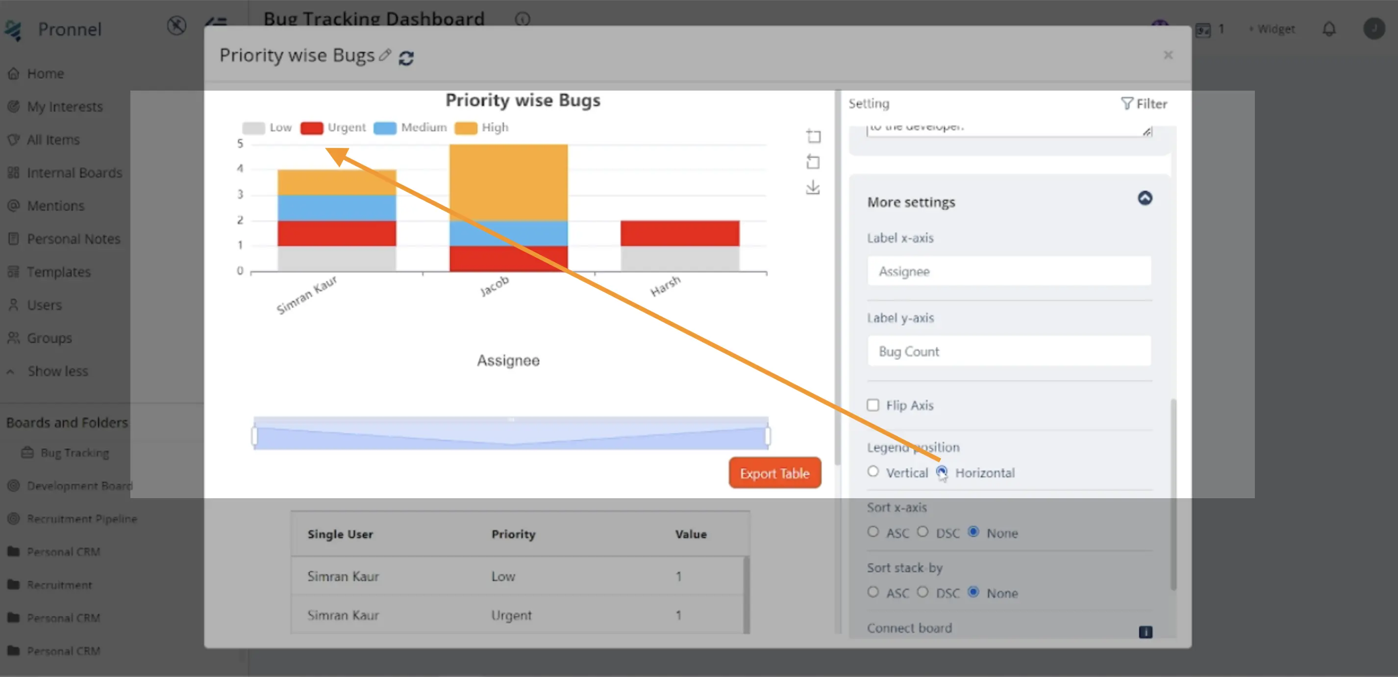
Step 4: Advanced Settings
Explore additional settings such as providing labels for the axes, adjusting the legend's position, sorting data, or flipping the chart orientation to suit your preferences.
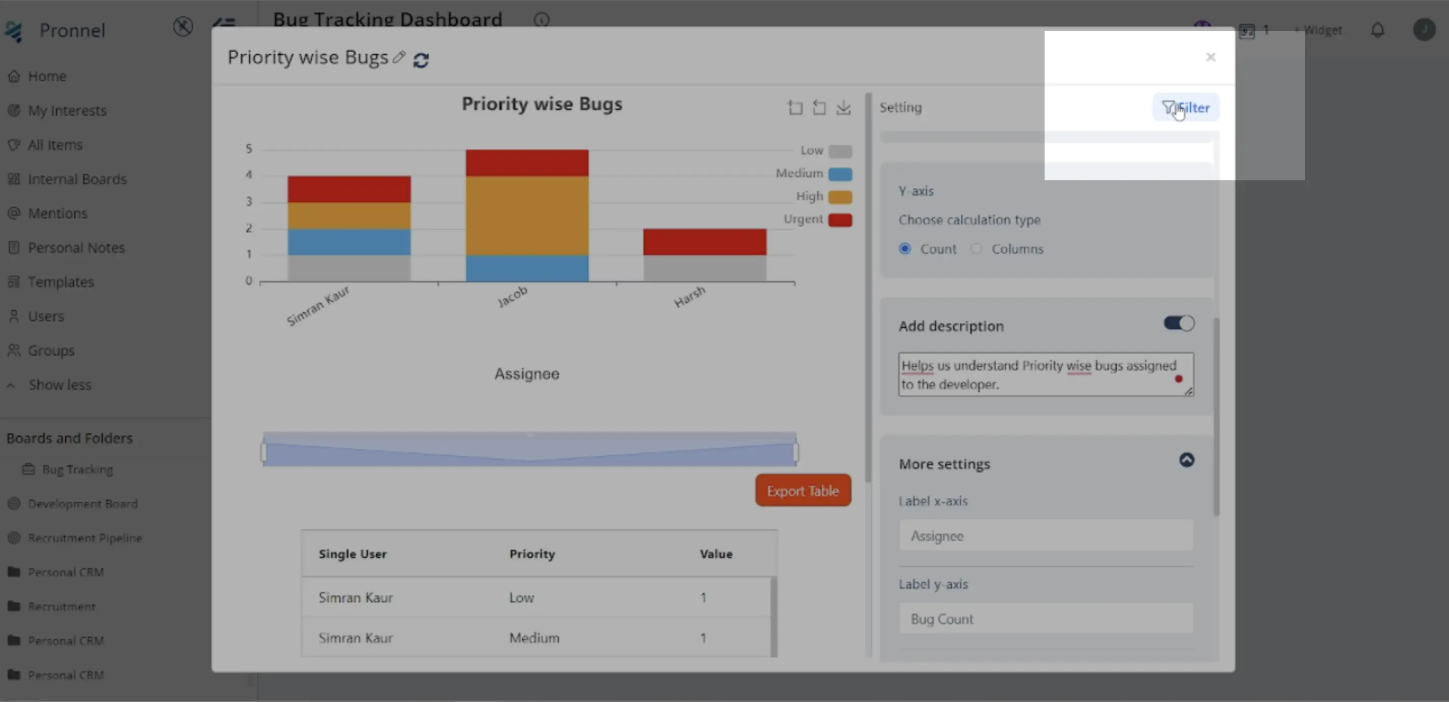
Step 5: Filtering Data
Utilize the filter icon to specify criteria for the data displayed in the stacked bar chart. This allows for customization and focusing on specific subsets of data, such as active tasks or tasks in particular stages.
Step 6: Finalizing the Stacked Bar Chart Widget
Review your settings and configurations to ensure they accurately represent the data you want to visualize. Once satisfied, save the widget, which will be added to your dashboard or overview view.
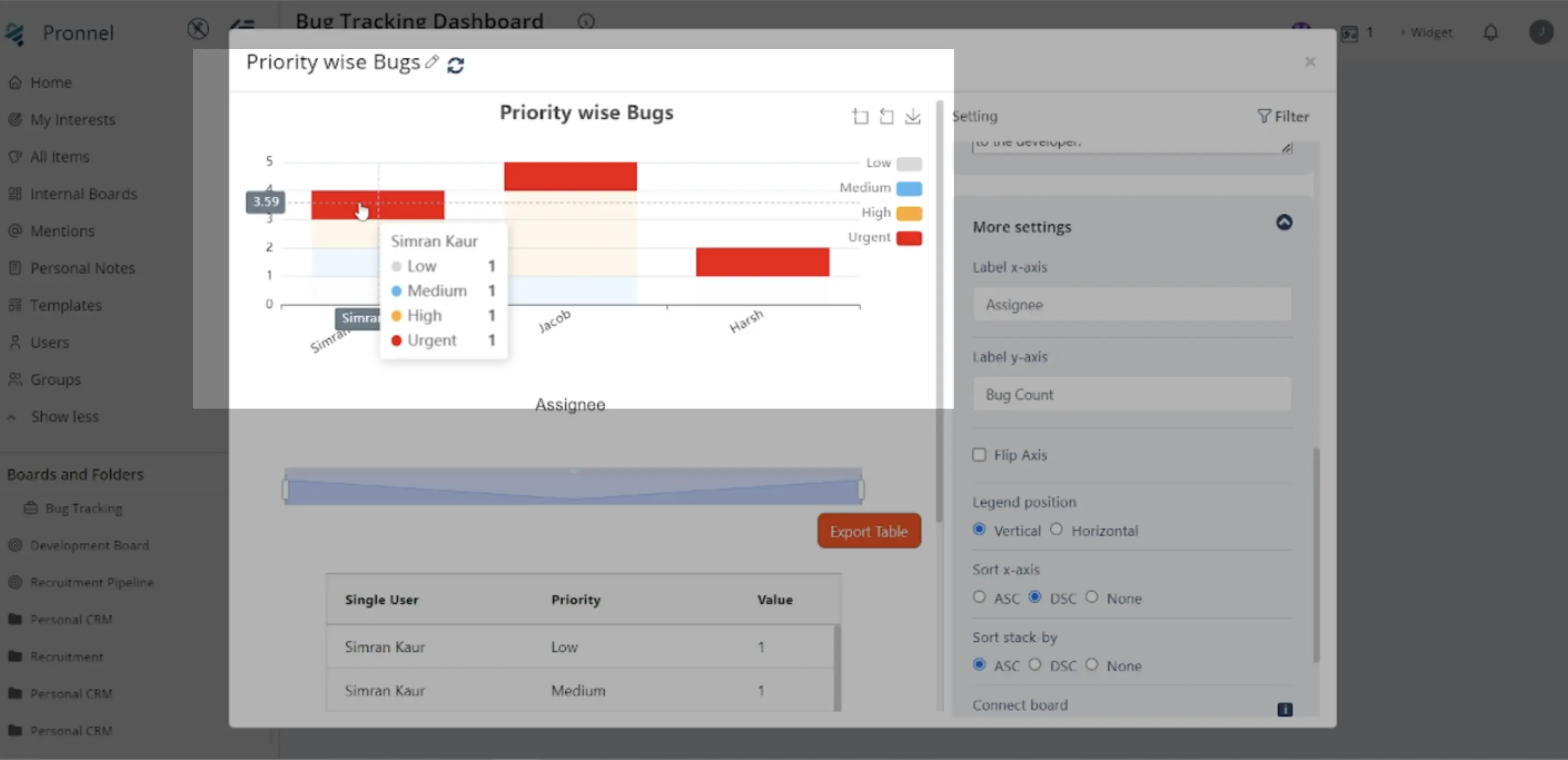
Step 7: Analyzing the Stacked Bar Chart
Once the Stacked Bar Chart Widget is added to your dashboard or overview view, you can analyze the visual representation of priority-wise assigned tasks among different users. Use the chart to identify trends, patterns, or areas that require attention.
Following these steps, you can create informative Stacked Bar Chart Widgets in Pronnel, providing clear insights into your data and activities. Experiment with different configurations and settings to tailor the visualization to your needs and preferences.
Frequently Asked Questions About Stacked Bar Chart Widgets in Pronnel
How do I access the dashboard to create a Stacked Bar Chart?
Log into Pronnel, open the target board, then use the Add Widget option (top-right) to start.
Can I create Stacked Bar Charts in an Overview View?
Yes. You can add Stacked Bar Chart widgets directly to Overview Views or Dashboards.
What are the key configuration steps?
Pick X and Y axes, choose the value (e.g., count or numeric), optionally add a description, then refine advanced settings and filters.
Which variables can I select for axes?
Use categorical fields like Assignees, Priority, Status, or any relevant field from your board.
What can I use for the value displayed?
Use Count or numeric columns; operations include Count, Max, Min, Median, Average, and Sum.
How do I add a description?
Enable Add Description in settings and describe the widget’s purpose for viewers.
What advanced settings are available?
Axis labels, legend position, sort order, and flip orientation; adjust to improve readability.
Can I filter the stacked bar data?
Yes. Use the Filter icon to focus on subsets like active tasks or specific stages.
How do I edit the widget later?
Open the widget’s settings from the dashboard or Overview View and update configuration.
How should I analyze the chart?
Look for trends by user and priority to find workload patterns and areas needing attention.