How to Create Dynamic Line Charts for Data Visualization in Pronnel
In Pronnel, Dashboards and Overview Views are essential tools for summarizing data and gaining insights into your operations. Among the various widgets available, the Line Chart widget stands out for its ability to dynamically visualize data trends and relationships over time. This tutorial will guide you through creating and customizing Line Charts in Pronnel to represent your data effectively.
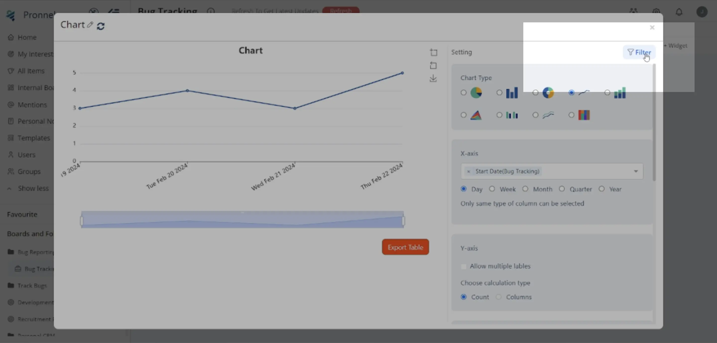
For better understanding, let's take an example and see the Line chart displaying tasks with start dates and giving a sense of how many tasks are scheduled to be started by the team on a given date.
1. Setting up the Dashboard:
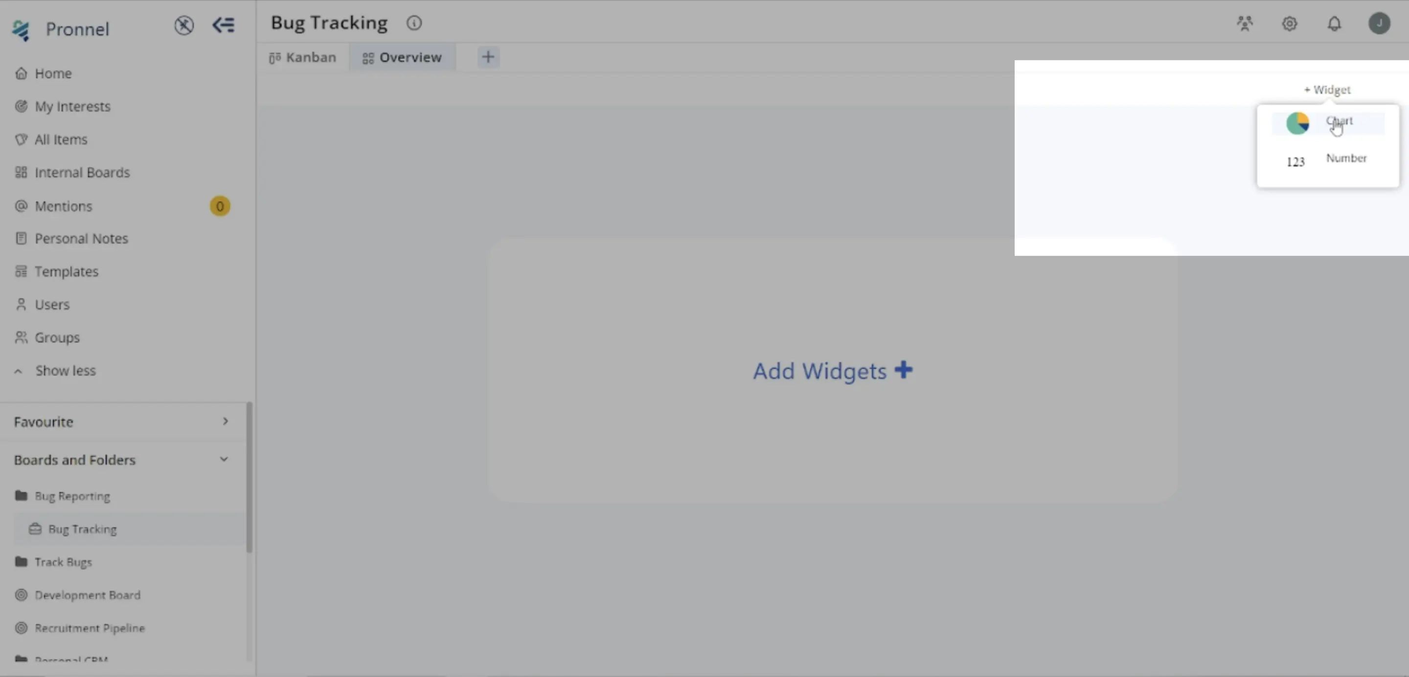
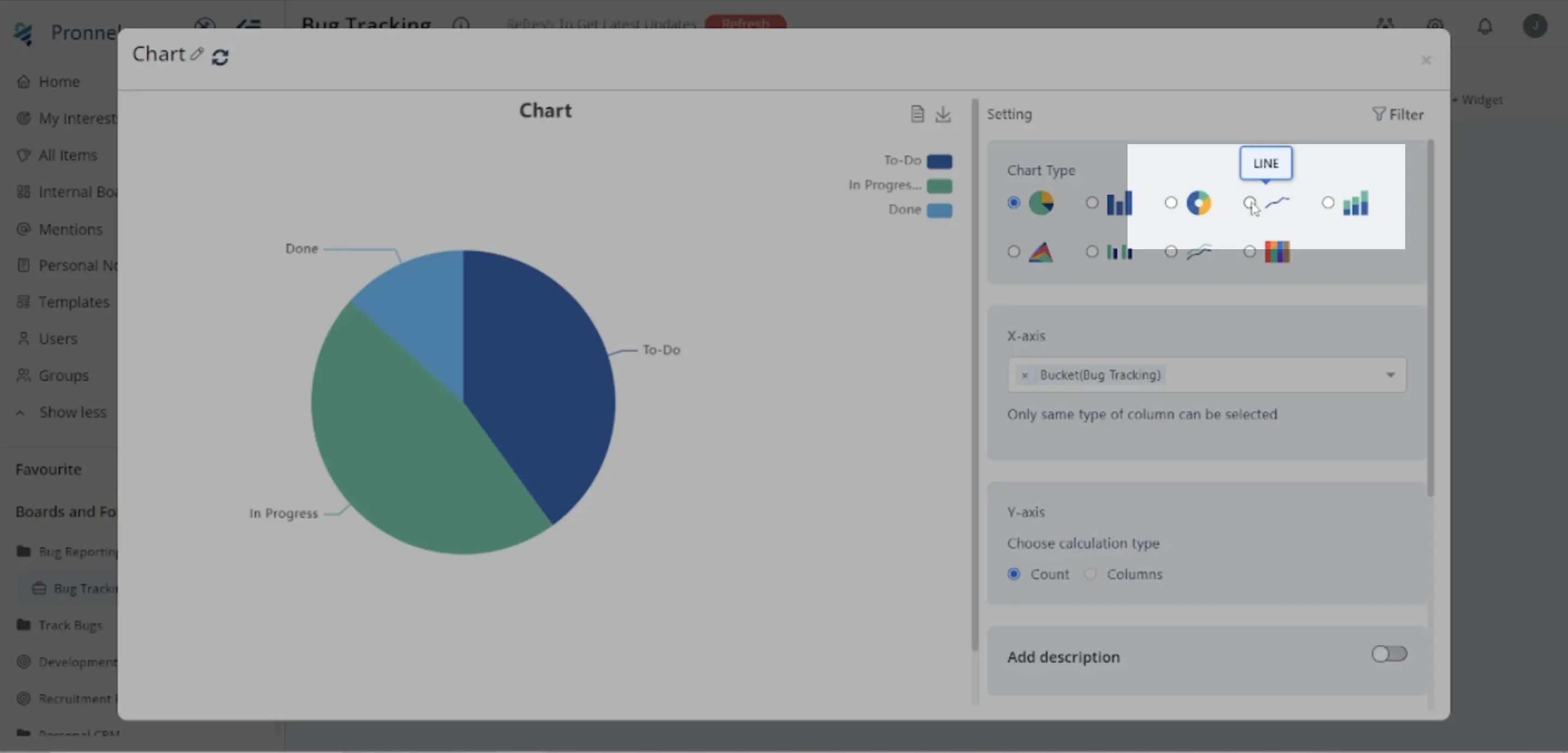
Start by preparing your Dashboard for new additions. Click on the top right corner to create a new widget. Select "Chart" and choose "Line Chart" from the Chart Type options.
2. Configuring the Line Chart Widget:
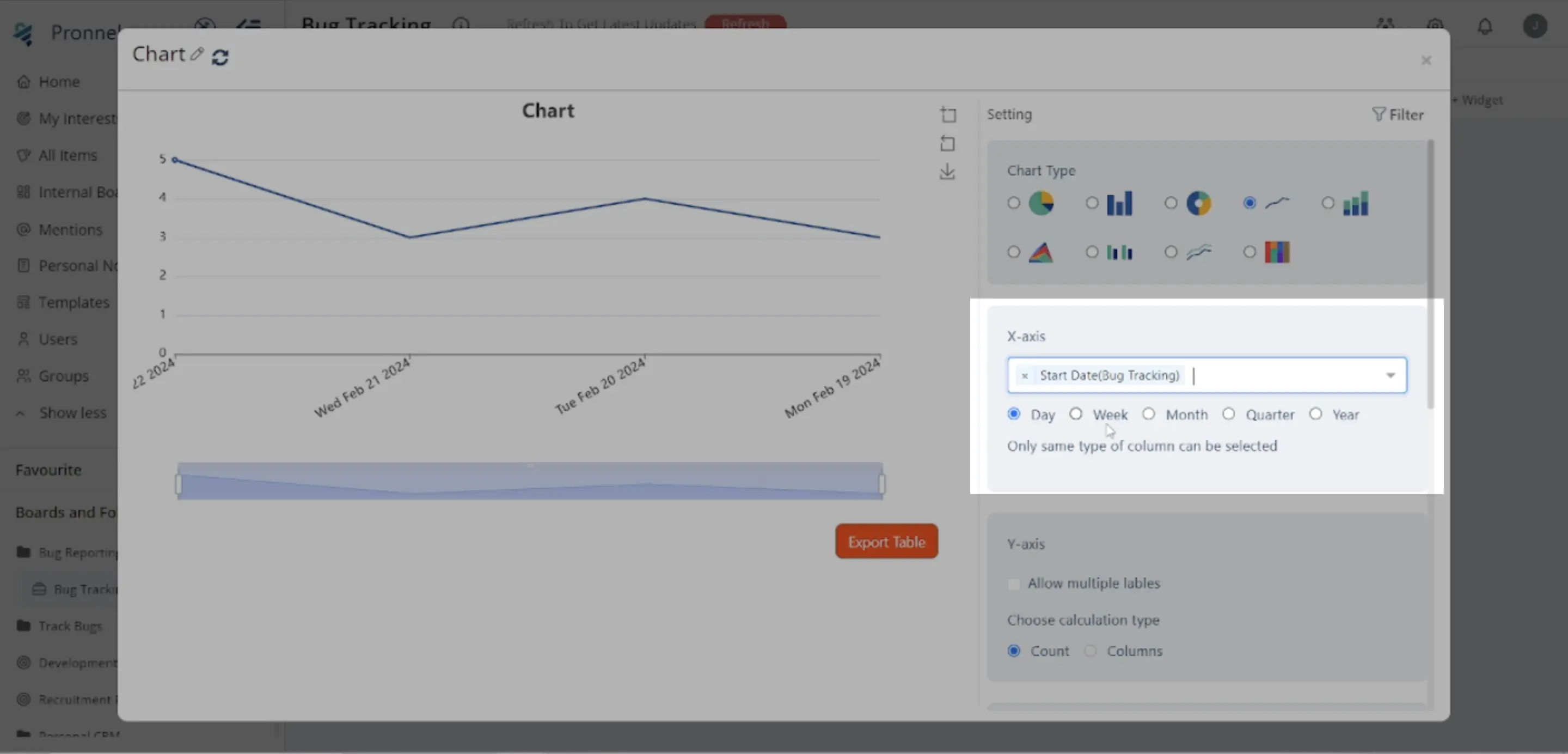
X-Axis Selection:
The X-axis represents a sequential progression of values.
Please choose the appropriate data field, such as Start Date, for the X-Axis to represent time intervals for our example.
Time Interval Selection:
Select the time interval (day, week, month, quarter, or year) based on how you want to view the data's progression over time.
Y-Axis Selection:
Choose the values representing a specific metric's progression. Options include counting items or selecting a numeric column. Apply arithmetic operations such as Count, Max, Min, Median, Average, or Sum to numeric columns.
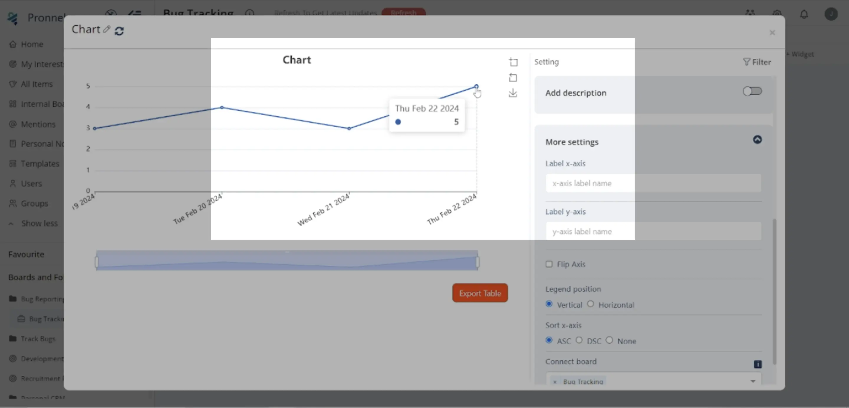
Adding Description:
Activate the "Add Description" feature to include a brief note explaining the purpose of the Line Chart, helping others understand its intent.
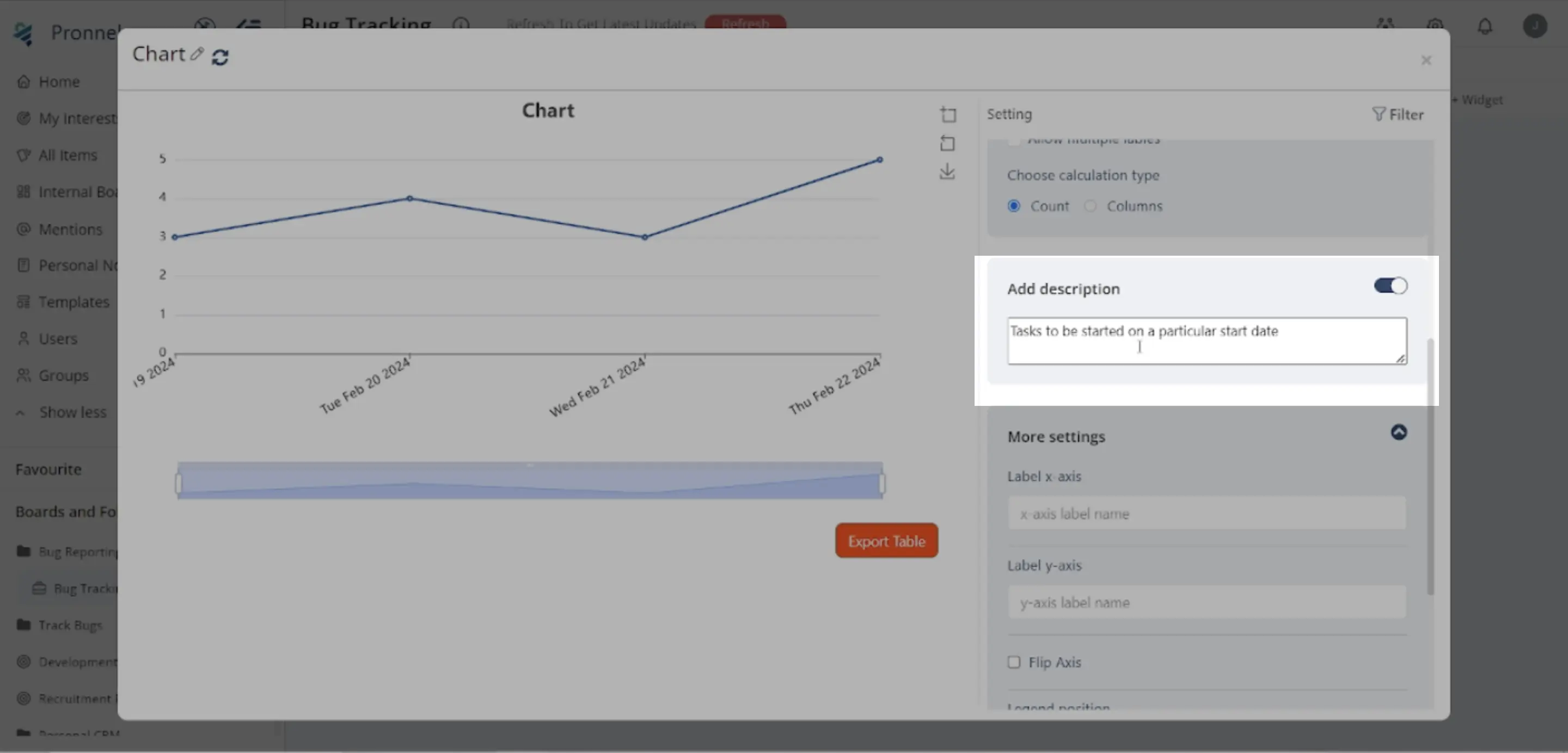
More Settings:
Customize the legend's orientation, organize data in ascending or descending order, select specific boards for data extraction, or invert the chart to swap the roles of the x-axis and y-axis.
3. Filtering Data:
Utilize the Filter Icon in the top right corner to refine the data used for the Line Chart. Apply filters to focus on specific subsets of data, such as active tasks, by excluding items in Final buckets.
4. Visualization:
With the Line Chart configured and data filtered, you can now visualize any relevant metric on your Dashboard. The Line Chart provides clear insights into trends, changes, and relationships in your data over time.
Conclusion:
Line Charts in Pronnel offer a powerful tool for dynamic data visualization, allowing you to communicate insights and trends effectively. Following this tutorial, you can create customized Line Charts tailored to your specific needs, enhancing your ability to analyze and understand your data effectively. Experiment with different configurations and filters to unlock more profound insights into your operations.
Frequently Asked Questions About Line Chart Widgets in Pronnel
Can I create Line Charts in an Overview View?
Yes. Add a widget → Chart → Line Chart for streamlined visualization.
How do I select X-axis data?
Choose a sequential field (e.g., Start Date) and set the desired time interval.
Can I customize the X-axis interval?
Yes. Use day, week, month, quarter, or year to control granularity.
What goes on the Y-axis?
Counts or numeric columns; operations include Count, Max, Min, Median, Average, and Sum.
How do I add a description?
Enable Add Description to explain chart purpose and context.
What additional settings are available?
Legend orientation, sort order, board selection, and invert axes.
How do I filter data?
Use the Filter icon to focus on subsets (e.g., exclude Final bucket).
Can I show multiple Line Charts?
Yes. Add multiple Line Chart widgets and configure each as needed.
Are Line Charts interactive?
Yes. Hover for values, zoom, and toggle series via the legend.
Why use Line Charts?
They reveal trends and relationships over time, improving analysis and decisions.